This post contains affiliate links. We may earn a commission when you download a freebie or buy a subscription on Creative Fabrica, at no extra cost to you.
You found the perfect little glass bottle at the thrift store, the kind with a cork and a slightly wavy neck. It needs a label. You type “Lavender” in the font your computer calls “vintage,” print it, and the bottle suddenly looks like it came from a big-box candle aisle. Nothing is wrong with the font. It is just vintage from the wrong century.
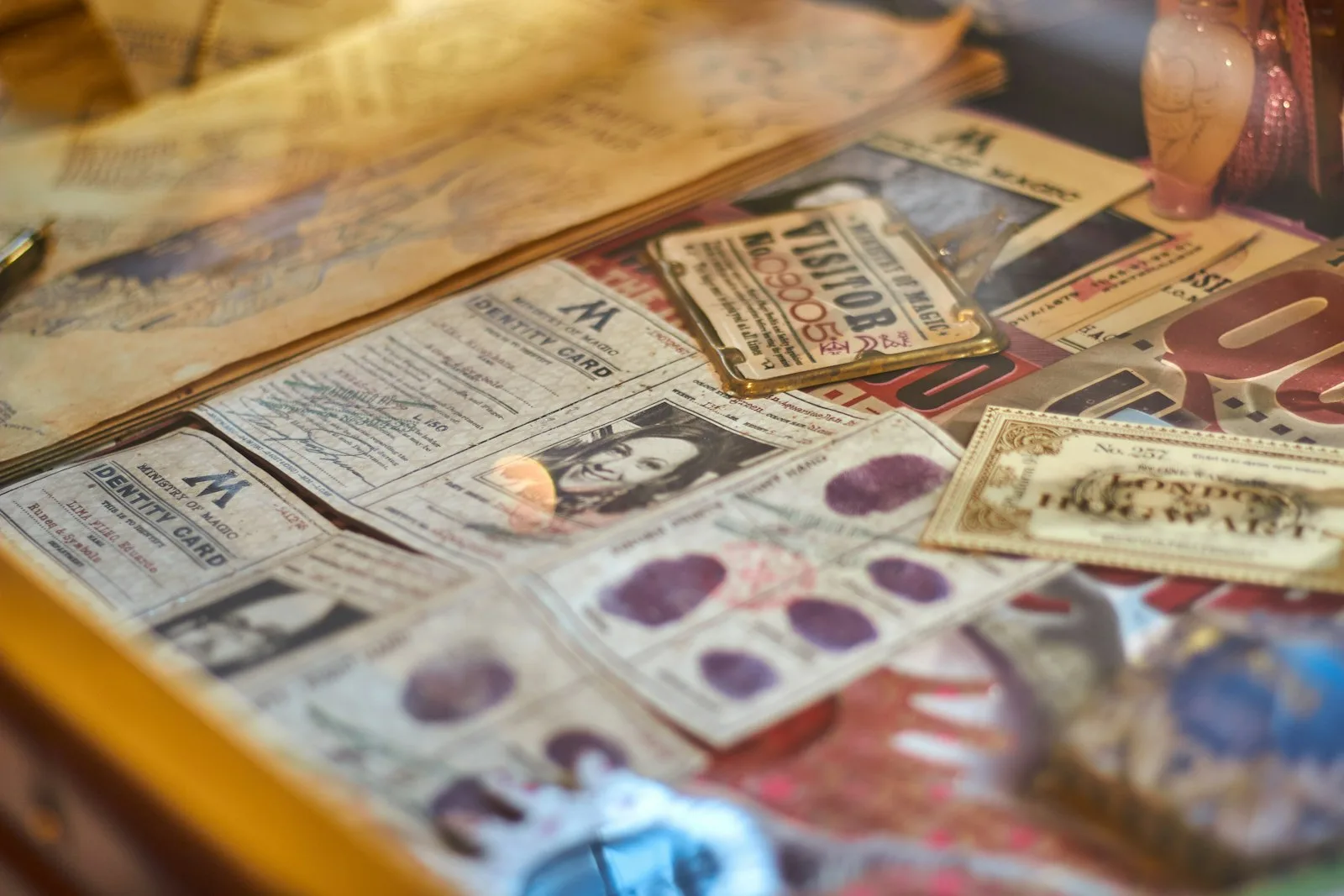
“Vintage” covers about 150 years of lettering, and each stretch has its own tells. A Victorian apothecary label, a 1950s diner sign and a typed library card all read as old, but they do not read as the same kind of old. Match the era to the thing you are making and even a plain inkjet label starts to look like it was found, not printed.
The short version: For labels and ephemera, reach for ornate Victorian or engraved display fonts. For junk journal tags and tickets, a typewriter font does half the aging for you. For signs and shirts, a mid-century script or a varsity slab is the look. The five free fonts below cover three serifs, an old-world display face and a 3D headline, enough for a first batch of labels.
Ornaments inside the letters, spurs, shadows, lots of swashes
Bottle labels, tea tins, journal covers
Engraved and bank-note
Fine cross-hatching or inline strokes inside thick letters
Certificates, gin and spirits labels, bookplates
Typewriter and label maker
Even, mechanical letter rhythm, slightly uneven ink
Junk journal tags, tickets, index cards
Mid-century signage script
Thick, bouncy connected script with a lift at the end
Kitchen signs, recipe cards, diner-style menus
Varsity and athletic
Heavy slab serifs, outlines, a script tail underneath
Shirts, hoodies, team or reunion merch
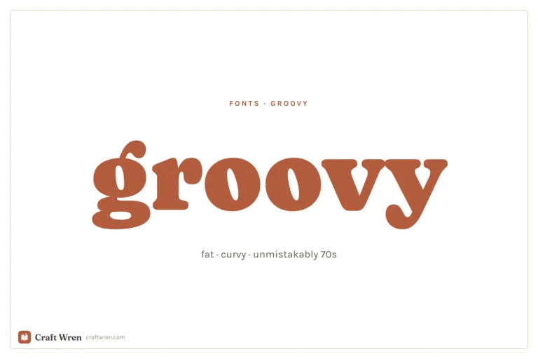
Missing from the table on purpose: 1970s groovy lettering, which has its own groovy fonts roundup, and saloon and wanted-poster type, which lives in western fonts.
Free vintage fonts to start with
All five are free downloads. The only trap is the button: on Creative Fabrica the big one starts a subscription trial, and the free file hides behind the smaller “Download this product as a freebie” link.
Tobacco Road and ShoCard Caps both come from Nick Curtis, a designer known for reviving old display lettering, which is why they look like they were lifted off a real sign rather than invented yesterday.
Victorian and apothecary fonts for labels
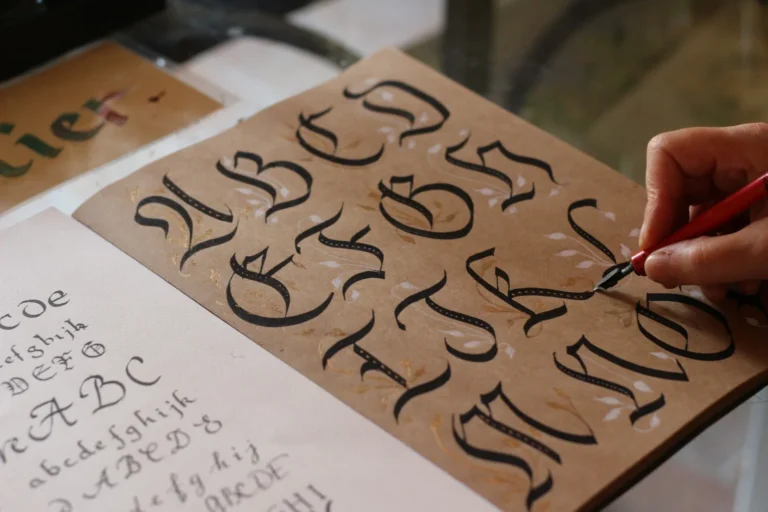
Back to that thrift-store bottle. Victorian display fonts carry decoration inside the letters, stacked shadows and curled terminals, and they look best big and short: one word, maybe two, on a label with a border around it.
Valortha’s two stackable styles are worth a word. You type the word twice, once in Regular and once in Shadow, color them differently and line them up exactly on top of each other, and you get the layered, printed-in-two-inks look of an old label. In Canva or Word, set both text boxes to the same size and nudge one with the arrow keys until they lock.
Engraved and label fonts
Engraved fonts have fine lines running inside thick letters, the look of old bank notes and spirits labels. They need size to show those lines, so use them for the main word and keep the small print plain.
Typewriter fonts for journals and tags
For junk journals, a typewriter font is the cheapest aging trick there is. Type a line of a poem, a date, a name, print it on cream paper, tear it into a strip, and it looks like it came out of an old office drawer. Most typewriter fonts also mimic the uneven ink and the even letter rhythm of a real machine, so the texture carries across the whole line.
Mid-century scripts are thick and bouncy, the lettering of old diner signs and seed packets. Postcard scripts are rougher, like ink that sat in a drawer for fifty years. Both are happiest as a single word or a short line.
Varsity fonts for vintage shirts
The vintage tee is its own genre: a heavy slab word across the chest with a script swooping underneath. A font duo gets you there in two text boxes.
For vinyl, cut the slab and the script as separate layers and keep the script at least a few inches wide; thin tails are where iron-on lettering tears. Our Cricut fonts guide covers welding scripts so they cut in one piece.
How to make a printed label look genuinely old
The font does maybe half of the work. The rest is paper and a little abuse.
Print on the right paper. Cream, ivory or kraft card instead of bright white. Bright white is the fastest way to make a vintage font look new.
Choose a softer ink color. Dark brown, faded navy or deep green reads older than pure black. Set the text color to something like a dark sepia before printing.
Knock the edges back. Tear the label instead of cutting it, or rub the edges with a brown ink pad or a used tea bag, and let it dry flat under a book.
Add one border. A thin double line or a simple frame around the text makes almost any Victorian font look like a real product label.
For the typed-strip look in journals, skip steps 2 and 4 and just tear the strip unevenly. If the page needs a handwritten note beside the typed one, our handwriting fonts roundup has diary-style scripts.
Printing labels and cutting vinyl with these fonts
Most people print labels from Word or Pages, and both use whatever fonts are installed on the computer. Cricut Design Space finds them under system fonts. In Canva, uploads need a paid plan (how to add fonts to Canva). Planning to sell the labels or prints? Freebies from Creative Fabrica carry a license that allows commercial use and All Access files follow its subscription license, but the product page has the final word.
Frequently asked questions about vintage fonts
What font looks the most vintage?
Whichever matches the era of the thing you are making. Victorian ornament for labels, typewriter for journal ephemera, a slab and script duo for shirts.
Are there free vintage fonts for commercial use?
Creative Fabrica’s freebies, including the five above, come with its Single Sales License, which it says allows commercial use. Read the listing before you sell.
What is a good vintage font in Canva?
On a paid plan you can upload any of the fonts here. On the free plan, stick with Canva’s own serif and typewriter-style options and age the look with cream backgrounds and brown text.
How do I make a font look old?
Print it on cream or kraft paper in a dark brown ink color, tear the edges and rub them with an ink pad or tea bag.
Which vintage font is best for junk journals?
A typewriter font for tags and typed strips, plus one ornate display font for page titles. Daily Typewriter Stories and School Vintage are made for exactly that.
A label from the right century
Pick the century before you pick the font. The lavender bottle ends up with a cream label, a thin double border, one ornate word in sepia and a torn edge you rubbed with yesterday’s tea bag, and the next person who picks it up asks which antique shop you found it in.
Get free junk journal printables
New printables, page ideas, and paper craft tutorials, straight to your inbox.
This post contains affiliate links. We may earn a commission when you download a freebie or buy a subscription on Creative Fabrica, at no extra cost to you. It starts with your grandmother’s bread, the recipe you finally got right, and a card you want to look like it came out of a flour-dusted cookbook…
This post contains affiliate links. We may earn a commission when you download a freebie or buy a subscription on Creative Fabrica, at no extra cost to you. Picture the poster: a 70s-themed birthday, a disco playlist cover, a tote with one big word in mustard and brown. Fat bubbly letters, a little wonky, the…
Canva font pairings that reliably work, grouped by mood: elegant, modern, bold, and playful, plus the simple rule for building your own.
Manage Consent
To provide the best experiences, we use technologies like cookies to store and/or access device information. Consenting to these technologies will allow us to process data such as browsing behavior or unique IDs on this site. Not consenting or withdrawing consent, may adversely affect certain features and functions.
Functional
Always active
The technical storage or access is strictly necessary for the legitimate purpose of enabling the use of a specific service explicitly requested by the subscriber or user, or for the sole purpose of carrying out the transmission of a communication over an electronic communications network.
Preferences
The technical storage or access is necessary for the legitimate purpose of storing preferences that are not requested by the subscriber or user.
Statistics
The technical storage or access that is used exclusively for statistical purposes.The technical storage or access that is used exclusively for anonymous statistical purposes. Without a subpoena, voluntary compliance on the part of your Internet Service Provider, or additional records from a third party, information stored or retrieved for this purpose alone cannot usually be used to identify you.
Marketing
The technical storage or access is required to create user profiles to send advertising, or to track the user on a website or across several websites for similar marketing purposes.