25 Free Cricut Fonts (and How to Use Them in Design Space)
This post contains affiliate links. We may earn a commission when you download a freebie or buy a subscription on Creative Fabrica, at no extra cost to you.
The font looked perfect on the canvas. Delicate script, gorgeous swashes, exactly right for the twelve gift tags you promised your sister. Then the mat comes out and you start weeding, and the hairline joining every letter tears the second the pick touches it. Twenty minutes later you have eleven ruined tags and one that passes if nobody looks at the R. The font was never a problem on screen. It was a problem at 3 millimeters wide in vinyl.
The gap between “looks good on the canvas” and “survives the weeding” is the whole skill of picking fonts for a Cricut, and it has less to do with taste than with stroke weight, letter spacing, and how small you are cutting.
The best free Cricut fonts are system fonts: install them on your computer or device and Design Space picks them up automatically, at no cost and with no upload step. Google Fonts is the safest source, because its licenses permit selling what you make, so the shirt or the sign is yours to put a price on. Choose by how a font behaves on the mat rather than how it looks in the preview, which means even strokes, open counters, and enough weight to survive weeding.
Below are 25 free fonts sorted by the job they do, each with a note on where it holds up and where it will fight you. All free, all installable in about a minute.
How to use your own fonts in Cricut Design Space
If you came from Canva or Procreate, the confusing part is that Design Space has no font upload button at all. You do not add a font to Cricut. You install it on your computer or phone and Design Space finds it by itself.
Cricut’s own documentation says it plainly: system fonts are the fonts installed on your computer or mobile device, and Design Space accesses them automatically each time you sign in. The install happens in your operating system, not in the app.
All 25 below live on Google Fonts, free and no account needed: search the name, open the family, hit download. On Windows, unzip it and right-click the .ttf or .otf to Install. On a Mac, double-click the file and click Install Font. One catch that trips people up: fonts install per device, so what you added on the laptop will not appear in Design Space on your iPad.
Then find it in Design Space. On Windows or Mac, click Text in the left-hand panel, open the Font drop-down, and switch to the System index: the list refreshes to show only what is installed on that computer. On iOS, tap Text at the bottom of the Canvas and pick the System tab, one of three that read Cricut, System, and All. On Android, tap Text and search the list, where your own fonts carry a System label.
One thing Cricut’s guide leaves out: if you installed a font while Design Space was open and it is missing, quit the app fully and reopen. That is a community fix, not an official step, but try it before doubting the install.
While you are in there, notice the small grey labels under the Cricut fonts: Single-Layer Cutting, Multi-Layer Cutting, Writing. System fonts do not carry them, which means everything below cuts as a single layer and any pen or layering work is yours to set up.
What actually makes a font cut well
Four things decide whether a font survives the mat. Not one of them is how pretty it looks in the preview.
Stroke weight beats beauty. Strokes much thinner than a millimeter and a half at final size tear while you pick them, or lift off the shirt after a couple of washes. High-contrast serifs and delicate scripts are the usual casualties. The fix is rarely a different font. It is a bigger cut.
How small each of these 25 fonts can go
Everybody says delicate fonts are risky. Nobody says how small is too small, so we measured it.
A font is a file, and a file can be measured. We rendered all 25 at the same letter height and hunted for the thinnest stretch of ink in the glyphs that cause trouble: the joints in a, e and s, the top and bottom of o, the hairlines on a serif. Then we worked out how tall the letter has to be before that thinnest point clears a millimeter and a half.
Treat these as a floor, not a promise. The 1.5 mm threshold comes off the weeding table rather than out of a Cricut manual, and cardstock forgives things glitter vinyl never will. But it beats guessing. Great Vibes needs nearly three inches. Sacramento is fine at one and a quarter.
| Font | Group | Smallest height that weeds cleanly |
|---|---|---|
| Anton | Bold display | 0.36″ (9.2 mm) |
| Lilita One | Bold display | 0.37″ (9.4 mm) |
| Fredoka | Clean sans | 0.38″ (9.6 mm) |
| Bowlby One | Bold display | 0.38″ (9.8 mm) |
| Grandstander | Clean sans | 0.46″ (11.7 mm) |
| Quicksand | Clean sans | 0.49″ (12.4 mm) |
| Shrikhand | Bold display | 0.49″ (12.4 mm) |
| Jost | Clean sans | 0.55″ (13.8 mm) |
| Comfortaa | Clean sans | 0.59″ (15.1 mm) |
| Permanent Marker | Handwriting | 0.59″ (14.9 mm) |
| Caveat | Handwriting | 0.79″ (20.0 mm) |
| Indie Flower | Handwriting | 0.89″ (22.5 mm) |
| Tenor Sans | Serif | 1.01″ (25.7 mm) |
| EB Garamond | Serif | 1.18″ (30.0 mm) |
| Sacramento | Script | 1.28″ (32.6 mm) |
| Homemade Apple | Handwriting | 1.29″ (32.7 mm) |
| Sorts Mill Goudy | Serif | 1.58″ (40.2 mm) |
| Playfair Display | Serif | 2.02″ (51.2 mm) |
| Allura | Script | 2.02″ (51.2 mm) |
| Parisienne | Script | 2.02″ (51.2 mm) |
| Cormorant Garamond | Serif | 2.35″ (59.8 mm) |
| Abril Fatface | Bold display | 2.35″ (59.8 mm) |
| Tangerine | Script | 2.82″ (71.7 mm) |
| Great Vibes | Script | 2.83″ (72.0 mm) |
| Pinyon Script | Script | 3.53″ (89.6 mm) |
The pattern matters more than any single row: heavy display faces cut down to about a third of an inch, geometric sans lands near half an inch, and formal scripts are not safe until two or three inches. Which is why a name on a mug works and the same name on a gift tag does not.
Counters close up when you scale down. The counter is the enclosed hole in an a, e, or o. Cut a tight-countered font at an inch tall and the middle of every e becomes a speck that either stays glued to the backing or lands in your lap. Round open counters are the reason geometric sans fonts forgive so much.
Script letters do not connect by themselves. A cursive font on the canvas will cut as separate letters with visible gaps, because the letterforms only overlap if you make them. Reduce the letter spacing until the strokes physically overlap, then select the text and use Weld to fuse it into one piece. Skip that and you get a name in individual floating letters.
Iron-on flips everything. HTV is cut mirrored and weeded from the back, so a font that behaved in adhesive vinyl gets harder the moment you are picking tiny pieces out of a design you are reading backwards.
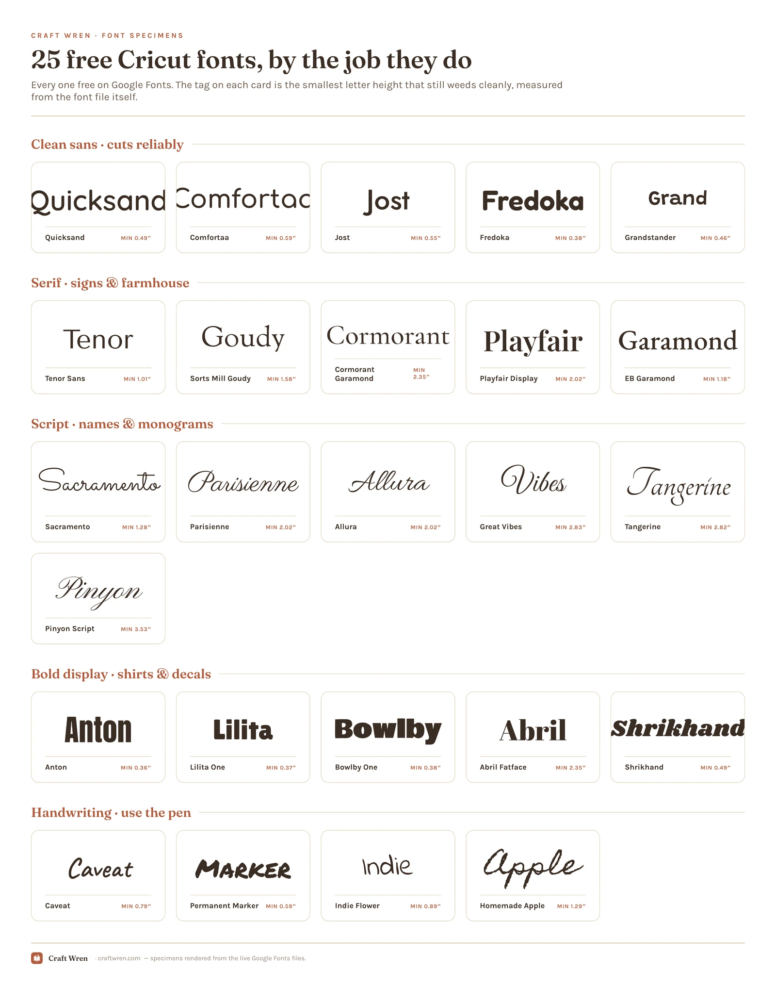
The 25 free Cricut fonts, by job
Grouped by what you are making, not by how the letters look. Find your project, install two or three, leave the rest.
Clean sans fonts that cut reliably
The safest group here: even strokes, open counters, nothing fussy to lose at small sizes. Start here if a project has to work first try.
- Quicksand. Rounded, geometric, the same weight everywhere you look. That evenness is why it survives being cut small, and why it is the one to reach for on pantry labels.
- Comfortaa. Soft and fully rounded, with the most generous open counters in the group. Weeds easily and reads calm rather than cold.
- Jost. Crisp and Futura-adjacent, sharper and more grown-up than Quicksand. For tumblers and labels that should read tidy, not cute.
- Fredoka. Rounded with extra weight behind it, which is what fabric wants. The friendly pick for kids’ shirts and party decor.
- Grandstander. Round letters with a gentle wobble baked in, like a stencil someone traced by hand. Enough weight behind the wobble that it never becomes a weak spot.
Serif fonts for signs and farmhouse decor
Serifs read expensive and carry real risk, because the thin bits and little feet tear first. These five hold up better than most if you keep them large.
- Tenor Sans. A near-serif with barely-there details and a wide, calm shape. Elegant on a sign and far sturdier on the mat than a true high-contrast serif.
- Sorts Mill Goudy. Old-style serif, warm and slightly irregular in the letterforms. The farmhouse-sign pick, and the sturdiest true serif here.
- Cormorant Garamond. Delicate and understated, lovely on a wedding sign at full size. Its hairlines measure among the thinnest in this list, so treat two and a half inches as the floor.
- Playfair Display. Swings between very thick and very thin, which is what makes it read like a magazine masthead. Those thin parts tear first, so give it room.
- EB Garamond. Holds legibility at moderate sizes better than the rest of this group, so it is the one for a sign with a whole sentence rather than one word.
Script and cursive fonts for names and monograms
The most-wanted group and the most demanding. Every one needs the letter-spacing-and-Weld treatment above, and every one punishes small sizes.
- Great Vibes. On every save-the-date since about 2015, and it earns the overexposure. Loops wide and needs the most room of anything here, so: signs and cake toppers, not tags.
- Allura. Swashes that trail off into almost nothing. Stunning for a single name, and a patience test at the weeding stage.
- Sacramento. Every stroke is the same width, top to bottom, which is the single property that makes a script cuttable. If you only install one cursive, make it this one: it stays clean at a quarter the height Great Vibes demands.
- Parisienne. Bounces along the baseline instead of marching, so it feels handwritten rather than engraved.
- Tangerine. All the drama is in the capitals, which tells you how to use it: one initial, cut large, on a monogram.
- Pinyon Script. Copperplate formality, the hand that used to appear on an engraved RSVP. The finest font in this list by measurement, so send it through the pen rather than the blade.
Bold display fonts for shirts and decals
Thick, loud, almost impossible to ruin. New to HTV? Make your first shirt from this group.
- Anton. Narrow, enormous, impossible to weed wrong, because nothing in it is small enough to lose. One word across a shirt front and the design is finished. The safest small cut here.
- Lilita One. Weight without silliness. Use it when the design has to read bold and still look like somebody made deliberate choices.
- Bowlby One. Fat rounded letters that lean slightly retro without shouting about it. Holds up beautifully on tote bags and mugs, where a thin font would look lost.
- Abril Fatface. Heavy serif with a swoop, the kind of letter you see on a magazine cover from a decade you liked. Carries a whole design alone, though the pinched joints where thick meets thin want room.
- Shrikhand. Carries a warm, slightly sun-faded poster energy. Thick everywhere it counts, so it comes through weeding and the washing machine intact.
Handwriting fonts that work with the pen
Load these into a pen rather than cutting them. Handwriting fonts have exactly the thin uneven strokes that cause weeding grief, and they look better drawn anyway.
- Caveat. Leans forward like someone writing in a hurry, and unlike most handwriting fonts it does not look faked. First choice for place cards.
- Permanent Marker. Chisel-tip lettering with the slight squeak of a marker pressed too hard. Thick enough that it also cuts as vinyl without complaint, which makes it the one font here that does both jobs.
- Indie Flower. Round print lettering with a friendly bounce, the handwriting of someone cheerful. Lovely drawn with a pen, tedious cut in vinyl.
- Homemade Apple. Loops and joins like a real person’s cursive, uneven bits included. One line, pen, done.
Paid Cricut fonts that earn their download slot
The 25 above are free and they cut clean. Paid shelves sell something else: layered looks built for two colors of vinyl, scripts already spaced to weld, monogram sets that arrive as a finished frame instead of three pieces you nudge into place by hand.
Fifteen from Creative Fabrica, in the order a project usually needs them. The links pay us a commission and cost you nothing extra.
Those five cover names and lettering. Bolder work next:
Signs and monograms after that, where the shape does most of the job:
Same rule as the free ones, and the reason this post exists: cut one small test line before you cut twelve.
Where to find more free Cricut fonts
The 25 above cover most of what a Cricut does. When a project wants more personality than open-source type gives, two places are worth knowing and one trap is worth avoiding.
Font marketplaces are where the crafting-specific stuff lives: layered fonts built for multi-color vinyl, script faces already spaced so they weld without a fight, and monogram sets that come as real SVG frames. Creative Fabrica has the widest Cricut shelf of them, and its free tier lets you take a few home before deciding whether any of it earns a subscription. Four that are worth the download slot right now:
- Winky Swing is a bouncy retro script with actual weight behind the strokes, which is rarer in script fonts than it should be.
- Hello Honey is chunky handwriting that survives HTV and the wash.
- Signature Handwriting and Easy Handwriting both do the signature-style name thing, one more formal than the other.
- Simple Notes is for the pantry-label people, and it cuts small better than most handwritten faces.
Or dig through the font library yourself, which is browsable by style. For period oddities, dafont still runs a corner of the internet nobody has tidied since 2009.
The trap is licensing, and it bites Cricut people hardest because so much of what we make gets sold. A font can be free to download and still forbid the Etsy listing, the craft fair table, and your coworker’s custom order. Open the license file, look for the words commercial use, and if it only says personal, keep that font in the sketchbook. The 25 above are clear on this point. Full breakdown of what license terms actually mean is in our Canva fonts guide, kept in one place instead of half-explained in five posts.
You do not need all 25
Installing all 25 and then scrolling past every one of them is its own flavor of procrastination. A working Cricut shelf is about four fonts: one clean sans for labels, one monoline script for names, one bold display for shirts, and one handwriting font for the pen.
If you want the shortest possible version: Quicksand, Sacramento, Anton, Caveat. Those four will handle labels, a monogram, a tee, and a hand-lettered card, and every one of them cuts without drama. Add a serif when you get a sign commission.
For the look side of the decision, our aesthetic fonts guide and Canva font pairings have combinations you can lift directly.
Frequently asked questions about Cricut fonts
How do I add a font to Cricut Design Space?
You do not add it in Design Space. Install the font on your computer or device the normal way, then open Design Space, click Text, open the Font drop-down, and choose the System index to see it.
Are Cricut fonts free?
Some, not all. Design Space ships with a set of free Cricut fonts, charges for others through Cricut Access or one-off purchase, and treats anything already installed on your device as fair game at no cost. That last route is the whole trick behind this list: the fonts are free because they were never Cricut’s to sell in the first place, and Design Space reads them anyway.
Can I sell things I make with free fonts?
It depends entirely on the license, not on the price. Every font in this list is a Google Font, which means commercial use is allowed. A random free download from elsewhere may be personal-use only, so check before you sell.
Why is my cursive font cutting as separate letters?
Because the letters are not actually touching. Tighten the letter spacing until the strokes overlap, select the text, then Weld.
What size should I cut small text?
There is no official minimum, but as a working rule keep strokes at a millimeter and a half or thicker, which for most fonts here lands around three quarters of an inch tall. Go smaller and weeding turns into tweezer work.
The short version
Fonts do not fail on the canvas, they fail on the mat, and almost always for the same three reasons: strokes too thin, counters too tight, script letters never welded. Fix those and the font you loved in the preview will still be intact when it comes off the backing.
Which means those twelve gift tags were always doable. They just needed Sacramento at three quarters of an inch instead of a hairline script at three millimeters, and a weld before the mat ever went in.