This post contains affiliate links. We may earn a commission when you download a freebie or buy a subscription on Creative Fabrica, at no extra cost to you.
It is someone’s birthday and you are making the card. Or the sticker sheet, or the invite, or the little name tags for the party favors. In your head it is fun: bouncy, bubbly, the kind of lettering that looks like it is smiling. Then you type it out and it lands in something flat and corporate, and now your birthday card reads like a spreadsheet wishing someone many happy returns.
Girly fonts fix that in one move. They are the loud, friendly, slightly silly typefaces that carry fun the way coquette fonts carry softness. Pick the right one and the page feels like a party before you have added a single sticker.
Girly fonts are playful, rounded, often handwritten typefaces that read fun and feminine, the bubbly cousin of the more delicate coquette look. They work for birthday cards, sticker sheets, kids’ projects, and anything that wants to feel cheerful.
There are three flavors, and they run from loud to casual.
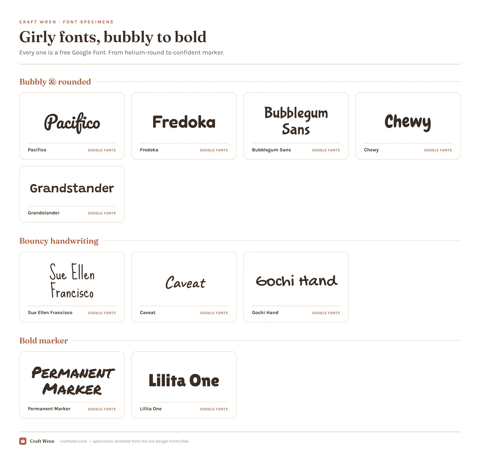
Smallest print size is measured from each font file: the letter height at which the thinnest part of the stroke drops to 0.25 mm, which is roughly where home printing starts losing the line. Screens forgive more, vinyl forgives less.
Font
Sub-style
What it gives you
Smallest print size
Fredoka
Bubbly
Pure bubble that holds at the smallest size
1.6 mm
Lilita One
Bold marker
Rounded heavy, bold cheerful
1.6 mm
Chewy
Bubbly
Chunkiest bubble, all soft
1.8 mm
Gochi Hand
Bouncy handwriting
Rounder, doodly handwriting style
1.8 mm
Bubblegum Sans
Bubbly
The same bubble, wants a hair more room
1.9 mm
Grandstander
Bubbly
Adds bouncy retro wobble
1.9 mm
Pacifico
Bubbly
Classic rounded brush script
2.3 mm
Permanent Marker
Bold marker
Gives thick highlighter-pen look
2.5 mm
Caveat
Bouncy handwriting
Everyday handwriting, stays tidy
3.3 mm
Sue Ellen Francisco
Bouncy handwriting
Breezy felt-tip handwriting option
4.6 mm
The bubbly rounded ones
Fat, soft, rounded letters that look inflated with helium, the loudest and most fun of the girly fonts. These carry a title or a single big word and they are impossible to feel grumpy looking at.
Pacifico is the classic, a rounded brush script that has been on a thousand cute logos for good reason. Fredoka and Bubblegum Sans push further into pure bubble territory, Chewy is the chunkiest of the lot, all soft corners, and Grandstander adds a bouncy retro wobble if you want a bit more character. Every one of them is free on Google Fonts and drops straight into Canva.
The bouncy handwriting ones
A step more casual: letters that look hand-scribbled, a little uneven, like a note passed in class. They feel personal and warm, and they are perfect when you want girly without going full bubblegum.
Sue Ellen Francisco is the breezy felt-tip option, Caveat is the everyday handwriting that still looks tidy, and Gochi Hand has a rounder, doodly quality. They read beautifully in short bursts, a greeting, a name, a quick caption, and all three come free from Google Fonts.
The bold marker ones
When you want fun that still reads as grown-up, a confident marker or chunky display font does it. Less twee than the bubbles, still unmistakably playful.
Permanent Marker gives you that thick highlighter-pen look, and Lilita One is a rounded heavy display that feels bold and cheerful at once. These are the girly fonts you can use on a planner cover without it looking like it belongs to an eight-year-old. Both free, both in Canva.
Building a girly starter set
If you make a lot of cheerful things, three fonts and a plain body cover almost everything. One bubbly headline font for the loud titles, Fredoka or Chewy. One bouncy handwriting font for captions and little notes, Caveat or Sue Ellen Francisco. One bold marker for the grown-up projects, Lilita One or Permanent Marker. Add a clean sans you already own for body text, and you can build a birthday card, a sticker sheet, and a planner cover without opening a font site again.
The point of a small set is consistency. When every project pulls from the same three fonts, your work starts to look like a brand instead of a font-of-the-week scramble, which matters a lot if you sell printables or post on a schedule. Pick your three, save them, and stop downloading.
Cute without going childish
The whole risk with girly fonts is the cliff between cute and kindergarten. Cross it and your grown-up planner suddenly looks like a school worksheet. Almost nobody reaching for “girly” is actually reaching for “third grade.”
Three things keep you on the right side. Lean toward the bolder, rounder fonts over the extra-loopy ones, because weight reads as confident and thin bounce reads as juvenile. Pair the playful font with a clean, plain body font so the whole thing is not shouting. And keep the color grown-up, since a sophisticated palette does more than the font to age a design up. A bubbly title in dusty rose looks chic. The same title in primary rainbow looks like a kids’ menu.
Where to download girly fonts free
Three sources, in the order worth checking:
Google Fonts has every font above, free for personal and commercial use, no download needed in Canva or Docs. It covers the bubbly, handwritten, and marker styles all in one place.
Creative Fabrica is the spot for the extra-cute styles, the ones with hearts dotting the i’s and little doodles built in, and the free plan lets you download a handful without paying.
dafont has a big handwriting-and-cute section, with the usual rule: read the license, since many are free for personal use only.
If you sell printables, read the license before you fall for a font. Personal-use-only means exactly that, no products, even when it cost nothing to download. Everything I named from Google Fonts is fine to sell with, so check only the picks from elsewhere. The aesthetic fonts guide has the long version.
How to use a girly font
One playful font, one calm one. Put the fun font on the title or the name, keep the body text in a plain sans, and let the cheerful typeface be the loudest thing on the page. Two bouncy fonts at once is where cute curdles into chaotic.
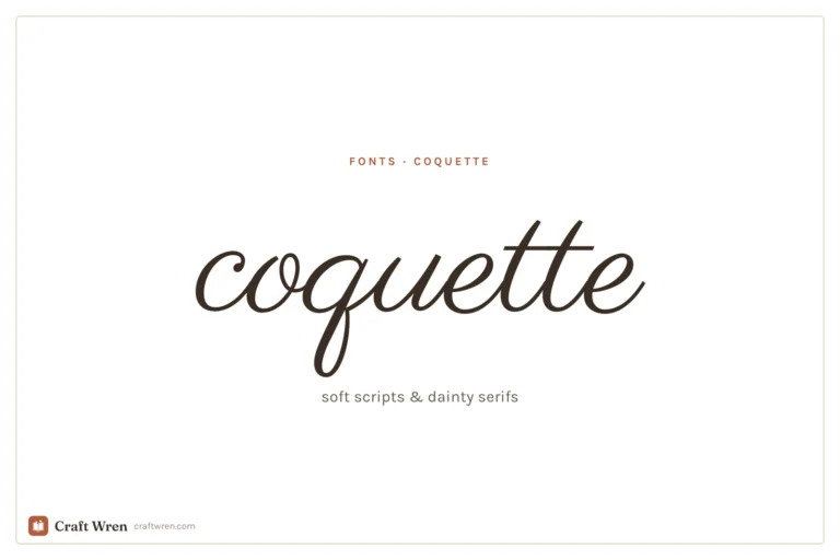
If you want softer and more romantic than bubbly and fun, the coquette fonts guide is the gentler neighbor: same feminine instinct, quieter volume. Girly is the one you reach for when the project should feel like it is grinning.
Frequently asked questions about girly fonts
What is a good girly font?
It depends on the energy you want. Pacifico and Fredoka are the bubbly, cheerful picks, Caveat and Sue Ellen Francisco cover the casual handwritten look, and Lilita One is the bolder, more grown-up option. All are free on Google Fonts, so you can try a few before committing.
Are girly fonts free?
Most are. Google Fonts hosts Pacifico, Fredoka, Bubblegum Sans, Chewy, Caveat, and more free for personal and commercial use. The extra-decorative styles with built-in hearts and doodles usually sit on Creative Fabrica and dafont, where some are personal-use only.
How do I make a font look cute but not childish?
Choose bolder, rounder fonts over thin loopy ones, pair the playful font with a plain body font, and keep the color palette sophisticated. A bubbly title in a muted, grown-up color reads as stylish; the same font in bright primary colors reads as a kids’ party.
What is the difference between girly and coquette fonts?
Girly is loud, bouncy, and fun, built on bubbly and handwritten styles. Coquette is quiet, delicate, and romantic, built on fine scripts and dainty serifs. Both feel feminine, but girly grins and coquette whispers.
Can I use girly fonts in Canva?
Yes. Every Google Font here, including Pacifico, Fredoka, and Lilita One, appears in Canva’s font menu with no download. A cute font you grabbed from dafont can go in too, as long as you are on Canva Pro.
Get free junk journal printables
New printables, page ideas, and paper craft tutorials, straight to your inbox.
This post contains affiliate links. We may earn a commission when you download a freebie or buy a subscription on Creative Fabrica, at no extra cost to you. The screenshot has been in your camera roll for months. A name in a fine looping script, small, on the inside of the wrist, the kind of…
Manage Consent
To provide the best experiences, we use technologies like cookies to store and/or access device information. Consenting to these technologies will allow us to process data such as browsing behavior or unique IDs on this site. Not consenting or withdrawing consent, may adversely affect certain features and functions.
Functional
Always active
The technical storage or access is strictly necessary for the legitimate purpose of enabling the use of a specific service explicitly requested by the subscriber or user, or for the sole purpose of carrying out the transmission of a communication over an electronic communications network.
Preferences
The technical storage or access is necessary for the legitimate purpose of storing preferences that are not requested by the subscriber or user.
Statistics
The technical storage or access that is used exclusively for statistical purposes.The technical storage or access that is used exclusively for anonymous statistical purposes. Without a subpoena, voluntary compliance on the part of your Internet Service Provider, or additional records from a third party, information stored or retrieved for this purpose alone cannot usually be used to identify you.
Marketing
The technical storage or access is required to create user profiles to send advertising, or to track the user on a website or across several websites for similar marketing purposes.


")

")