This post contains affiliate links. We may earn a commission when you download a freebie or buy a subscription on Creative Fabrica, at no extra cost to you.
The screenshot has been in your camera roll for months. A name in a fine looping script, small, on the inside of the wrist, the kind of thing a sleeve covers on the days you want it covered. Then you put it in front of an artist, they hold the stencil against your arm, and you get the sentence nobody wants: not at that size. The letters are two millimeters apart on paper and skin does not hold two millimeters. Give it enough years and the loops close, the name goes soft, and the options left are laser or a cover-up.
Nothing about that font was wrong. The size was wrong, and the font is what decided the size.
The best free tattoo fonts are the ones whose gaps stay open at the size you want the piece to be. All 28 come from Google Fonts, whose licenses allow commercial work, which keeps the font side clean for an artist selling designs. Blackletter needs less room than most people expect, and fine script needs far more: measured from the font files, Old English holds a short word at about two and a half inches, and the finest copperplate script wants five and a half.
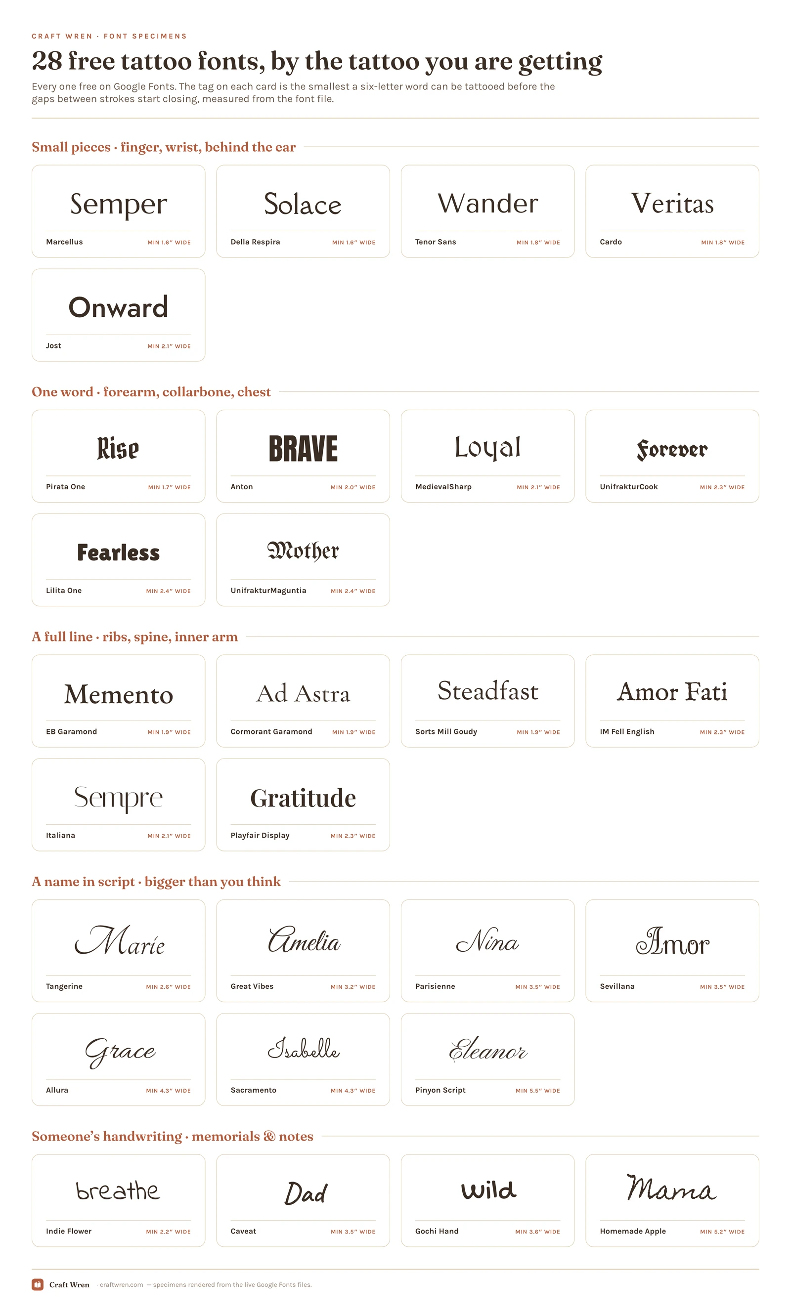
Below are 28 free fonts, grouped by the tattoo you are getting and measured for the smallest each one can go.
A font is the first draft of a lettering tattoo. Your artist redraws the word by hand from there, thickening stems so they survive and opening joins so they do not fill in. What you are choosing is the shape and the size, and the size is the part you can test at home.
Set the word in anything that lets you type a real measurement: Canva on a laptop, Procreate on an iPad, Word if that is what is open. Install the font first (download it from Google Fonts, unzip, then double-click on a Mac or right-click and Install on Windows), and size the text box by width, not by a point size that means nothing on skin.
Print it at 100 percent. Not fit-to-page, not scaled to fill the sheet. Then put a ruler on the paper and check the printer obeyed, because it often does not. Cut the word out, tape it where the tattoo is going, and live with it for a few days, including one photo if the placement is somewhere you cannot see. A word that looks right flat on a desk sits at a strange angle on a forearm.
Then send your artist the font file and the measurement together. People remember the font and forget the number, and the number is the half that ages.
If what you want is a real person’s handwriting, a note from a grandmother or a signature off a photo, skip fonts entirely: photograph it flat in daylight and let your artist work from the hand that wrote it. The handwriting fonts further down are for when no sample exists.
What happens to lettering on skin
Four things work against a lettering tattoo, and none of them show up in the mockup.
Ink spreads. Tattoo ink sits in the dermis, and over years it migrates a little in every direction. Lines get slightly thicker and slightly softer. That is normal aging, not bad work, and it means the white space between strokes is on a countdown. Whatever gap you start with is the widest that gap will ever be.
Gaps close before strokes fail. The order surprises people. A thin line stays a line, softer than it was, but still a line. The gap narrows, then reads as a shadow, then stops being a gap. The middle of an e usually goes first, followed by the join where a script letter loops back on itself.
Placement has a say. Artists will tell you fingers, hands and feet blur and fade fastest, which is why so many of them talk people out of tiny script on the side of a finger. Ask about your specific spot before you commit to a size. The same word can be fine on a forearm and doomed on a knuckle.
Curves distort a long line. A quote along a rib cage or down a spine bends with the body, and letters with dramatic thick-thin contrast go uneven the moment the surface curves. Even weight travels better.
How much room each font needs
Every tattoo article warns you that fine lettering blurs. Almost none of them will name a size, so we went and got one.
A font file will tell you, if you ask it in pixels. We set the same word in all 28 faces, scaled every one to an identical letter height, and had a script hunt for the tightest strip of bare skin left anywhere in the word: the middle of the o, the pinch inside an e, the channel between two blackletter stems, the place a script loop swings back and nearly touches itself. Scale the word up until that tightest strip reaches a millimeter, and you have the number in the third column.
The test word is mother. Six letters, and there is no shortage of arms carrying it. Width tracks letter count, so a twelve-letter name at the same safe letter height runs roughly double the width in the table and no taller.
About that millimeter: it is our threshold, not an industry standard. We chose it because a millimeter is roughly where two lines stop reading as two lines after a decade of spread, and because a font file knows nothing about your skin or how heavy your artist’s hand is. Read the column as a starting number to argue up from with your artist. Still beats choosing by feel.
One fair objection: if your artist opens the joins and thickens the stems anyway, does the geometry of the file still matter? Up to a point. A letter can be opened a little and stay the letter you picked. Push further and the artist is drawing a sturdier cousin of it, which is a perfectly good tattoo and no longer the font in the screenshot. The number in the table is roughly where redrawing turns into redesigning.
Font
The tattoo it suits
Smallest before the gaps close
Della Respira
Small pieces
1.6″ wide
Marcellus
Small pieces
1.6″ wide
Pirata One
One word
1.7″ wide
Tenor Sans
Small pieces
1.8″ wide
Cardo
Small pieces
1.8″ wide
EB Garamond
A full line
1.9″ wide
Cormorant Garamond
A full line
1.9″ wide
Sorts Mill Goudy
A full line
1.9″ wide
Anton
One word
2.0″ wide
MedievalSharp
One word
2.1″ wide
Jost
Small pieces
2.1″ wide
Italiana
A full line
2.1″ wide
Indie Flower
Handwriting
2.2″ wide
Playfair Display
A full line
2.3″ wide
IM Fell English
A full line
2.3″ wide
UnifrakturCook
One word
2.3″ wide
Lilita One
One word
2.4″ wide
UnifrakturMaguntia
One word
2.4″ wide
Tangerine
A name in script
2.6″ wide
Great Vibes
A name in script
3.2″ wide
Parisienne
A name in script
3.5″ wide
Sevillana
A name in script
3.5″ wide
Caveat
Handwriting
3.5″ wide
Gochi Hand
Handwriting
3.6″ wide
Allura
A name in script
4.3″ wide
Sacramento
A name in script
4.3″ wide
Homemade Apple
Handwriting
5.2″ wide
Pinyon Script
A name in script
5.5″ wide
The order settles an argument. Old English gets blamed for every blurred forearm, and UnifrakturMaguntia comes in eighteenth of twenty-eight at 2.4 inches, which is less room than any script in the list wants and less than half what Pinyon Script wants. So the gothic pieces that went dark were not too dense for skin. They were sized for a wrist when the font was asking for a forearm.
The 28 free tattoo fonts, by the tattoo you are getting
Sorted by the piece, not by the mood. Scroll to the tattoo you are getting, take two names out of that group, and let the rest go. If you came for a particular look: Old English and the rest of the gothic alphabets sit in the second group, fine script for a name in the fourth, handwriting in the fifth.
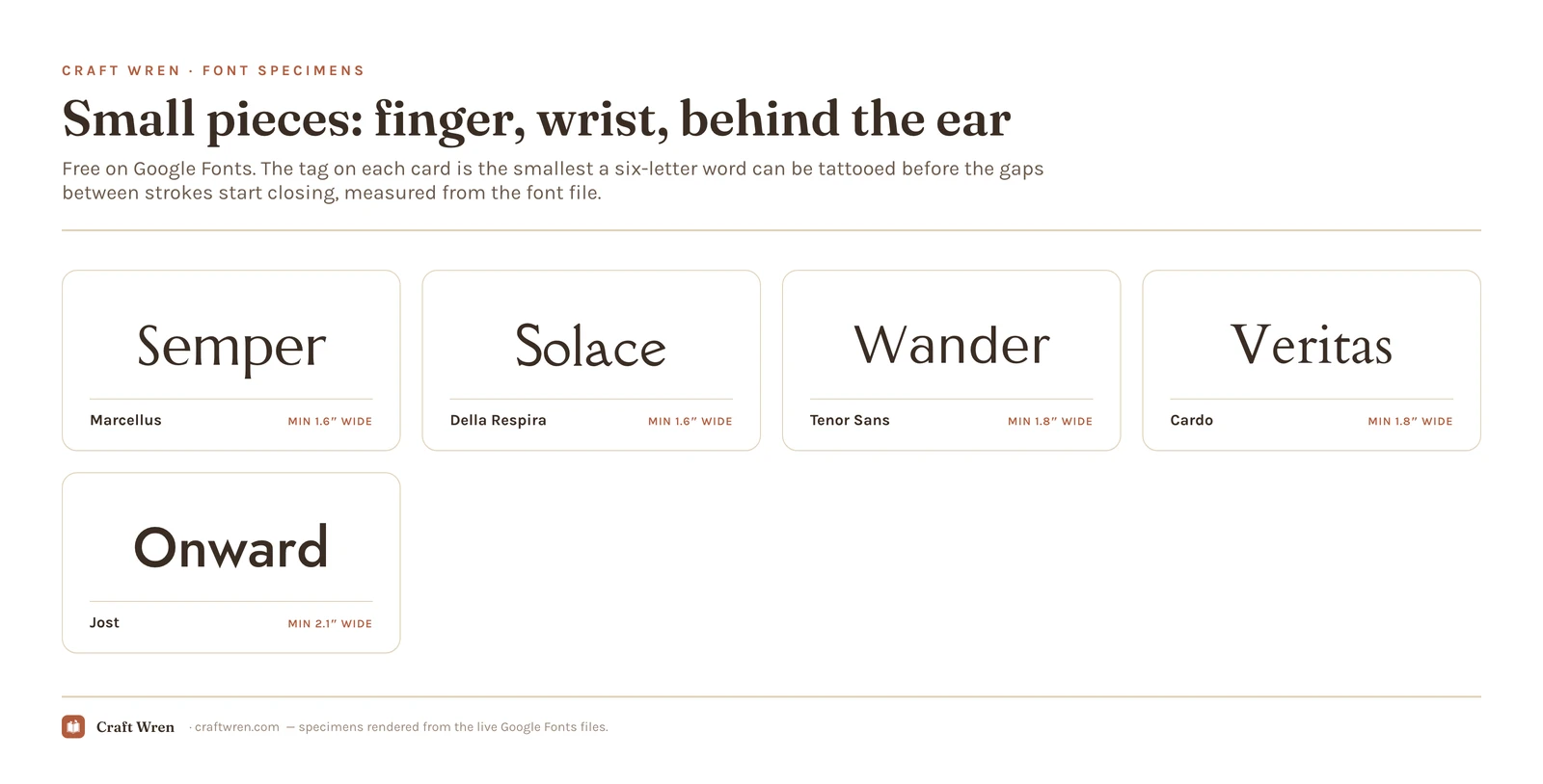
Small pieces: fingers, wrists, behind the ear
Four of the five smallest numbers in the table are in this group. Open letterforms, no hairlines to lose, and enough air inside the a and the e that a decade of spread does not fill them in. Start here if the tattoo has to live under a watch strap.
Marcellus. Roman capitals with the feel of something chiseled into stone. Set a date or one word in caps and it stays readable at a size where most faces have stopped being letters.
Della Respira. Tied with Marcellus for the smallest footprint here, softer and more bookish in the letterforms. Behind the ear, where the skin curves and width is the thing you do not have, this is the one.
Tenor Sans. Almost a sans: the serifs are so slight you only notice them close up. Nothing in it hangs on a hairline and the letters sit well apart, which is why coordinates and single initials survive in it.
Cardo. An old-style book serif that reads like a printed page. It keeps its counters open at wrist scale, and if the word is Latin, this is usually the shape it wants.
Jost. Clean geometric sans, nothing decorative anywhere in it. This is the minimalist one-word tattoo people screenshot off Pinterest, and it is also the roomiest face in this group at 2.1 inches, which surprises everyone who assumes simple means small.
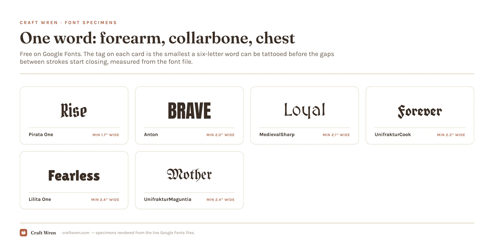
One word: forearms, collarbones, chest
Heavy faces meant to be read across a room, and the address of everything gothic. All six carry one word better than a sentence.
UnifrakturMaguntia. The alphabet on the back of every varsity jacket and in half the portfolios in any shop. Its capitals are decorated to the point of illegibility, so the usual move is one capital and the rest lowercase. At 2.4 inches for six letters it asks for less room than any script in this post.
UnifrakturCook. Same alphabet, drawn tighter and blacker. The difference you feel on an arm is width: the same six letters run a little shorter at the safe size, which decides things when the space is a collarbone.
Pirata One. Blackletter with the lace stripped out. One weight, no doubled hairlines, letters wide enough for a stranger to read across a bar. It measures 1.7 inches, third smallest in the whole list, and it is the only gothic here a wrist can take.
MedievalSharp. Angular and hand-cut, shapes that came off a chisel instead of a quill. Less biker bar, more scriptorium. Latin words and single names suit it.
Anton. Condensed and extremely heavy, without one decorative move in it. A word of Anton across a collarbone is the closest a font gets to tattoo-proof, and it eats less width than anything else this bold.
Lilita One. Anton with the corners rounded off and a little air let back in. For a word that should read strong without reading like a warning sign.
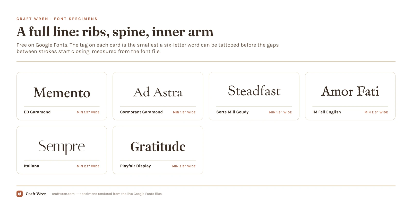
A full line: ribs, spine, inner arm quotes
A quote is a different problem from a word. Every letter has to hold at a small size, because the line has to fit on a body, and the shapes have to stay even where the surface curves.
EB Garamond. If the tattoo is a sentence, start here. It is the face in this group that stays a sentence when the letters go small, instead of turning into texture, which is what a rib quote does to type.
Cormorant Garamond. The pretty one, and the one that leans hardest on your artist. Its thin strokes are what make it look expensive, and they are also the first thing a heavy hand thickens into something ordinary.
Sorts Mill Goudy. Letterforms with a wobble in them, like metal type printed on paper that soaked up a little ink. Warm on skin, and easier on a long quote than a sharper Garamond.
IM Fell English. Type from a seventeenth-century press, roughness and all. For scripture, Latin, or anything that should look printed long before you were born.
Italiana. Wide, high in contrast, and quiet. One centered line under a collarbone is its job. Shrink it and the elegance goes, because the thin strokes were carrying all of it.
Playfair Display. The thick and thin in it sit further apart than anything else in this group, and a curved rib cage exaggerates that gap. Stunning across a flat inner arm, uneven where the body bends.
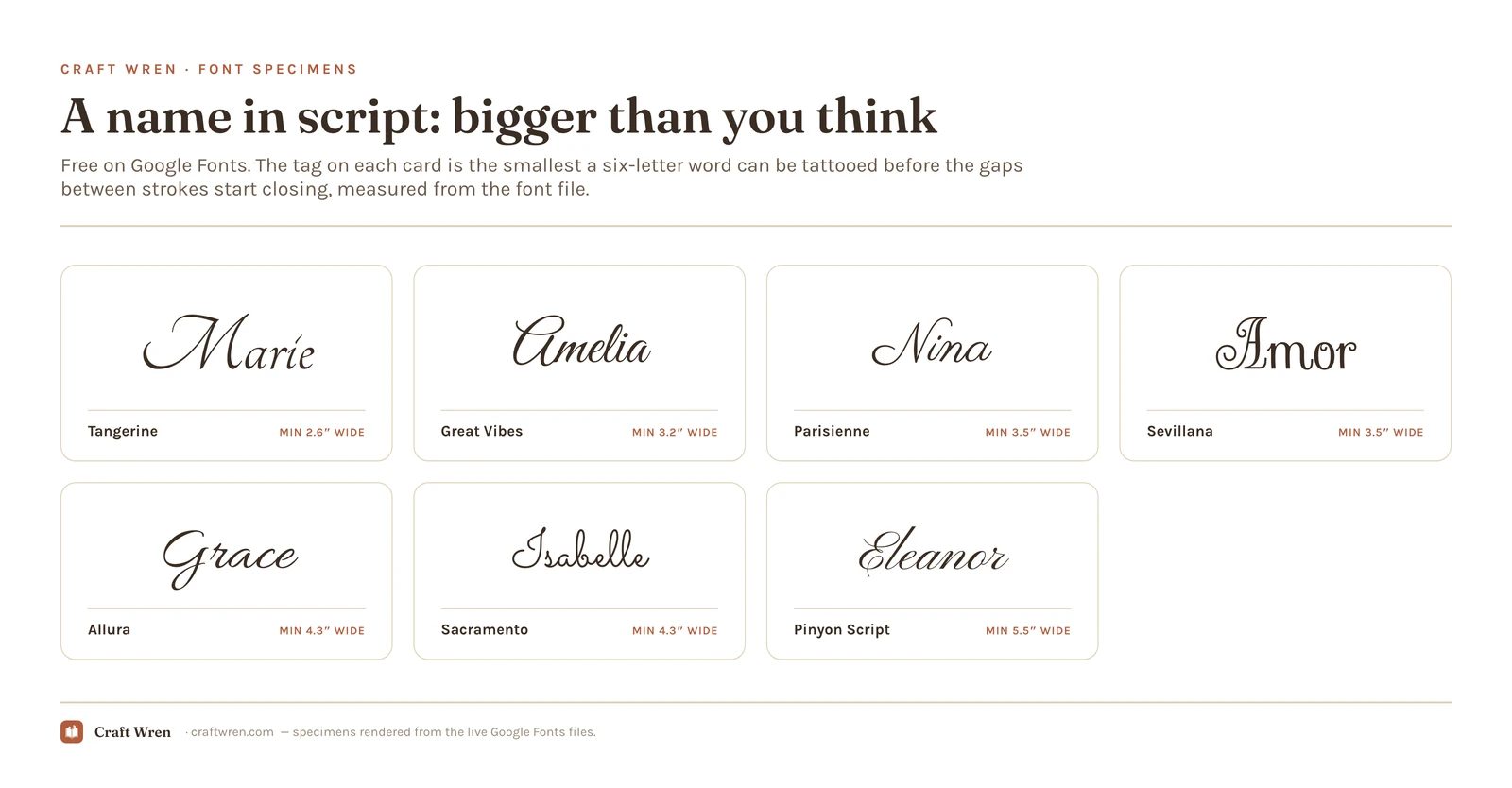
A name in script: bigger than you think
The most requested lettering in any shop, and the most expensive in skin. Every face here needs real width, and every one loses its joins first as it ages. Small placement plus script name is a fight from the start.
Sacramento. The signature script from a thousand logos, and the one hand here with no thin spots at all: the stroke never changes width. That evenness is why it ages better than the fancier scripts, even at 4.3 inches, which is wide for a name.
Great Vibes. The formal wedding hand, and the cheapest of these in skin once the tattoo is a whole name: 3.2 inches for six letters, more than an inch under Sacramento. Its swashes travel sideways, so the room it needs is horizontal.
Parisienne. Casual where the others are ceremonial, with letters sitting at slightly different heights the way handwriting does. Suits a nickname, or a word somebody says out loud.
Tangerine. Almost nothing to it except the capitals, which are enormous and full of swash. Use it the way it was drawn: one initial.
Sevillana. Ornate and Spanish flavored, with flourishes that curl back over the letters they belong to. Those crossings close up first, so it wants generous size and an artist willing to open them by hand.
Allura. Swashes that thin out to almost nothing at the tips, which is precisely the part that softens with age. It wants 4.3 inches, and an artist happy to leave those tails fine.
Pinyon Script. The engraved-invitation hand, and the most demanding face in the post: 5.5 inches before its loops stop closing on themselves. Lovely down a forearm. A gray haze on a wrist.
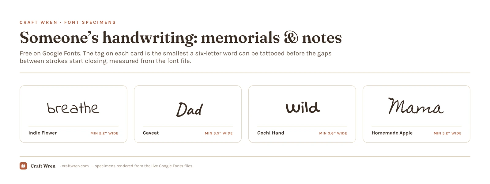
In someone’s handwriting: memorials and notes
For when the tattoo should look like a person wrote it. All four need width, because handwriting is made of thin joins, and that is also the argument for tracing a real note instead if you have one.
Caveat. Slanted, quick, and the most believable of the four. Nobody looks at it and asks which font it is.
Indie Flower. Print, not cursive, with round letters and a light bounce along the line. It holds at 2.2 inches, the smallest number in this group, so a short phrase fits on a forearm.
Gochi Hand. Marker-thick and wobbly, like something scrawled fast on the back of a receipt. Of the four it is the one that reads blunt.
Homemade Apple. Full looping cursive with a real hand’s unevenness, and the widest of the four at 5.2 inches for six letters. Worth the room when the piece should look like a letter somebody wrote you.
Paid tattoo fonts for the shapes free ones do not cover
Everything above is free and holds its size. What free type does not give you is the shop-specific stuff: gothic that ships with the alternate capitals it needs, script drawn with the joins already open, blackletter that reads hand-lettered instead of typeset. That lives on the paid shelves.
Fifteen worth looking at, sorted the way the list above is sorted: heavy faces first, script after. Links go to Creative Fabrica and pay us a commission, at no extra cost to you.
Those four are the classic end of the shelf. The rest get louder:
That is the heavy half. The script half, where size discipline stops being optional:
None of these fixes a font that is too fine for the placement you want. Print at 100 percent, tape it on, live with it for a week, same as with the free ones.
Where to find more free tattoo fonts
Free and commercially licensed covers most lettering. Not all of it. When it does not, one marketplace is worth the trip, and one line of small print is worth reading before you go.
Paid shelves carry the tattoo-specific lettering: blackletter cut for skin instead of band posters, alphabets that ship with the alternate capitals gothic really needs, script faces drawn with the joins already open. Creative Fabrica has more of it than anywhere else, and a free account still comes with a few downloads a month, enough to print one at 100 percent and tape it to an arm before money moves. Six worth a slot right now:
Black English is the most downloaded blackletter there this season, and the closest to traditional tattoo Old English.
Kingsbridge is a cleaner, more modern gothic, easier to read at arm’s length than the traditional cuts.
Gothic Old English is the plain-spoken classic, and the cheapest way to get the textbook shape.
Blazing Hollow covers the other side of the shop: a script with enough weight in the strokes to survive being tattooed small.
The full font library sorts by style if you would rather browse than take somebody’s word for it. Aggregator sites like dafont are the other road, and the one where that small print stops being theoretical.
The small print matters most on the artist’s side of the chair. Getting tattooed from a font is one thing, since the letters get redrawn by hand and the font was a reference. Drawing flash to sell from that font is another, and plenty of free downloads carry a personal use only line that makes it a bad idea. The two words live in the text file that came with the download, so read them before money is involved. Nothing in the 28 above carries that restriction. If you want the license side explained properly, that lives in our Canva fonts guide.
Pick one, not twenty-eight
Twenty-eight downloads and a font menu scrolled at midnight is how a tattoo idea sits untouched for another six months. The decision is smaller than the list makes it look, and it runs in a fixed order: size, then group, then one font, printed at 100 percent and worn on paper for a week.
Shorter still, if you want it handed to you: Marcellus for something small, Pirata One for a gothic word, EB Garamond for a quote, Great Vibes for a name.
If you would rather mock the word up on an iPad before the appointment, our free Procreate fonts guide covers installing these same files on a tablet, and the aesthetic fonts guide sorts type by mood if you are still deciding what the piece should feel like.
Frequently asked questions about tattoo fonts
What is the best tattoo font?
It is a size question before it is a taste question. For small placements, the open Roman faces go smallest: Marcellus and Della Respira both hold a six-letter word at 1.6 inches. For one word on a forearm, Pirata One is the most readable gothic here and Anton the most bulletproof. For a name in script, Great Vibes needs the least room and Sacramento ages the most predictably.
Are these tattoo fonts free to use?
Yes. All 28 are Google Fonts, released under open licenses that allow commercial use, which is the part that matters if you draw flash for a living. Novelty font sites are where free gets slippery.
How small can a lettering tattoo be?
Smaller than most fonts will let you go, which is the constraint people miss. Measured from the font files, the most open faces here hold a six-letter word at 1.6 inches of width. Most of the scripts want double that or more, and Pinyon Script wants 5.5 inches. Placement moves the answer again, so ask your artist about the spot as well as the size.
Why do lettering tattoos blur over time?
Because ink spreads slowly in the skin and the gaps between strokes lose the race. The line itself survives, a little thicker and softer than it started, but the sliver of clear skin inside an e or between two blackletter stems keeps shrinking until it is gone. Which is why a bigger version of the same font fixes more pieces than a different font does.
Can I bring a font to my tattoo artist?
Bring it, and bring the measurement with it. Send the font file or a high-resolution image, say how wide you want the finished piece, and expect the letters to get redrawn instead of traced: stems thickened, joins opened. A font is a starting point, and any artist worth booking treats it as one.
The short version
Lettering tattoos rarely fail on the font. They fail on the size the font was asked to work at, and skin does not give the gaps back.
So the name on the inside of that wrist was never impossible. It wanted Great Vibes at three inches instead of copperplate at one, a week taped to the arm on paper, and an artist who heard the width before the shape.
Get free junk journal printables
New printables, page ideas, and paper craft tutorials, straight to your inbox.
This post contains affiliate links. We may earn a commission when you download a freebie or buy a subscription on Creative Fabrica, at no extra cost to you. Picture the poster: a 70s-themed birthday, a disco playlist cover, a tote with one big word in mustard and brown. Fat bubbly letters, a little wonky, the…
This post contains affiliate links. We may earn a commission when you download a freebie or buy a subscription on Creative Fabrica, at no extra cost to you. Three calm words, that is the whole print. “Let love grow,” maybe, for a bedroom wall, or the signage for a wedding buried in pampas grass and…
Manage Consent
To provide the best experiences, we use technologies like cookies to store and/or access device information. Consenting to these technologies will allow us to process data such as browsing behavior or unique IDs on this site. Not consenting or withdrawing consent, may adversely affect certain features and functions.
Functional
Always active
The technical storage or access is strictly necessary for the legitimate purpose of enabling the use of a specific service explicitly requested by the subscriber or user, or for the sole purpose of carrying out the transmission of a communication over an electronic communications network.
Preferences
The technical storage or access is necessary for the legitimate purpose of storing preferences that are not requested by the subscriber or user.
Statistics
The technical storage or access that is used exclusively for statistical purposes.The technical storage or access that is used exclusively for anonymous statistical purposes. Without a subpoena, voluntary compliance on the part of your Internet Service Provider, or additional records from a third party, information stored or retrieved for this purpose alone cannot usually be used to identify you.
Marketing
The technical storage or access is required to create user profiles to send advertising, or to track the user on a website or across several websites for similar marketing purposes.