This post contains affiliate links. We may earn a commission when you download a freebie or buy a subscription on Creative Fabrica, at no extra cost to you.
You are making the invitation. A garden party, a bridal shower, the kind of thing that wants pressed flowers in the corners and lettering that curls like a vine. You picture it: romantic, a little vintage, soft around the edges. Then you set the names in whatever font was loaded and it reads like a memo with a flower clip-art stapled to the top. The botanicals are there. The letters never got the message.
Floral fonts are the ones that grow. Curling swashes, vine-like tails, sometimes actual blooms tucked into the capitals, the typefaces that look like they belong on a seed packet from 1910. Get one right and a plain page reads as a garden before you draw a single petal.
Floral fonts are decorative typefaces with curling swashes, botanical flourishes, and sometimes flowers built into the letters. They suit wedding invitations, journaling spreads, and monograms, and they work best on a few words rather than a paragraph.
Which one is right comes down to the project, so the fonts below are grouped by what you are making.
Smallest print size is measured from each font file: the letter height at which the thinnest part of the stroke drops to 0.25 mm, which is roughly where home printing starts losing the line. Screens forgive more, vinyl forgives less.
Font
Sub-style
What it gives you
Smallest print size
EB Garamond
Journaling
Warm, readable serif body
5.0 mm
Playfair Display
Journaling
Refined serif with heading drama
8.5 mm
Allura
Invitations
Wedding-standard script that holds up smaller
8.5 mm
Cormorant Garamond
Journaling
Delicate serif like botanical print
10.0 mm
Tangerine
Invitations
Lighter, old-fashioned, refined serif
11.9 mm
Great Vibes
Invitations
The same wedding look, wants more height
12.0 mm
Imperial Script
Invitations
Formal flourish, maximum romance
20.0 mm
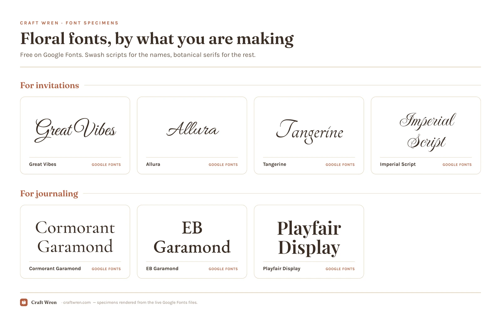
For invitations and cards
The big romantic scripts belong here: long, looping letters with dramatic tails that sweep under the next word. They turn a name into the centerpiece of a card.
Great Vibes and Allura, free on Google Fonts, are the wedding-invitation standards, flowing and elegant without a download. Tangerine is lighter and more old-fashioned, and Imperial Script piles on the formal flourish if you want maximum romance. Use them on the names and the headline, never the fine print.
For journaling and longer text
A pressed-flower spread or a recipe card needs words you can actually read, so the heavy scripts step aside for a soft botanical serif. These keep the romance but stay legible down a whole paragraph.
Cormorant Garamond leads here, a delicate high-contrast serif that feels like an old botanical print. EB Garamond is the warmer, more readable cousin for real body text, and Playfair Display brings a little more drama to a subhead. All three are free on Google Fonts and pair beautifully with a swash script up top.
For monograms and logos
A single ornate initial, wreathed in leaves or built from flowers, is the floral font at its most decorative. This is the look for a wax-seal-style monogram, a shop logo, or the cover of a keepsake book.
The truly illustrated styles, the ones where the letters are made of blossoms, mostly live on Creative Fabrica rather than the free libraries, since they take real illustration to build. You can download some on the free plan to test before you commit. For a simpler floral monogram, a high-contrast script capital like the ones in Imperial Script does the job with nothing extra.
Match the font to your style of flowers
Floral fonts are not all the same flavor of romantic, and the real trick is matching the lettering to the flowers around it. If your project leans vintage, think pressed blooms, sepia botanical prints, antique seed packets, reach for the older, more ornate scripts like Imperial Script and Tangerine. They have serious flourish and they sit naturally beside a faded rose.
If your style is modern, all clean line-art florals and minimalist single-stem illustrations, those heavy swashes will fight the artwork instead of framing it. Pull back to a simpler script like Great Vibes, or even a plain botanical serif, and let the illustration carry the decoration. A delicate line drawing of a wildflower next to a curl-heavy Victorian font is two eras arguing on one page. Pick a lane, vintage or modern, and let the font and the flowers agree on which one it is.
The trouble with printing them small
Floral fonts have a specific failure mode, and it only shows up after you print. All those swashes and tiny botanical details that look gorgeous on screen turn into a smudgy blob at small sizes or on a home printer, where the thin strokes either vanish or bleed together into a hedge.
The fixes are simple. Keep ornate floral fonts large, on titles and names, not on the date or the address. Print a test page before you commit to a full run, because a screen at 100 percent lies about how thin strokes hold up on paper. And if a line has to be small and readable, set it in the plain serif, not the swash script. A blurred, illegible address on a printed invitation is how the RSVPs quietly go missing.
Where to download floral fonts free
Where to look, best bet first:
Google Fonts has the swash scripts and botanical serifs above, free for personal and commercial use, no download needed in Canva or Docs. It covers most floral projects on its own.
Creative Fabrica is the home of the illustrated styles, the letters wrapped in leaves and flowers, and the free plan lets you grab a few without paying.
dafont has a calligraphy-and-floral section worth a dig, with the standing rule: check the license, since many are personal-use only.
One thing to settle before a design goes up for sale: personal-use fonts cannot legally ride on a product, however free the download felt. The Google Fonts picks here are all fine to sell with, so a paid invitation suite is safe. Full licensing notes live in the aesthetic fonts guide.
How to use a floral font
Give the page one swash script, one calm serif, and room to breathe, the way a good arrangement leaves space between the blooms. Set the names or the title in the swash font, keep the readable details in a botanical serif, and resist the urge to fill every corner with curls. The flourish reads as special only when the rest of the page stays quiet.
For a softer, more modern romance without the botanical drama, the coquette fonts guide leans on finer, simpler scripts. Reach for floral when you specifically want vintage and garden-grown, not just delicate.
Frequently asked questions about floral fonts
What font has flowers in it?
The letters-made-of-flowers styles are mostly illustrated fonts you will find on Creative Fabrica, since they take real artwork to build. For the floral feeling without literal blooms, swash scripts like Great Vibes and Allura on Google Fonts give you the curling, vine-like look for free.
Are floral fonts free?
The essential ones, yes. Google Fonts has Great Vibes, Allura, Tangerine, Cormorant Garamond, and more free for personal and commercial use. The illustrated floral fonts with flowers in the letters usually live on Creative Fabrica and dafont, where many are free for personal use only.
What is the best floral font for a wedding invitation?
Pair a flowing swash script like Great Vibes or Allura for the names with a clean botanical serif like Cormorant Garamond for the details people have to read. That combination gives you romance on the headline and legibility on the date and address.
Why do my floral fonts look blurry when I print them?
The thin swashes and tiny botanical details that look crisp on screen bleed together or disappear at small print sizes and lower printer resolution. Keep ornate floral fonts large, print a test page first, and use a plain serif for any small text.
Can I use floral fonts in Canva?
Yes. The Google Fonts here, like Great Vibes, Allura, and Cormorant Garamond, are in Canva’s font menu with no download. For an illustrated floral font from Creative Fabrica, you can upload it to Canva on a Pro plan.
Get free junk journal printables
New printables, page ideas, and paper craft tutorials, straight to your inbox.
This post contains affiliate links. We may earn a commission when you download a freebie or buy a subscription on Creative Fabrica, at no extra cost to you. Three calm words, that is the whole print. “Let love grow,” maybe, for a bedroom wall, or the signage for a wedding buried in pampas grass and…
This post contains affiliate links. We may earn a commission when you download a freebie or buy a subscription on Creative Fabrica, at no extra cost to you. The font looked perfect on the canvas. Delicate script, gorgeous swashes, exactly right for the twelve gift tags you promised your sister. Then the mat comes out…
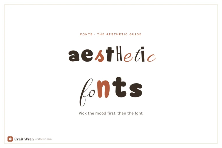
The prettiest aesthetic fonts sorted by vibe: y2k, coquette, cottagecore, floral and more, plus where to download them free and how to use them in your projects.
30 free Procreate fonts you can install today, grouped by style, plus the exact steps to add fonts to Procreate on iPad.
Manage Consent
To provide the best experiences, we use technologies like cookies to store and/or access device information. Consenting to these technologies will allow us to process data such as browsing behavior or unique IDs on this site. Not consenting or withdrawing consent, may adversely affect certain features and functions.
Functional
Always active
The technical storage or access is strictly necessary for the legitimate purpose of enabling the use of a specific service explicitly requested by the subscriber or user, or for the sole purpose of carrying out the transmission of a communication over an electronic communications network.
Preferences
The technical storage or access is necessary for the legitimate purpose of storing preferences that are not requested by the subscriber or user.
Statistics
The technical storage or access that is used exclusively for statistical purposes.The technical storage or access that is used exclusively for anonymous statistical purposes. Without a subpoena, voluntary compliance on the part of your Internet Service Provider, or additional records from a third party, information stored or retrieved for this purpose alone cannot usually be used to identify you.
Marketing
The technical storage or access is required to create user profiles to send advertising, or to track the user on a website or across several websites for similar marketing purposes.


")
")

")