Cursive and Script Fonts in Canva: Elegant, Readable Picks
A cursive font is the one that betrays you in the preview. It looks stunning in the little font-menu sample, all loops and flourish, so you set your whole headline in it, and then you read it back and three of the words have melted into each other. The flourish that made it beautiful is the same thing that made it unreadable. Cursive is the most rewarding font category in Canva and the easiest to misuse, and the difference is entirely in how you handle it.
So this is the shortlist of script and cursive fonts that actually work, sorted by the job: the clean readable ones, the formal calligraphy ones, the bold brushy ones, and the few Pro fonts worth the upgrade. Each comes with a note on where it shines and, where it matters, whether it is free or Pro.
The short version: The best cursive fonts in Canva balance beauty and readability. For clean, legible script, try Sacramento, Nickainley, or Howell. For formal calligraphy, Great Vibes and Parisienne are the wedding-invitation standards. Keep cursive to short phrases, never all caps, and size it up. Most are free; a few elegant ones like La Luxes Script sit behind Canva Pro.
The one rule that saves every cursive font
Before the names, the rule that matters more than which font you pick: cursive is for short bursts, not paragraphs.
Script fonts are designed to imitate joined handwriting, which is graceful in a name or a phrase and exhausting in a sentence. The longer the run of cursive text, the harder the reader works, until they stop. So the working approach is simple. Use cursive for the word or short line you want to feel special, the name, the “thank you,” the headline of three words, and set everything else in a clean, plain font. Never put cursive in all capitals; the joins were never built for it and the letters fall apart. And give it room: cursive needs a larger size than a sans-serif to stay legible.
Follow that one rule and almost any script font below will look intentional. Ignore it and even the prettiest one turns to mush.
Clean, readable cursive fonts
Start here if you want cursive that people can actually read at a glance. These keep their loops controlled, so they stay legible on signage, social graphics, and labels where clarity matters as much as charm.
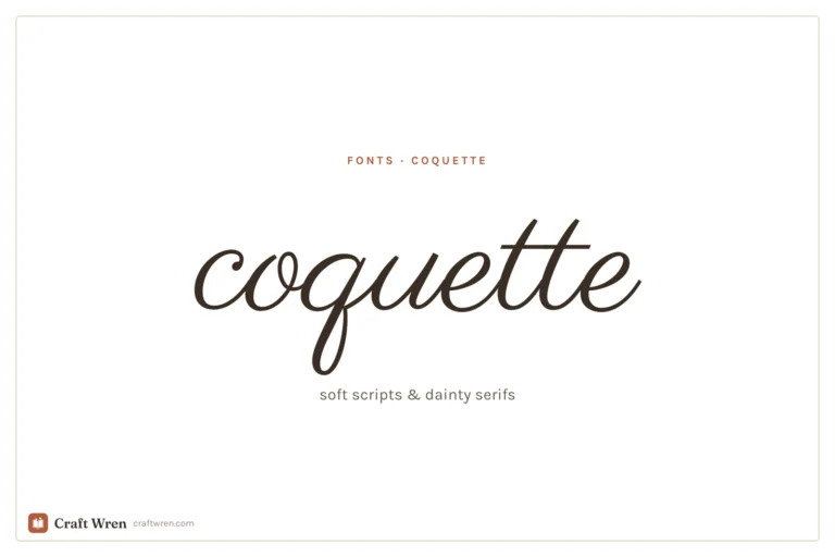
- Sacramento. Light, single-weight, and casual, with just enough flow to feel handwritten and not an ounce more. One of the most readable scripts in Canva, ideal for a soft accent word or a friendly header.
- Nickainley. A classic, slightly vintage script with a steady, even hand. Reads beautifully at headline size and brings a timeless feel without the fragility of formal calligraphy.
- Howell. A balanced, gently bouncy cursive that stays easy to read on signs, labels, and social graphics. A good middle ground when you want personality and legibility in equal measure.
- Amsterdam. A popular flowing script that comes in several variations (One through Four), so you can dial the flourish up or down. Versatile and friendly for a wide range of designs.
If clarity is your priority, Sacramento or Nickainley will rarely let you down.
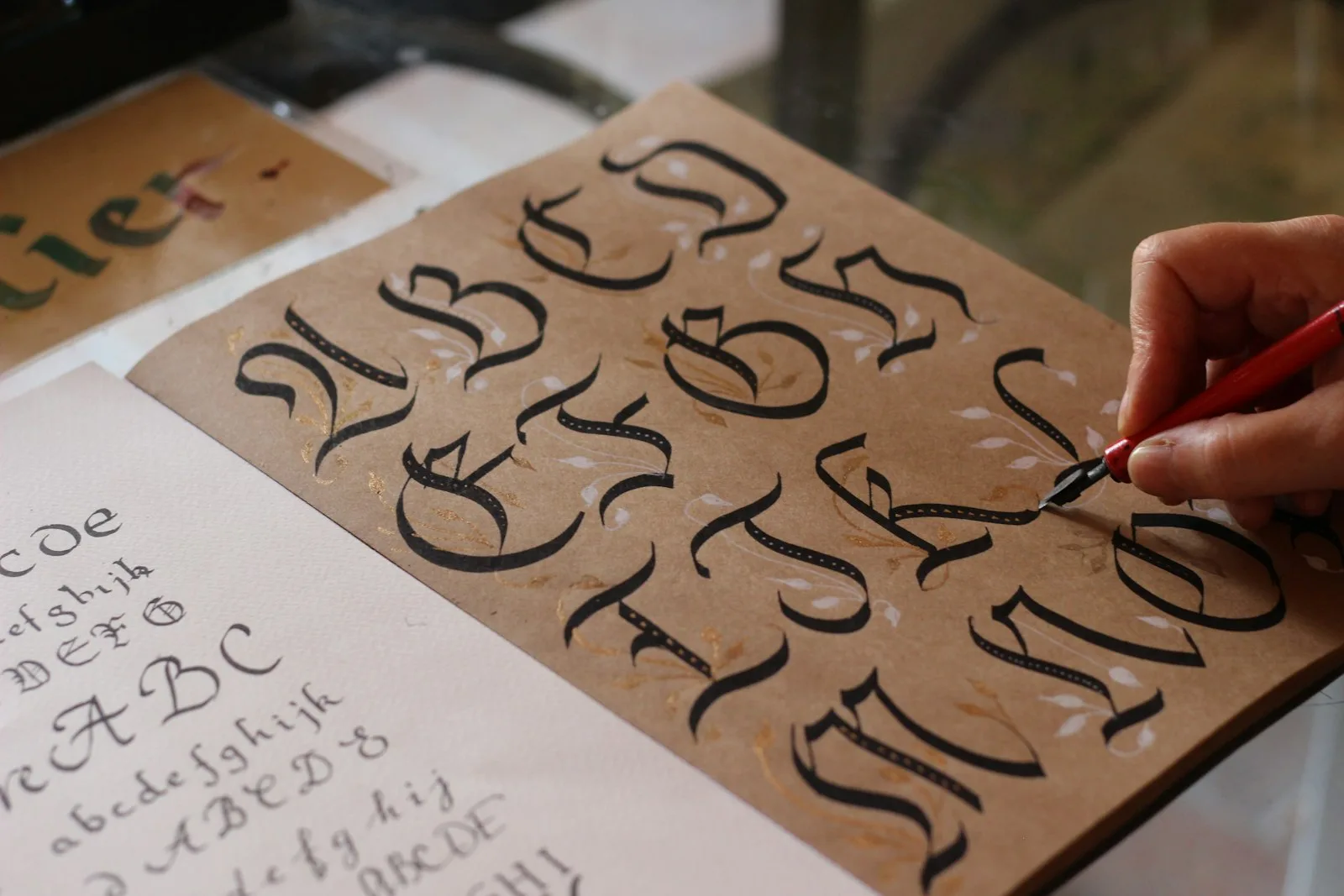
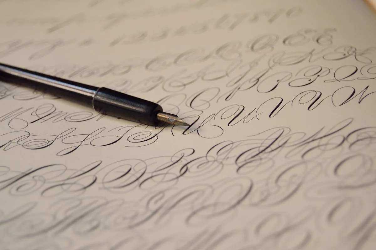
Elegant calligraphy fonts for formal designs
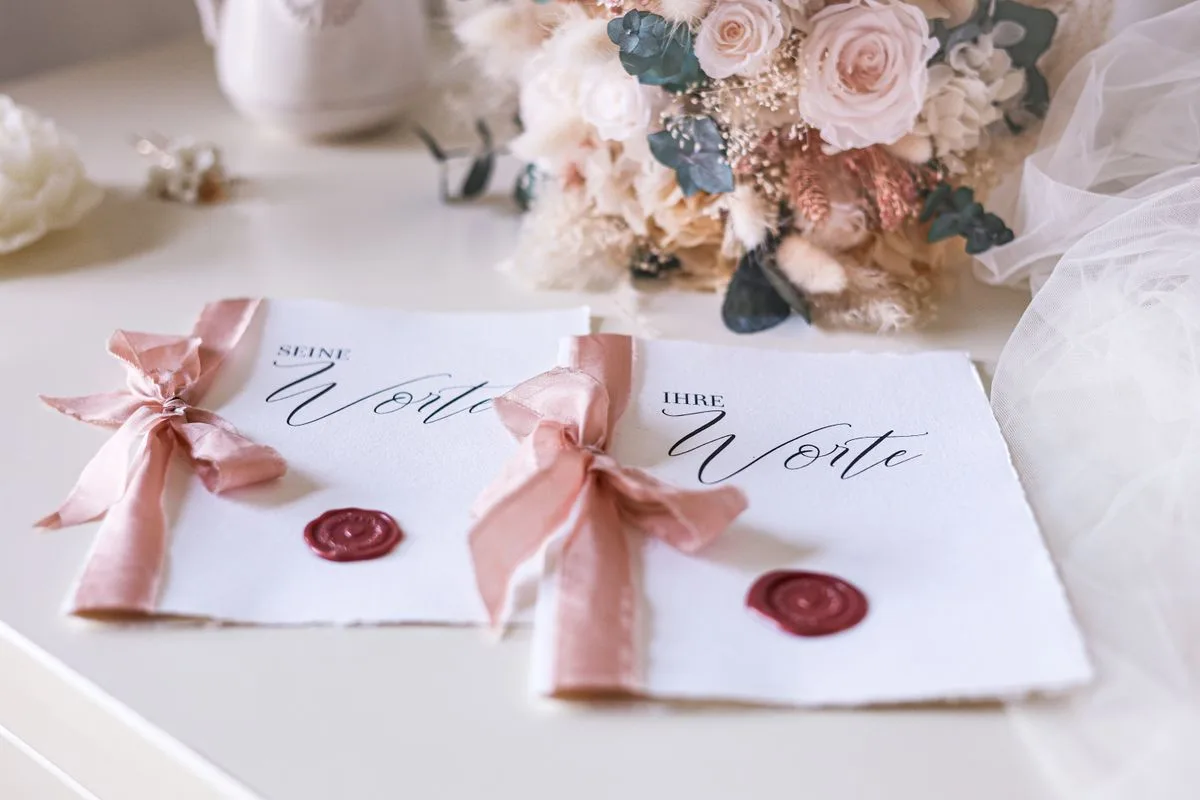
This is cursive at its most dressed-up: flowing, ornate, and made for an occasion. Reach for these on wedding invitations, luxury branding, and anything that should feel like an event. They trade a little readability for a lot of elegance, so keep them short.
- Great Vibes. The classic elegant calligraphy font, with graceful balanced loops that read as celebratory and refined. Probably the most-used wedding script in Canva, and a safe, beautiful default for formal designs.
- Parisienne. Romantic and a touch nostalgic, with a delicate hand that suits invitations, monograms, and soft feminine branding.
- Pinyon Script. Formal copperplate-style calligraphy with fine hairlines and dramatic flourishes. Stunning at large sizes for a single elegant phrase, too delicate for anything small.
- Anastasia Script. A graceful, modern calligraphy font with flowing connected letters, lovely for quote graphics and high-end stationery.
These are gorgeous and fragile. Use them big, use them briefly, and pair them with something plain so the elegance has a quiet backdrop.
Bold and brush script fonts
Not all script is delicate. This group is thicker, brushier, and more confident, the lettering of a hand-painted sign or a modern logo. Great when you want personality with some weight behind it.
- Dancing Script. Bouncy, warm, and genuinely hand-drawn looking, with more body than the delicate scripts. Friendly and casual for invitations and celebratory headers.
- Vintage Goods. Weathered, quill-style strokes with old-world charm, perfect for rustic branding, farmhouse designs, and vintage-inspired labels.
- Jonathan. A clean brush script that pairs flow with readable weight, a reliable pick for quote graphics and modern signage.
Bold scripts hold up better at smaller sizes than the fine calligraphy fonts, though the same short-and-roomy rule still applies.
Worth the upgrade: Canva Pro cursive fonts
A few of the most beautiful scripts sit behind Canva Pro, marked with a crown in the menu. If you have Pro, these are worth knowing.
- La Luxes Script. A luxe, high-fashion calligraphy font with elegant thin-to-thick contrast. Beautiful for premium branding and upscale invitations.
- Emitha. Graceful and modern, with thin flowing lines and a slightly organic, hand-drawn feel that reads expensive and current at once.
- Snell Roundhand. A formal classic with refined, even loops, the kind of script that looks engraved.
- Brittany Signature. A modern signature-style script that looks like elegant real handwriting, a perennial favorite for brand names and that one flourished word layered over a photo.
Canva does move fonts between free and Pro now and then, so the crown is the thing to trust, not any list. If one of these is not in your menu, search for the closest free match above; you can usually get within a hair of the same look for nothing.
How to pair a cursive font
A script font almost never works alone. The contrast that makes it sing comes from setting it against something plain: a flowing Great Vibes headline over clean Montserrat body text, or a Sacramento name beside a simple Lora serif. The script carries the personality; the plain font does the reading.
Our guide to Canva font pairings shows more combinations that actually work, and our best Canva fonts shortlist has the calm, neutral partners to reach for. If the script you want is more sweet and playful than elegant, the bubbly rounded kind, our roundup of cute Canva fonts lives in that lane.
Frequently asked questions about Canva cursive fonts
What is the best cursive font in Canva?
It depends on whether you want readable or formal. For clean, legible script, Sacramento and Nickainley are hard to beat. For elegant wedding-style calligraphy, Great Vibes and Parisienne are the standards. Match the font to the formality of the project rather than hunting for one font that does everything.
What is a clean, readable cursive font in Canva?
Sacramento, Nickainley, and Howell are the readable scripts to start with. They keep their loops controlled, so they stay legible at a glance on social graphics, labels, and signage, where ornate calligraphy fonts would blur together. Keep them at a generous size for the best clarity.
Are Canva cursive fonts free?
Many are. Sacramento, Nickainley, Great Vibes, Parisienne, and Dancing Script are all typically free, while the luxe options like La Luxes Script, Snell Roundhand, and Brittany Signature need Canva Pro. The crown badge next to a font in the menu tells you which is which at a glance.
Why does my cursive font look hard to read?
Almost always one of three reasons: the text is too long, it is set in all capitals, or it is too small. Cursive fonts are built for short phrases in mixed case at a generous size. Shorten the line, switch off all caps, and size it up, and a script that looked like mush turns elegant.
How do I find script fonts in Canva?
Use the font menu search box with words like “script,” “cursive,” “calligraphy,” “handwritten,” or “signature.” That narrows the library to the scripts fast. From there, compare a few at headline size with your actual words, since a font’s sample text rarely matches how your phrase will look.
Beautiful and readable, not one or the other
Cursive does not have to be a gamble. Decide whether you need clarity or ceremony, pick from the matching group above, and then respect the one rule: short lines, mixed case, generous size, a plain font alongside. Do that and Sacramento stays crisp, Great Vibes stays elegant, and nothing melts into a beautiful blur.
When you are ready to pair your script with a plain partner, our best Canva fonts guide and font pairings post have the matches waiting.


")