You opened Canva to make one quick graphic, clicked the font dropdown, and then lost ten minutes. The list just keeps going. Hundreds of names, half of them you have never heard of, all previewed in the same three words, and somewhere in there is the one that would make your design look finished instead of fine. So you scroll, second-guess, and end up back on the default because at least the default is safe. That scroll is what this guide fixes.
You do not need hundreds of fonts. You need maybe a dozen good ones you trust, sorted by the job they do, so the next time you open that dropdown you are choosing on purpose instead of fishing. This is that shortlist: the Canva fonts worth knowing, grouped by type, with a plain note on when to reach for each.
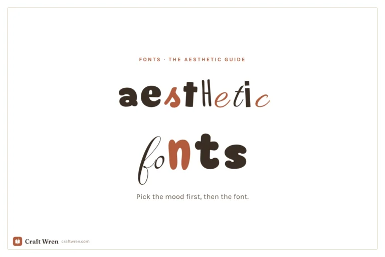
The short version: The best Canva fonts are the ones that match your project’s mood and stay readable at the size you need. For most designs, pick one characterful font for headlines and one clean font for body text, and stop there. Serifs like Playfair Display and Lora read elegant; sans-serifs like Montserrat and Poppins read modern; display fonts like Anton make a statement; scripts like Sacramento and Dancing Script add a personal hand. Nearly all of these are free. Choose by mood, not by scrolling.
Before the lists, the one habit that saves you from the endless scroll: stop hunting for the single perfect font and start asking what the font has to do.
A font has a tone of voice. A wedding invitation and a gym flyer cannot use the same one. The letters themselves carry a mood before anyone reads the words. So the useful question is never “what is the best font,” it is “the best font for this.” A headline that needs to grab a thumb in a feed wants weight and confidence. Body text wants to disappear so the reading is easy. A signature flourish on a quote graphic wants personality you would never inflict on a paragraph.
That is also why Canva’s search box is your real shortcut. Type a feeling or a use into it, “script,” “vintage,” “bold,” “handwritten,” and the library narrows to a working set you can actually compare. The categories below are the same map, with the names already filled in.
One more thing worth saying plainly. Most of the fonts here are free to every Canva account. A handful sit behind Canva Pro, and Canva does quietly reshuffle its library now and then, moving a font behind Pro or renaming it. So treat every name as a starting point: if you cannot find one, search the closest match, and you will almost always land somewhere just as good.
Best serif fonts in Canva
Serifs are the fonts with little feet on the letters, and they read as classic, trustworthy, and a touch formal. Reach for them when you want a design to feel established rather than trendy: editorial layouts, wedding suites, book-ish covers, anything that should look like it has been around a while.
Playfair Display. The workhorse elegant serif. High contrast between thick and thin strokes gives it a fashion-magazine air, and it shines in large headline sizes. It is probably the most-reached-for “make this look expensive” font in Canva.
Lora. A calmer, more readable serif that holds up beautifully in body text where Playfair would feel fussy. Warm without being old-fashioned. If you need a serif people will read a paragraph of, this is it.
Cormorant Garamond. Thin, refined, and a little dramatic. Gorgeous for short luxe headlines and quote graphics, less suited to small sizes where its delicate strokes start to vanish.
DM Serif Display. A bolder, chunkier serif with real presence. It gives you that classic-magazine weight without the high-fashion fragility of Playfair, so it survives on busy backgrounds and at smaller sizes.
If you only learn one serif, learn Playfair Display for headlines and pair it with a plain sans below it. That single combination carries an astonishing number of polished designs.
Best sans-serif fonts in Canva
Sans-serifs drop the feet. They read clean, modern, and friendly, and they are the safest body-text choice in the library because they stay legible at almost any size. When in doubt for the readable part of a design, you are reaching here.
Montserrat. The default recommendation for a reason. Geometric, neutral, and available in a wide range of weights, so you can use the bold for a header and the light for the text underneath and keep the whole thing in one family.
Poppins. Rounder and a little softer than Montserrat, with perfectly circular o’s that read approachable and current. A favorite for modern brands and anything aimed at a friendly, not-corporate feel.
Raleway. Slightly more elegant and narrow, with a distinctive thin weight that works well for refined headers. It pairs especially nicely under a serif.
Canva Sans. Canva’s own house font, and a genuinely good neutral default. There is nothing wrong with staying here for a quick, clean design; it is the safe blank canvas the rest builds on.
For most people, a Montserrat-or-Poppins body with a characterful headline above it is the entire job. You can build a year of graphics on that pairing alone.
Best display and statement fonts
Display fonts are built to be big. They are too much personality for a paragraph and exactly the right amount for a single bold line. Use them sparingly, at size, for the word you want a viewer to actually stop on.
Anton. Tall, heavy, and impossible to ignore. One word of Anton across the top of a poster does more than a whole sentence in something timid. The go-to for sale graphics, event posters, and punchy social headers.
Bebas Neue. Condensed, all-caps, and clean. It packs a confident headline into a narrow space, which makes it a staple for everything from fitness graphics to minimalist quote posts.
Abril Fatface. A display serif with thick, swooping strokes and a vintage editorial feel. It bridges classic and bold, perfect when you want a statement headline that still reads elegant rather than loud.
The trap with display fonts is using them twice in one design. Pick one, make it the loudest thing on the page, and let everything else stay quiet underneath it.
Best script and handwritten fonts
Scripts add a human hand. They are the fonts that say personal, which is also why they break the moment you ask too much of them. Keep scripts to short phrases, names, and accents, never a full paragraph, and never in all caps.
Sacramento. A light, single-weight script with a casual, friendly flow. Lovely for a signature touch, a “hello” on a header, or a soft accent word in an otherwise clean layout.
Dancing Script. Bouncy and warm, with letters that genuinely look hand-drawn. It carries a relaxed, celebratory mood that suits invitations and greeting graphics.
Pacifico. A warm, surfy brush script with a relaxed retro feel. Friendly and easy to read for a casual header or a single welcoming word.
Great Vibes. Formal calligraphy with graceful loops, the kind you want on a wedding invitation or anything that should feel like an occasion.
Scripts are a deep, fun rabbit hole, and they split into two moods worth their own guides. For the sweet, rounded, playful end, see our roundup of cute Canva fonts. For the elegant flowing calligraphy end, our guide to cursive and script fonts in Canva sorts the prettiest ones by free and Pro.
When the built-in library isn’t enough
Sometimes you have a specific look in your head and the built-in list does not have it, a particular brand font, a themed display face for a holiday design, a typeface a client handed you. Canva Pro lets you upload your own fonts (TrueType, OpenType, or WOFF files) and use them like any built-in one, which quietly unlocks the entire universe of fonts outside Canva.
That is where font marketplaces come in. Sites like Creative Fabrica sell (and give away) thousands of display, script, and hand-lettered fonts you can download and upload straight into Canva Pro, which is how designers get a look that nobody else’s templates have. We walk through the upload step by step, plus how to install themed fonts, in our guide on how to add fonts to Canva.
Two fonts, not five
The fastest way to make a design look amateur is to use too many fonts. The fastest way to make it look designed is restraint: one font for the headline, one for the body, and a third only as a rare accent. The skill is not collecting fonts, it is pairing two that disagree in the right way, a bold display over a quiet sans, a flowing script beside a clean serif.
Getting that contrast right is its own small craft, and we have a whole guide to it in our best Canva font pairings post. If you are building something with a softer, dreamier mood, our aesthetic Canva fonts roundup leans into that look, and it is the set we reach for when we design a digital vision board.
Frequently asked questions about Canva fonts
What are the best fonts in Canva?
It depends on the job, but a reliable shortlist covers every base: Playfair Display and Lora for elegant serifs, Montserrat and Poppins for clean modern sans-serifs, Anton and Bebas Neue for bold display headlines, and Sacramento or Dancing Script for a script accent. Pick one characterful font for headlines and one plain one for body text, and you can design almost anything well.
Are Canva fonts free to use?
The large majority are free to every Canva account, and you can use them commercially in your own designs. A smaller set sits behind Canva Pro, marked with a little crown in the font menu. Canva does occasionally move fonts between free and Pro, so check the menu rather than assuming, and search for the closest match if a specific name has moved.
How many fonts should I use in one design?
Two is the sweet spot: one for headings and one for body text. A third is fine only as a rare accent, like a script for a single flourished word. More than three in one design almost always reads cluttered, no matter how nice each font is on its own.
Can I upload my own fonts to Canva?
Yes, with Canva Pro. It lets you upload TrueType, OpenType, or WOFF font files and use them like any built-in font, which is how you get brand fonts or themed display faces that are not in the default library. Free accounts are limited to Canva’s built-in selection.
What is a good all-purpose font in Canva?
Montserrat is the safest single pick. It is clean, neutral, comes in many weights, and reads well at any size for both headings and body text. Poppins is an equally good rounder, friendlier alternative. Either one will quietly carry a design that needs to look modern and put-together.
Stop scrolling, start choosing
The next time that font list opens, you do not have to fall down it. Decide what the font has to do first, grab the one from the right shelf above, and pair it with something plain. A serif when you want elegance, a sans when you want clarity. A display for the one loud line, a script for the personal touch. That is the whole map.
Keep this handful close and the dropdown stops being a time sink and turns back into what it should be: a quick decision on the way to a finished design. When you want to go deeper, our guides to font pairings, cute fonts, and cursive scripts take it from here.
Want the shortcut version? Our free Canva font cheat sheet pairs these fonts into ready-to-use combinations for headers, body text, and accents, so you can skip the guesswork. Sign up below and we will send it over.
Get free junk journal printables
New printables, page ideas, and paper craft tutorials, straight to your inbox.
This post contains affiliate links. We may earn a commission when you download a freebie or buy a subscription on Creative Fabrica, at no extra cost to you. It starts with your grandmother’s bread, the recipe you finally got right, and a card you want to look like it came out of a flour-dusted cookbook…
This post contains affiliate links. We may earn a commission when you download a freebie or buy a subscription on Creative Fabrica, at no extra cost to you. Three calm words, that is the whole print. “Let love grow,” maybe, for a bedroom wall, or the signage for a wedding buried in pampas grass and…
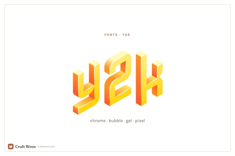
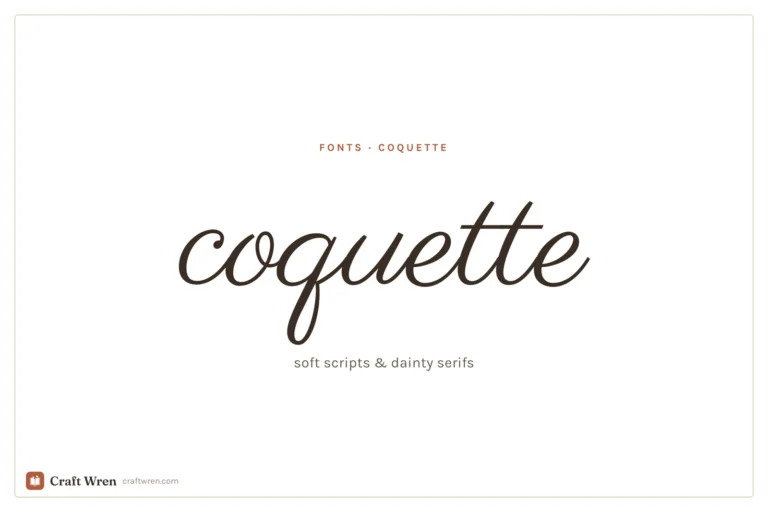
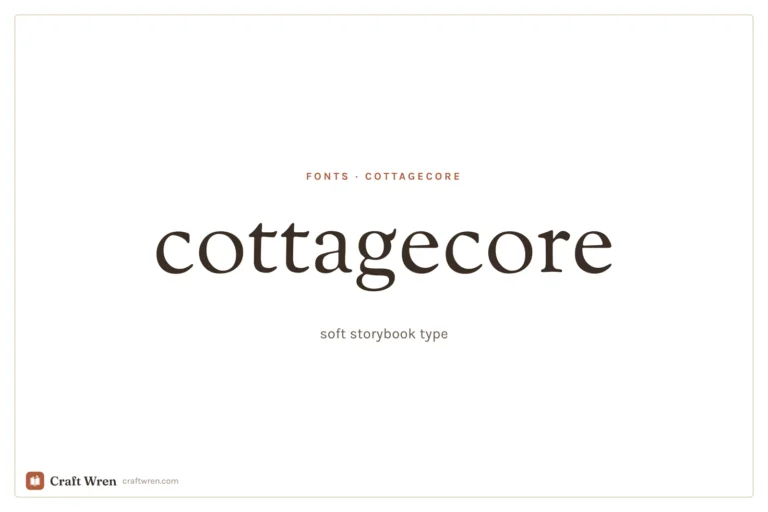
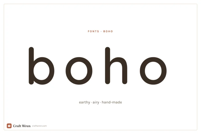
The prettiest aesthetic fonts sorted by vibe: y2k, coquette, cottagecore, floral and more, plus where to download them free and how to use them in your projects.
Manage Consent
To provide the best experiences, we use technologies like cookies to store and/or access device information. Consenting to these technologies will allow us to process data such as browsing behavior or unique IDs on this site. Not consenting or withdrawing consent, may adversely affect certain features and functions.
Functional
Always active
The technical storage or access is strictly necessary for the legitimate purpose of enabling the use of a specific service explicitly requested by the subscriber or user, or for the sole purpose of carrying out the transmission of a communication over an electronic communications network.
Preferences
The technical storage or access is necessary for the legitimate purpose of storing preferences that are not requested by the subscriber or user.
Statistics
The technical storage or access that is used exclusively for statistical purposes.The technical storage or access that is used exclusively for anonymous statistical purposes. Without a subpoena, voluntary compliance on the part of your Internet Service Provider, or additional records from a third party, information stored or retrieved for this purpose alone cannot usually be used to identify you.
Marketing
The technical storage or access is required to create user profiles to send advertising, or to track the user on a website or across several websites for similar marketing purposes.


")
")
")