This post contains affiliate links. We may earn a commission when you download a freebie or buy a subscription on Creative Fabrica, at no extra cost to you.
It starts with your grandmother’s bread, the recipe you finally got right, and a card you want to look like it came out of a flour-dusted cookbook that has lived on a shelf since 1950. Soft, warm, worn at the edges. Type it up in a crisp modern font on bright white, though, and the card reads like a calendar invite instead, all business and not a crumb of cottage.
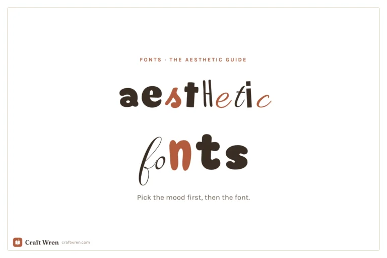
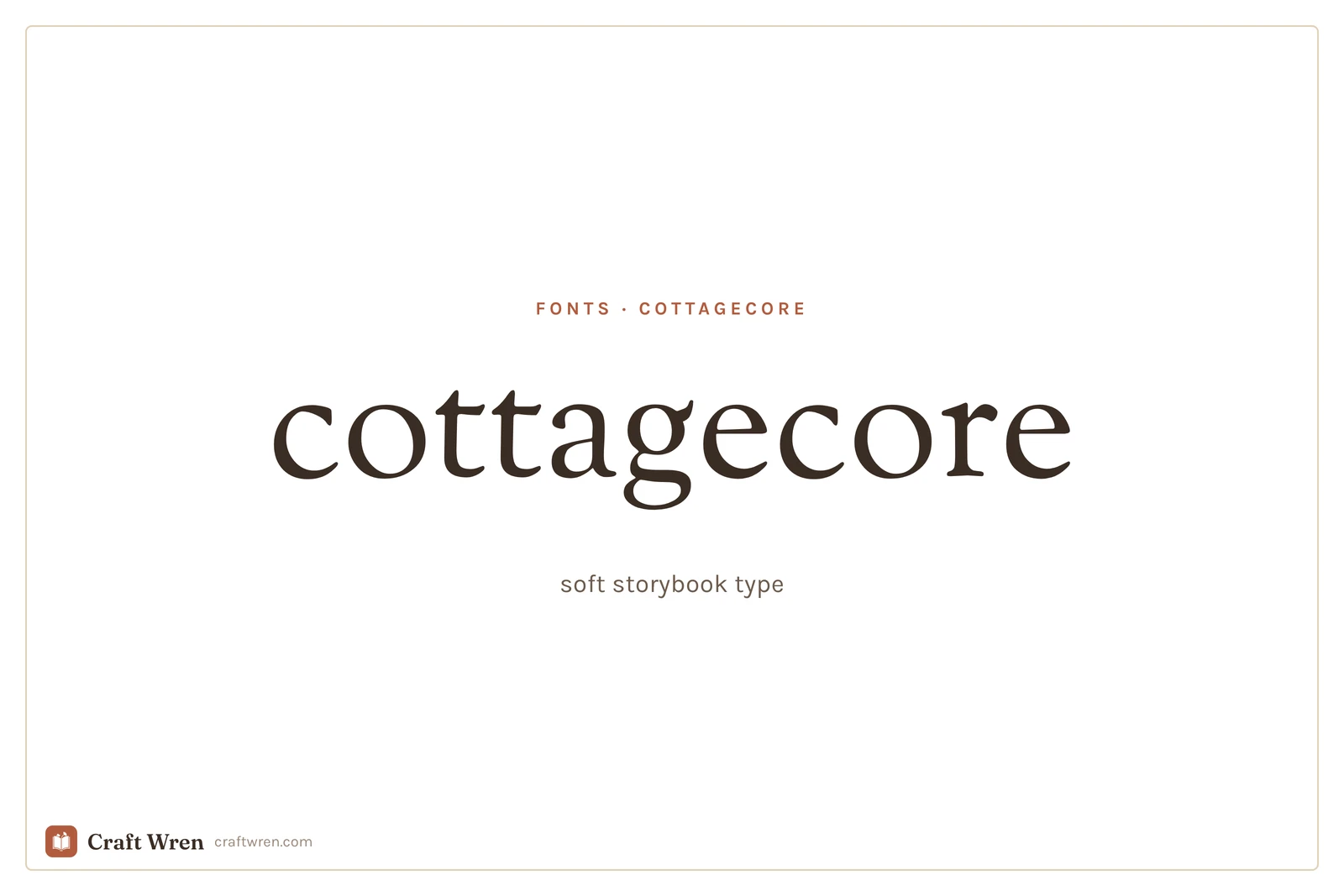
Cottagecore type is gentle and storybook, the look of an old children’s book left open in a sunny window. Soft serifs, hand-drawn capitals, nothing sharp or glossy. And it has one rule that sets it apart from every other aesthetic on the shelf.
Cottagecore fonts are soft, vintage-feeling typefaces, usually gentle serifs and hand-drawn lettering, that evoke old storybooks and farmhouse charm. Unlike loud display styles, the body font matters as much as the title, because the cosy feeling comes from the whole page.
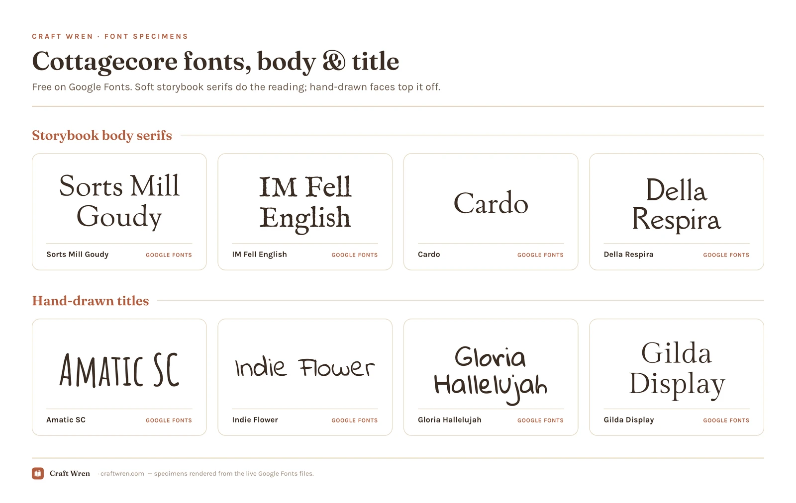
Smallest print size is measured from each font file: the letter height at which the thinnest part of the stroke drops to 0.25 mm, which is roughly where home printing starts losing the line. Screens forgive more, vinyl forgives less.
Font
Sub-style
What it gives you
Smallest print size
Gloria Hallelujah
Title layer
Hand-drawn casual lettering, pencil feel
2.6 mm
Indie Flower
Title layer
Casual handwritten, round and friendly
3.8 mm
Della Respira
Body layer
Soft rounded serif, clean and cosy
4.0 mm
Amatic SC
Title layer
Tall, thin, and all over chalkboards
4.6 mm
IM Fell English
Body layer
Antique letterpress look, uneven inked
5.0 mm
Sorts Mill Goudy
Body layer
Gold standard serif, gentle and warm
6.7 mm
Cardo
Body layer
Softer rounder serif, warm body font
7.5 mm
Gilda Display
Title layer
The dressier title: delicate high-contrast serif
8.6 mm
Why cottagecore is different: the whole page is the look
Most aesthetic fonts are a headline act. You set one loud font on the title and a plain one underneath, and the vibe lives entirely up top. Cottagecore does not work that way. The feeling you are after is an old, warm, printed book, and a book is not one fancy capital letter. It is a whole page of gentle, slightly worn type that all agrees with itself.
So this is the rare aesthetic where you choose the body font first, the one your actual words sit in, and treat the decorative capitals as a small finishing touch on top. Get the body right and the page is already cottagecore before you decorate a thing. Get it wrong, a sharp modern sans serif under a pretty title, and the spell breaks no matter how nice the heading is.
Layer one: the storybook body serif
This is the quiet workhorse, the font your recipe, your journal entry, your poem actually lives in. You want a soft, old-fashioned serif that reads like a printed book rather than a website.
Sorts Mill Goudy is the gold standard here, gentle and warm and free on Google Fonts, the kind of type that looks like it was always there. IM Fell English goes further back, a genuinely antique book face with the slightly uneven, inked look of an old letterpress, perfect when you want it to feel truly old. Cardo and Della Respira are the softer, rounder options for something cosy but a little cleaner. Set a whole paragraph in any of these and it already reads warm and storybook, before a single decoration goes on.
Layer two: the hand-drawn capitals on top
Once the body is doing its quiet work, the title is where you add the hand-made charm. Even this showy layer stays soft, because cottagecore never really shouts.
Amatic SC is the beloved standby, tall, thin, and hand-drawn, the lettering that shows up on every chalkboard and herb-jar label, and it is free on Google Fonts. For a more written, pencil-on-paper feel, Indie Flower and Gloria Hallelujah give you casual handwritten lettering without tipping into childish. Gilda Display is the dressier choice, a delicate high-contrast serif for a title that wants a touch of elegance while staying soft. Use one of these for the heading, the recipe name, the jar label, and let the storybook body carry everything else.
The warmth trick that does more than any font
The move that separates a real cottagecore page from a nice font on a screen is not a font at all. It is the color of the ink and the paper.
Old books were never pure black on pure white. They were warm dark brown or soft charcoal ink on cream, ivory, or faintly aged paper. Pure black on bright white is the single most modern, screen-like combination there is, and it fights everything cottagecore stands for. Switch your text color from #000000 black to a warm dark brown, and your background from bright white to cream, and a perfectly ordinary serif suddenly looks like it was printed decades ago. Add a faint paper or linen texture behind it if your tool allows, and the effect deepens further.
It costs nothing, takes ten seconds, and does more for the cottagecore feeling than agonizing over which serif to use. The font sets the shape; the warm ink and aged paper set the age.
Finding cottagecore fonts free
Both layers of the look are free, which is the best part. Every serif and hand-drawn face named above, Sorts Mill Goudy, IM Fell English, Cardo, Della Respira, Amatic SC, Indie Flower, Gloria Hallelujah, and Gilda Display, comes from Google Fonts at no cost, commercial use included, and shows up in Canva’s font list without a download. A whole storybook page can be built from that list alone.
The one thing Google Fonts will not give you is the truly illustrated cottage type, the letters wreathed in leaves and vines, since those take an illustrator to draw. Those live on Creative Fabrica, whose free plan lets you download a couple to test, and on dafont, where the calligraphy shelf rewards a slow browse. Read the license on anything from those two before you build something to sell, because a free download is not always free for commercial use. The Google picks are all clear on that front, so a recipe card or a label set you put up for sale is covered. Licensing is covered in depth in the aesthetic fonts guide.
Choose the soft body serif first, add one hand-drawn title on top, and put it all in warm ink on cream paper. That is the whole approach, and the order matters more than the exact fonts.
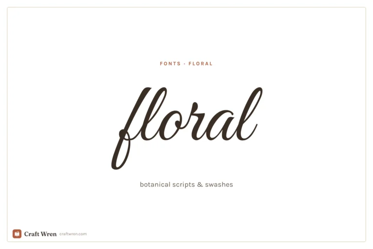
Resist the urge to make everything decorative. A page where the body, the title, and the labels are all hand-drawn turns into a busy, hard-to-read mess that misses the calm the aesthetic is built on. For the flower-heavy, botanical cousin of this look, the floral fonts guide leans into curling swashes, and for the earthier, more modern relative, the boho fonts guide covers that airy, hand-made neighbor.
Pick the warm old serif, write the title by hand, and trade the black-on-white for brown-on-cream. That card that came out reading like a calendar invite will finally look like it has been on the shelf for seventy years, flour dust and all.
Frequently asked questions about cottagecore fonts
What font is the cottagecore font?
There is no single one, but the look is built from soft serifs and hand-drawn lettering. On Google Fonts, Sorts Mill Goudy makes a warm storybook body font and Amatic SC gives you the tall, hand-drawn title. The cottagecore feeling depends on the body font being gentle too, plus warm ink on cream paper, rather than living in the heading alone.
Are cottagecore fonts free?
The ones that matter, yes. Sorts Mill Goudy, IM Fell English, Cardo, Della Respira, Amatic SC, Indie Flower, Gloria Hallelujah, and Gilda Display are all free to use commercially straight from Google Fonts. Only the illustrated cottage styles, the leaf-wrapped letters, tend to live on Creative Fabrica or dafont under personal-use terms, so check before you sell.
What is the best cottagecore font for a recipe card or journal?
Set the body of the text in a soft serif like Sorts Mill Goudy or Cardo so it reads warm and old-printed, then add the title in a hand-drawn font like Amatic SC. Most of the cottagecore feeling on a recipe card comes from that readable body serif plus warm brown ink on cream, not from the heading alone.
How do I make a plain font look cottagecore?
Change the colors before you change the font. Swap pure black text for a warm dark brown and the bright white background for cream or aged paper, and add a faint paper texture if you can. That alone makes an ordinary serif read as old and storybook, because old books were never printed in black on stark white.
Can I use cottagecore fonts in Canva?
Yes. Sorts Mill Goudy, Amatic SC, Cardo, and the rest sit in Canva’s built-in list with nothing to install. Set the text in a warm brown over a cream background to finish the old-book effect. An illustrated cottage font from Creative Fabrica works too, but you upload the file yourself under Brand Kit, which needs a Pro plan.
Get free junk journal printables
New printables, page ideas, and paper craft tutorials, straight to your inbox.
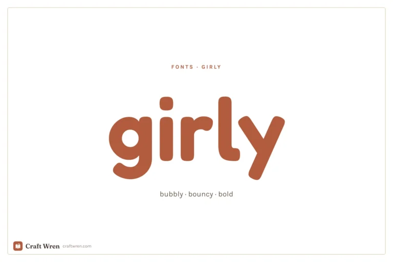
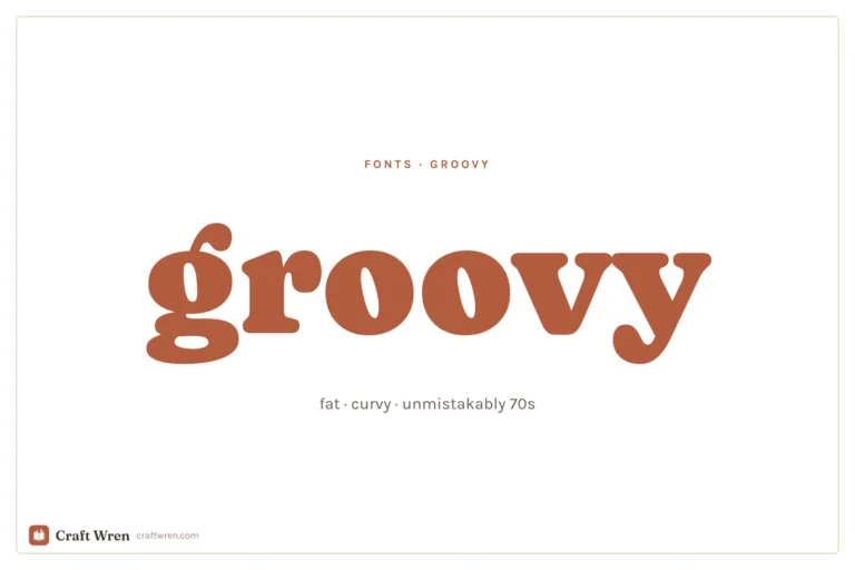
This post contains affiliate links. We may earn a commission when you download a freebie or buy a subscription on Creative Fabrica, at no extra cost to you. Picture the poster: a 70s-themed birthday, a disco playlist cover, a tote with one big word in mustard and brown. Fat bubbly letters, a little wonky, the…
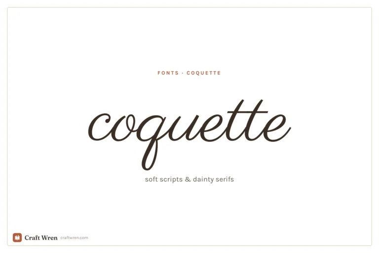
The prettiest aesthetic fonts sorted by vibe: y2k, coquette, cottagecore, floral and more, plus where to download them free and how to use them in your projects.
How to upload your own fonts to Canva step by step, plus the honest answer on Disney-style and Christmas fonts and how to use them safely.
Manage Consent
To provide the best experiences, we use technologies like cookies to store and/or access device information. Consenting to these technologies will allow us to process data such as browsing behavior or unique IDs on this site. Not consenting or withdrawing consent, may adversely affect certain features and functions.
Functional
Always active
The technical storage or access is strictly necessary for the legitimate purpose of enabling the use of a specific service explicitly requested by the subscriber or user, or for the sole purpose of carrying out the transmission of a communication over an electronic communications network.
Preferences
The technical storage or access is necessary for the legitimate purpose of storing preferences that are not requested by the subscriber or user.
Statistics
The technical storage or access that is used exclusively for statistical purposes.The technical storage or access that is used exclusively for anonymous statistical purposes. Without a subpoena, voluntary compliance on the part of your Internet Service Provider, or additional records from a third party, information stored or retrieved for this purpose alone cannot usually be used to identify you.
Marketing
The technical storage or access is required to create user profiles to send advertising, or to track the user on a website or across several websites for similar marketing purposes.


")

")