This post contains affiliate links. We may earn a commission when you download a freebie or buy a subscription on Creative Fabrica, at no extra cost to you.
Picture the poster: a 70s-themed birthday, a disco playlist cover, a tote with one big word in mustard and brown. Fat bubbly letters, a little wonky, the kind that belong on a roller-rink wall. Then you type the word for real and it shows up thin and upright and polite, a spreadsheet header that wandered into the wrong decade. All the mustard in the world will not rescue a skinny font.
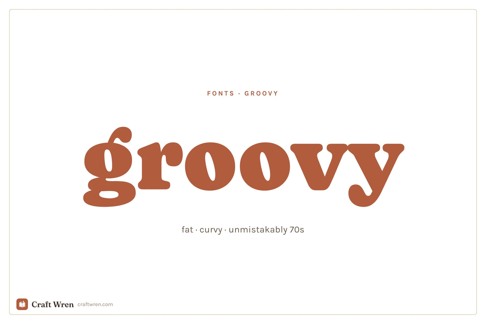
Groovy fonts are gloriously unsubtle: round, heavy, a little inflated, the typographic cousin of a shag carpet and a lava lamp. They are also easier to nail than they look, as long as you stop thinking of the whole thing as a hunt for one perfect font.
Groovy fonts are fat, rounded display typefaces inspired by 1970s posters, record sleeves, and signage. They work best big, on a single word or a title, and they almost always look better with a slight curve or wave added to the text.
The font is only half of it. The groovy look is really three ingredients, and once you can see all three, you can build it out of almost anything.
Smallest print size is measured from each font file: the letter height at which the thinnest part of the stroke drops to 0.25 mm, which is roughly where home printing starts losing the line. Screens forgive more, vinyl forgives less.
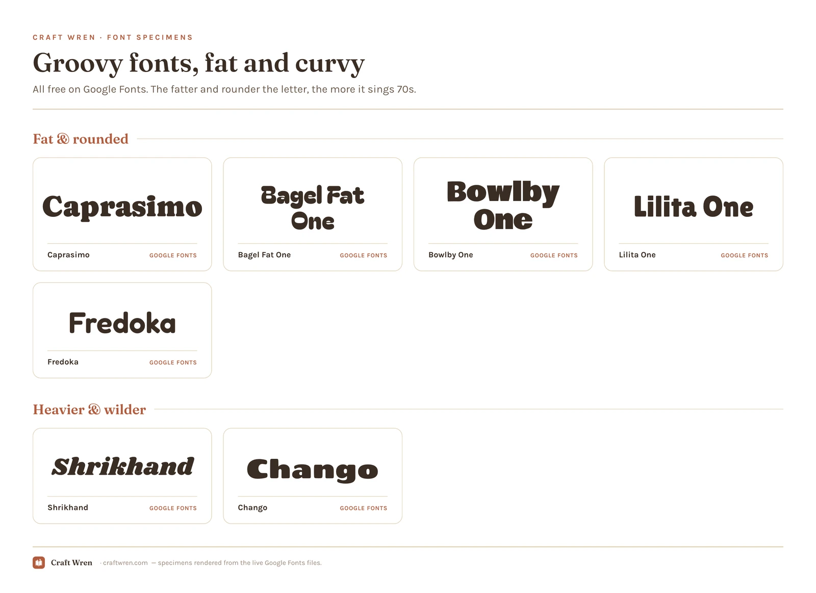
Font
Sub-style
What it gives you
Smallest print size
Lilita One
Chunky
Tidy variant of fat retro
1.6 mm
Bowlby One
Chunky
Fat retro cousin, slightly buttoned-up
1.6 mm
Chango
Psychedelic
Ultra-heavy, the smaller-safe of the pair
1.6 mm
Bagel Fat One
Chunky
Warm, chunky, round-letter poster weight
2.1 mm
Caprasimo
Chunky
Bold and chunky headliner, vintage warmth
2.1 mm
Shrikhand
Psychedelic
The same ultra-heavy look, wants more height
2.1 mm
Ingredient one: a font that is fat and round
The single biggest tell of a 70s font is weight. Thin does not read as groovy, ever. You want letters that look inflated, like they were drawn with a fat marker and then fed a big lunch. Rounded corners do the rest, since hard sharp edges drag the whole thing toward modern.
Google Fonts has a surprisingly good free bench here. Caprasimo and Bagel Fat One are the headliners: both are warm, chunky, and round enough to carry a poster on their own. Bowlby One and Lilita One are the slightly tidier cousins, still fat but a touch more buttoned-up, good when you want retro without full disco. Drop any of them in at a big size and the 70s arrives on schedule.
The rule that keeps this from going wrong: pick one and go enormous. A groovy font at body-text size just looks like a chunky mistake. Its whole job is to be the loudest thing on the page.
Ingredient two: the curve does half the work
A flat, straight line of fat type reads as a bold font on a beige background, not as 70s. Real groovy lettering almost never sits flat. It arcs over the top of the design, waves like a flag, or bulges out in the middle like the word itself is grinning, and that movement is doing as much work as the letterforms.
You do not need a fancy program for it. In Canva, set your word in one of the fat fonts above, select it, open Effects, and use the Curve slider. Push it until the word bends into a smile or a full arch. That one move does more for the vibe than any font swap. By hand, you do the same thing with a pencil and a faint arc line: write the fat letters along the curve instead of along a flat baseline, then ink over them.
Once it is curved, a couple of things help. Letters can touch or even overlap a little, the way they did on real album covers. Tighten the spacing so the word reads as one chunky blob rather than spaced-out capitals. And keep the curve gentle on longer words, because a six-letter word arches beautifully and a sentence turns into a rainbow nobody can read.
Ingredient three: the palette that seals it
Color does the third job, and quietly carries more of the decade than the letters do. The exact same fat font reads as generic-bold in black on white, and reads as unmistakably 1973 in burnt orange, mustard yellow, avocado green, and that warm chocolate brown. The era lived in those colors, so borrowing them is the fastest shortcut to the feeling.
You can keep it to two: a warm background and a font color one step louder. Cream behind orange. Brown behind mustard. Add a thin outline in a third warm shade if the word needs more punch. This is also the cheapest way to make a free, fairly plain font look intentional, because the palette is carrying the decade while the letters just carry the weight.
When you want the wilder, chrome and psychedelic styles
The fonts above cover warm-and-rounded, which is most of what people mean by groovy. The louder branches, melting psychedelic letters, liquid chrome, the swirling Yellow-Submarine kind of type, take real illustration to build, so they mostly live on the paid-and-freemium libraries rather than the free standards.
For the heavy display weights and the genuinely warped retro styles, Creative Fabrica is the deepest well, and you can download a few on the free plan to test a poster before you commit.
Shrikhand and Chango on Google Fonts get you partway to that ultra-heavy look for nothing, and dafont has a big 70s-and-disco section worth a dig, with the usual warning to read the license on each one before you sell anything made with it. If your wilder pick leans glossy and early-2000s rather than warm and 70s, that is a different decade, and the y2k fonts guide is the one you actually want.
Where the free ones live
The fat rounded fonts that carry most groovy projects, Caprasimo, Bagel Fat One, Bowlby One, and Lilita One, all sit on Google Fonts at zero cost, cleared for commercial work and waiting in Canva’s font list with nothing to download. That alone is enough for the average poster.
Paying buys variety, not necessity. Creative Fabrica’s free plan lets you pull a handful of the showier retro display faces, and dafont keeps a deep disco-and-psychedelic shelf if you want genuine period oddities. Both carry the same trap: a download tagged personal-use only is off-limits on anything you sell, free or not. The Google picks above are all safe for commercial use, so a tote or a print headed to your shop is fine. For the licensing in full, the aesthetic fonts guide spells it out.
One groovy font, used big, plus a plain font for anything you need to read. That is the whole rule, and groovy breaks it faster than any other style if you ignore it.
Set the title or the one big word in your fat retro pick, give it a curve, dress it in warm colors. Then set the date, the details, the small print in a clean sans serif and leave them flat and quiet. The contrast is the point. A poster where every line is fat and curved is not groovy, it is a headache with good intentions.
Pick the fattest font you can stand, bend it into a smile, and paint it the color of a 1974 kitchen. The word that showed up looking like a spreadsheet header will finally look like it belongs on a record sleeve, and the disco can start.
Frequently asked questions about groovy fonts
What font is the groovy 70s font?
There is no single one, but the look comes from fat, rounded display fonts. On Google Fonts, Caprasimo and Bagel Fat One are the closest free picks, both warm and chunky enough to carry a 70s poster. The melted, psychedelic, and chrome styles usually come from Creative Fabrica or dafont, since those take real illustration to build.
Are groovy fonts free?
The everyday ones are. The fat rounded picks, Caprasimo, Bagel Fat One, Bowlby One, and Lilita One, cost nothing from Google Fonts and come cleared for commercial work. It is the melted, chrome, and warped styles that tend to sit behind a license on Creative Fabrica or dafont, plenty of them personal-use only, so read the terms before you sell.
How do I get the curved groovy text look?
The curve is half the look, and it is easier than it sounds. In Canva, type your word in a fat font, select it, open Effects, and drag the Curve slider until the word arches or smiles. By hand, draw a faint arc line and write the letters along it instead of straight across. Keep it to a short word, because long ones turn into an unreadable rainbow.
What colors go with groovy fonts?
Warm, earthy, and loud: burnt orange, mustard yellow, avocado green, and chocolate brown. Pairing a fairly plain fat font with that palette does as much for the 70s feeling as the letters themselves, which is why a two-color combination of a cream background and an orange word already reads as retro.
Can I use groovy fonts in Canva?
Yes. Caprasimo, Bagel Fat One, Bowlby One, and the other Google picks load straight from Canva’s font list with nothing to install. Type your word, then reach for the Curve effect to arch it. A groovy font you downloaded from Creative Fabrica works too, but you have to upload the file yourself under Brand Kit, which needs a Canva Pro plan.
Get free junk journal printables
New printables, page ideas, and paper craft tutorials, straight to your inbox.
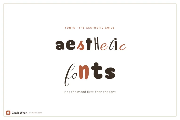
The prettiest aesthetic fonts sorted by vibe: y2k, coquette, cottagecore, floral and more, plus where to download them free and how to use them in your projects.
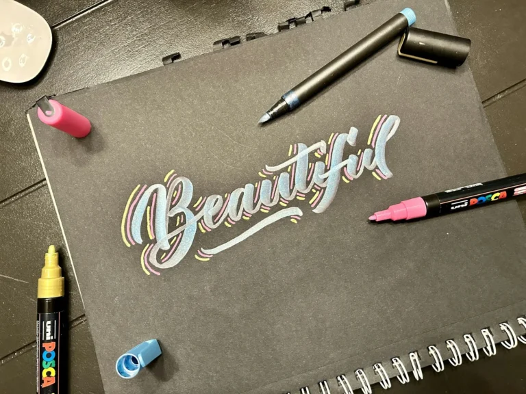
This post contains affiliate links. We may earn a commission when you download a freebie or buy a subscription on Creative Fabrica, at no extra cost to you. The screenshot has been in your camera roll for months. A name in a fine looping script, small, on the inside of the wrist, the kind of…
30 free Procreate fonts you can install today, grouped by style, plus the exact steps to add fonts to Procreate on iPad.
Manage Consent
To provide the best experiences, we use technologies like cookies to store and/or access device information. Consenting to these technologies will allow us to process data such as browsing behavior or unique IDs on this site. Not consenting or withdrawing consent, may adversely affect certain features and functions.
Functional
Always active
The technical storage or access is strictly necessary for the legitimate purpose of enabling the use of a specific service explicitly requested by the subscriber or user, or for the sole purpose of carrying out the transmission of a communication over an electronic communications network.
Preferences
The technical storage or access is necessary for the legitimate purpose of storing preferences that are not requested by the subscriber or user.
Statistics
The technical storage or access that is used exclusively for statistical purposes.The technical storage or access that is used exclusively for anonymous statistical purposes. Without a subpoena, voluntary compliance on the part of your Internet Service Provider, or additional records from a third party, information stored or retrieved for this purpose alone cannot usually be used to identify you.
Marketing
The technical storage or access is required to create user profiles to send advertising, or to track the user on a website or across several websites for similar marketing purposes.


")
")

")