This post contains affiliate links. We may earn a commission when you download a freebie or buy a subscription on Creative Fabrica, at no extra cost to you.
You found the perfect quote for your vision board, typed it out, and it landed in plain Arial like a receipt. The words were right. The font made them look like a memo about the office fridge. So you opened a font site, scrolled past four hundred options with names like “Untitled-1,” and closed the tab with nothing.
The problem was never the quote. It was that “pretty font” is not a category you can search. Pretty for a coquette planner spread and pretty for a 70s record-store poster are two different animals, and a font dump sorted alphabetically tells you nothing about which is which.
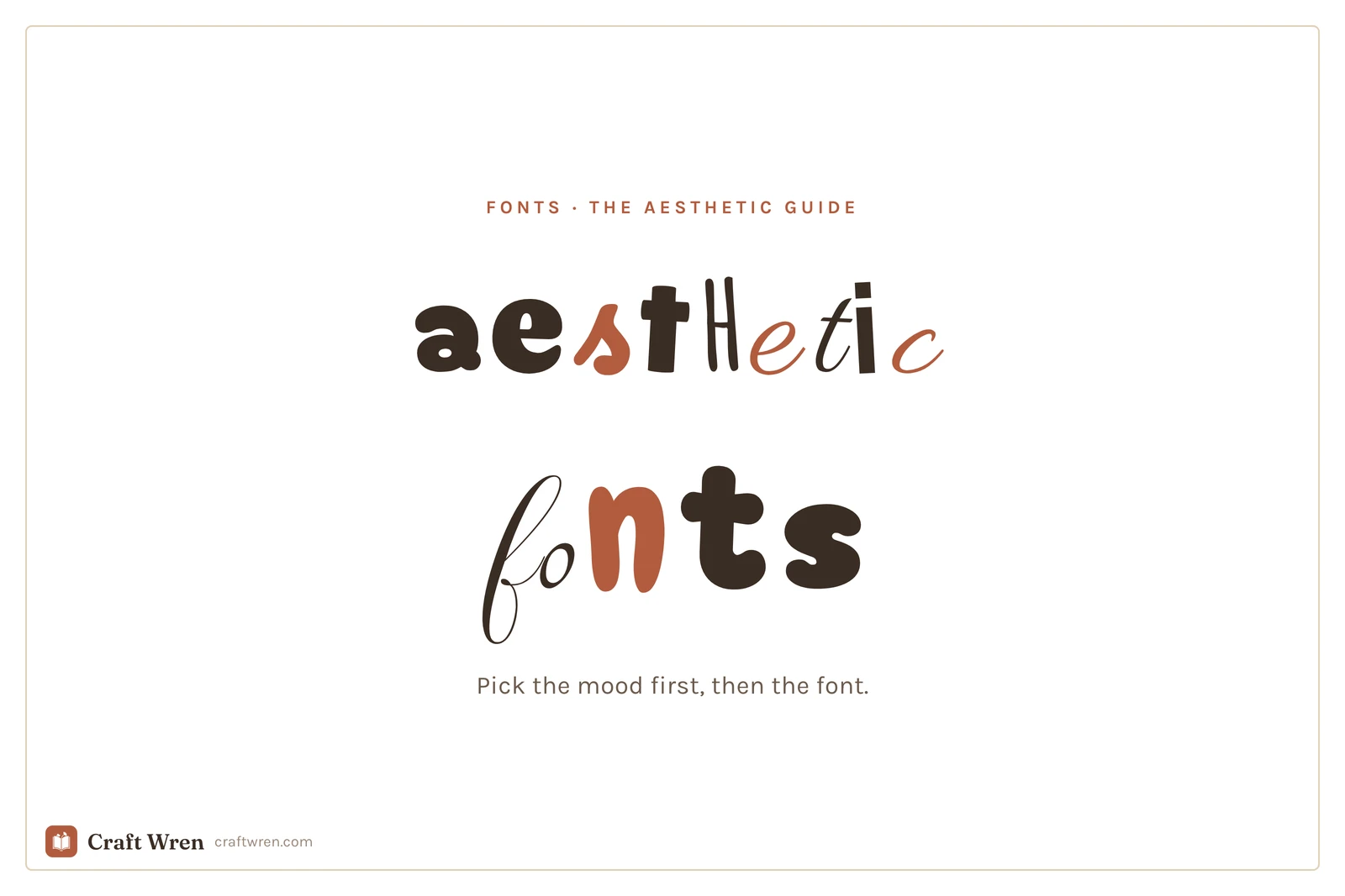
Aesthetic fonts are display typefaces picked for a specific mood, like y2k, coquette, or cottagecore, rather than for plain readability. You choose them by vibe first, then by where you can download them free.
So this guide is sorted the way your eye actually works. By vibe. Pick the mood you are going for, grab a font or two from that section, and ignore the rest.
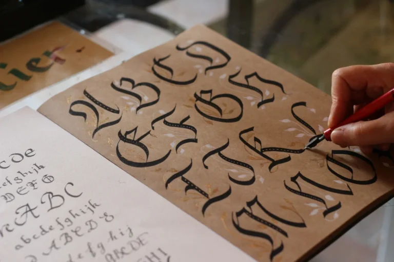
A working font, the kind you read a paragraph in, is built to disappear. An aesthetic font is built to be noticed. It carries a decade, a feeling, a whole Pinterest board in the shape of its letters.
That is why you use it in small doses. One aesthetic font for the title or the quote, one plain font for everything you actually have to read. Set your whole journal page in a curly script and you have made a beautiful thing nobody can get through. The vibe lives in the headline. The body stays out of the way.
So, vibe by vibe, from loudest to softest.
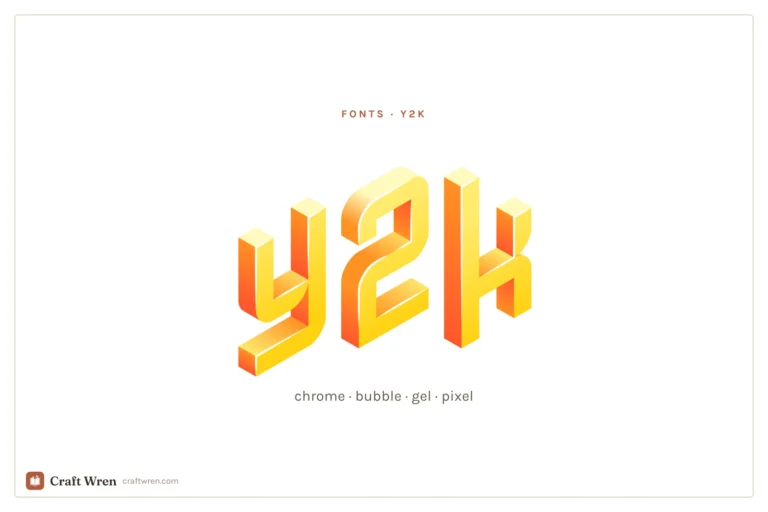
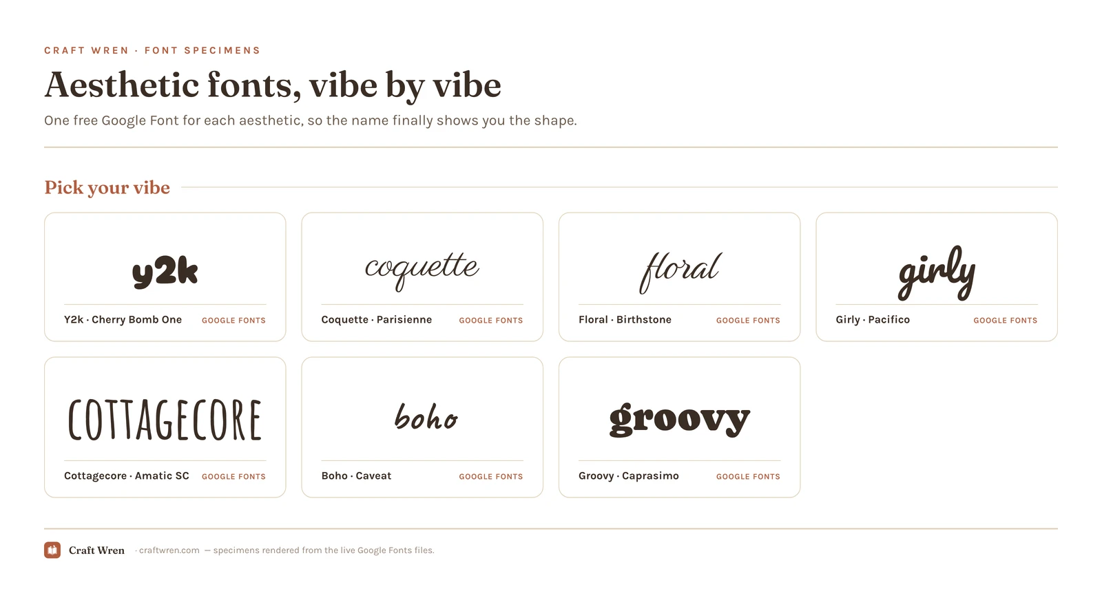
Y2k fonts, for the early-2000s chrome and bubble look
Y2k is glossy, round, a little bit MySpace. Think chrome lettering, inflated bubble shapes, and the kind of type that belongs on a CD case from 2002. It is the loudest aesthetic on this list and the most fun to overdo.
You will not find much true y2k on the buttoned-up free libraries, but bubbly rounded faces like Google’s Cherry Bomb One get you most of the way for headers, and dedicated chrome and gel fonts live on dafont and Creative Fabrica. For the full breakdown of which ones actually read at planner size, see y2k fonts.
Coquette fonts, soft and romantic with a bow on top
Coquette is the dainty one. Thin scripts, delicate serifs, the typographic version of a ballet flat and a ribbon. It works for affirmations, wedding details, anything that wants to feel tender rather than shouty.
Parisienne and Pinyon Script are the easy entry point, free on Google Fonts: loopy, fine-lined, and forgiving at small sizes. Pair one with a quiet serif so it does not tip into illegible. The deeper picks, including the pillowy bubble styles, are in coquette fonts.
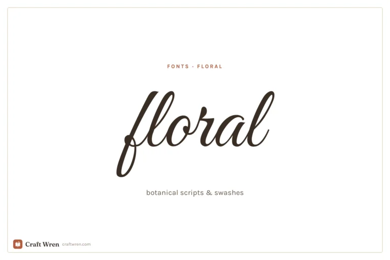
Floral fonts, for botanical swashes and vintage romance
Floral fonts lean decorative: curling swashes, vine-like terminals, sometimes actual flowers tucked into the capitals. They suit garden-party invitations, pressed-flower journal spreads, and anything cottage-adjacent.
Birthstone and Sevillana on Google Fonts give you that romantic swash without a download. For the layered, illustrated styles, plus how to keep a floral font from turning to mush when you print it small, see floral fonts.
Girly fonts, playful and handwritten
Girly is bubbly, bouncy, a little handwritten. Less precious than coquette, more fun: the lettering you would put on a birthday card or a sticker sheet. Pacifico and Sue Ellen Francisco are the workhorses, both a free download from Google Fonts.
The trap is using three of them at once. One playful font is charming. Three is a ransom note. The full set, sorted by how loud each one runs, is in girly fonts.
Cottagecore fonts, soft and storybook
Cottagecore reads like an old children’s book left out in a sunny window: gentle serifs, hand-drawn capitals, nothing sharp. Sorts Mill Goudy and Amatic SC are the quiet backbone, the kind of type that looks like it was always there, and Google Fonts hands you both for nothing.
This is the one that pairs beautifully with the floral picks above, and the one most likely to make a plain recipe card look like it belongs in a farmhouse kitchen. The full set, soft body serifs and hand-drawn titles both, is in cottagecore fonts.
Boho fonts, earthy and organic
Boho leans earthy and organic: airy hand-drawn letters, a little wonky on purpose, sand-and-terracotta energy. Quicksand covers the clean geometric side and Caveat the loose handmade side, and both are a free Google Fonts grab.
It is the most flexible aesthetic on the list, which is exactly why it is easy to make boring. Keep some imperfection. A font that is too tidy stops reading as boho and starts reading as a yoga-studio logo. The deeper picks, plus the wide-spacing trick that keeps it earthy, are in boho fonts.
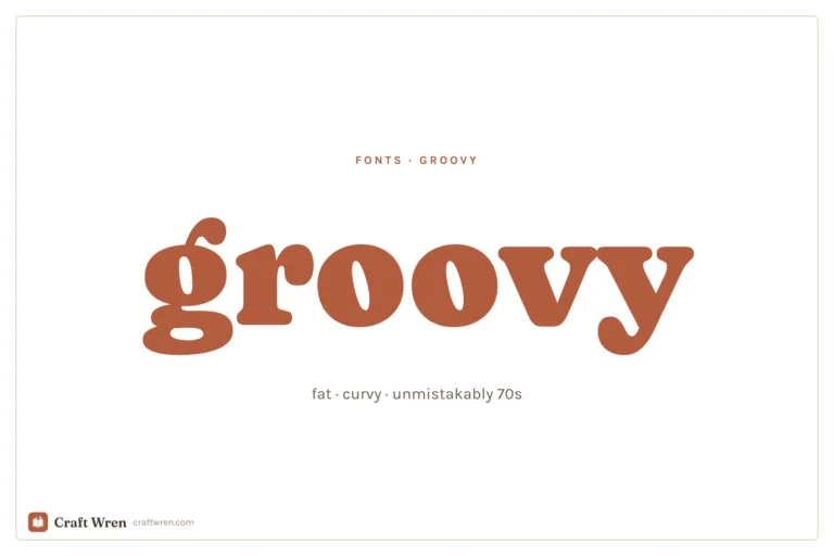
Retro and groovy fonts, for that 70s poster warmth
Groovy is fat, rounded, and unmistakably 70s: think record sleeves, van murals, orange-and-brown everything. Caprasimo and Bagel Fat One on Google Fonts hit that warm retro note without a download, and the chunkiest display weights are all over Creative Fabrica.
Used big, on a title or a single word, they carry a whole poster. Used small, in a paragraph, they fall apart. This is a headline font and only a headline font. The full bench, plus the curve trick that sells the look, is in groovy fonts.
Which aesthetic fits your project
What you are making decides the font more than your taste does. A quick gut-check:
Journals and scrapbooks want cottagecore and floral, the soft serifs and swashes that sit happily next to washi tape and a pressed flower.
Planners and affirmations do well in coquette and girly, pretty enough to enjoy daily but still legible enough to read a to-do list in.
Posters, T-shirts, and Cricut cuts call for groovy and y2k, the loud display faces built to be read across a room.
Weddings and invitations lean coquette and floral again, this time into the fine scripts, because elegant reads as expensive.
When you are stuck, match the font to the era or feeling of the thing itself, not to whichever font you happen to love this week. A 70s-themed party invitation set in a delicate ballet script is a font fighting its own party.
Where to actually download aesthetic fonts free
This is where “free” gets slippery, because it hides a catch worth knowing before you download a thing.
Google Fonts is the safest free source. Every font is free for personal and commercial use, no attribution required, and you can use them straight inside Canva and Google Docs. Most of the names above live here.
dafont is the deep well for niche aesthetics, especially y2k and grunge. Read the license line on each one: many are tagged “free for personal use,” which means you cannot legally sell a product that uses them.
Creative Fabrica is where the polished, layered, designer styles live, and you can download a stack of fonts free on the free plan. It is the easiest place to find a coherent set in one aesthetic instead of hunting one at a time.
The one rule that saves you trouble later: personal use and commercial use are not the same license. A font that is free to print for your own wall is not automatically free to put on a planner you sell on Etsy. If money is changing hands, open the license file and confirm “commercial use” in writing before you build the product. Google Fonts is blanket-clear on this, which is why it is the no-headache default.
How to use an aesthetic font without it looking messy
One aesthetic font, one plain font. That is the whole rule, and it survives every project.
Set the title, the quote, or the one word that matters in your aesthetic pick. Set everything you actually need to read, the body text, the dates, the captions, in a clean sans serif or a simple serif. The contrast is what makes the page look intentional instead of chaotic.
If you build in Canva, the picks here drop straight in, and our guide to aesthetic Canva fonts sorts the in-app library by the same vibes. Using a font you downloaded yourself? Our walkthrough on how to add fonts to Canva gets your y2k chrome pick to actually show up in the menu.
Pick the vibe, grab one font, leave the other three hundred in the tab. That quote you could not make look right will finally read the way it sounded in your head, and the rest of the page will quietly stay out of its way.
Frequently asked questions about aesthetic fonts
What are aesthetic fonts?
Aesthetic fonts are display typefaces chosen for a particular mood or era, like y2k, coquette, or cottagecore, rather than for plain readability. You pick them by the feeling you want a page to have, then use them for titles and accents instead of body text.
Where can I get aesthetic fonts for free?
Google Fonts is the safest free source and works inside Canva and Google Docs with no download. dafont is best for niche styles like y2k and grunge, and Creative Fabrica has a free plan with polished, layered designer fonts. Always check the license before using one for anything you sell.
Are aesthetic fonts free for commercial use?
Not all of them. Many “free” fonts are free for personal use only, which means you cannot legally use them on products you sell. Every Google Font is free for commercial use, so it is the safe default when money is involved; for anything else, read the license file first.
How many aesthetic fonts should I use on one page?
One. Pair a single aesthetic font for the title or quote with one plain font for everything you need to read. Two display fonts competing for the eye is what tips a page from styled into chaotic.
What is the most popular aesthetic font style right now?
Coquette and y2k are the two driving most searches lately, the soft ribbon-and-bow look on one end and the glossy early-2000s chrome look on the other. Cottagecore and floral hold steady with the journaling crowd because they pair so easily with each other.
Get free junk journal printables
New printables, page ideas, and paper craft tutorials, straight to your inbox.
This post contains affiliate links. We may earn a commission when you download a freebie or buy a subscription on Creative Fabrica, at no extra cost to you. Picture the poster: a 70s-themed birthday, a disco playlist cover, a tote with one big word in mustard and brown. Fat bubbly letters, a little wonky, the…
How to upload your own fonts to Canva step by step, plus the honest answer on Disney-style and Christmas fonts and how to use them safely.
Manage Consent
To provide the best experiences, we use technologies like cookies to store and/or access device information. Consenting to these technologies will allow us to process data such as browsing behavior or unique IDs on this site. Not consenting or withdrawing consent, may adversely affect certain features and functions.
Functional
Always active
The technical storage or access is strictly necessary for the legitimate purpose of enabling the use of a specific service explicitly requested by the subscriber or user, or for the sole purpose of carrying out the transmission of a communication over an electronic communications network.
Preferences
The technical storage or access is necessary for the legitimate purpose of storing preferences that are not requested by the subscriber or user.
Statistics
The technical storage or access that is used exclusively for statistical purposes.The technical storage or access that is used exclusively for anonymous statistical purposes. Without a subpoena, voluntary compliance on the part of your Internet Service Provider, or additional records from a third party, information stored or retrieved for this purpose alone cannot usually be used to identify you.
Marketing
The technical storage or access is required to create user profiles to send advertising, or to track the user on a website or across several websites for similar marketing purposes.

")

")
")
")
")