The page is done. Photos matted, paper trimmed, a clean little strip of pattern along the edge, and it looks genuinely good. So you uncap a marker, freehand the title across the top, and the third letter wobbles, the spacing drifts, and now the one thing your eye lands on first is your shaky handwriting. The page did not get worse. The title did.
Titles are the part of a page that feels like it needs a skill you do not have, and it is the one part you can buy your way out of entirely. There are at least six ways to put clean letters on a page, and only one of them asks you to trust your own handwriting. Pick the method that matches your budget and your patience, and the wobble problem disappears.
So here are the routes, from grab-and-stick to make-your-own.
If you want the fastest clean title with zero tools, letter stickers are the answer, and they are what most beginners reach for first. You peel and place, the spacing is up to you, and the letters are already consistent.
Two things make them look intentional instead of slapped on. Lay the whole word out before you peel anything, so you can center it and check the spacing dry. Then pencil a faint guideline to set them along and erase it once the glue is down, which is the quiet trick that keeps a title from sliding uphill across the page. We get into picking sets in our guide to scrapbook stickers, where alphabet packs are a whole category of their own.
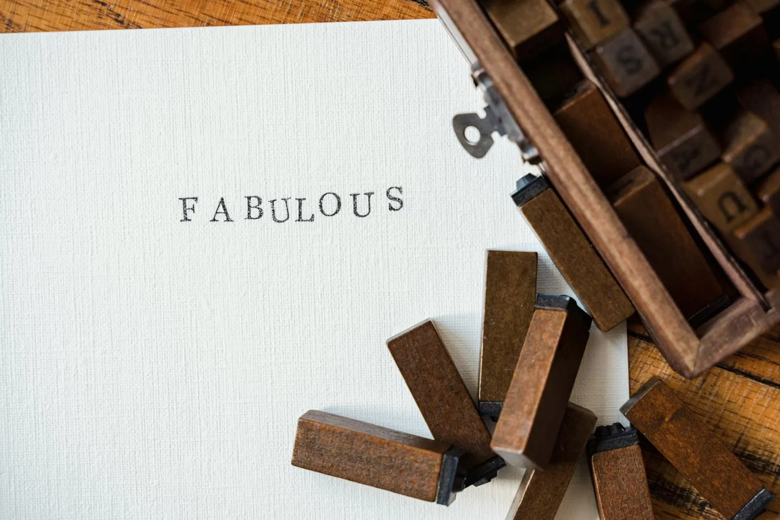
Chipboard and thickers: titles with a little height
When you want the title to feel like part of the design rather than a label, chipboard letters and thick foam alphabets add real dimension. They sit up off the page and cast a tiny shadow, which reads as deliberate and a bit premium.
They cost more per word and you will run out of the popular vowels fast, so they suit short titles, one strong word rather than a sentence. Keep a backup set of plain cardstock letters for the day you need a second E and the pack is out.
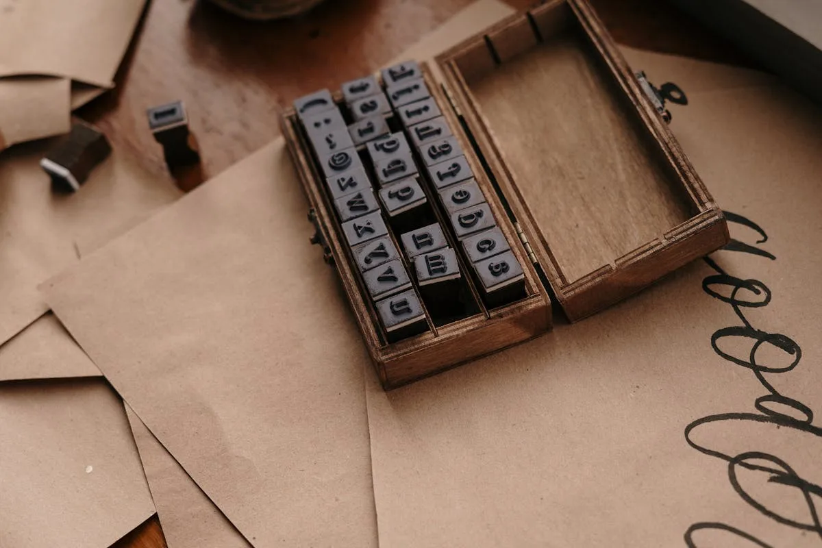
Alphabet stamps: one set, endless titles
A stamp alphabet is the most economical route over time. Buy one set, buy an ink pad, and you can letter every page in your book for years without restocking.
The tradeoff is that stamping straight and evenly takes a little practice, so warm up on scrap paper first and use an acrylic block so you can see where the letter lands. The payoff is flexibility: any word, any color of ink, sized to the page, from a single small purchase that lives in your kit.
Letter punches and dies: clean cuts from your own paper
If you already have a paper stash you love, letter punches or a die-cut machine let you cut titles from that exact paper, so the letters match the page instead of fighting it.
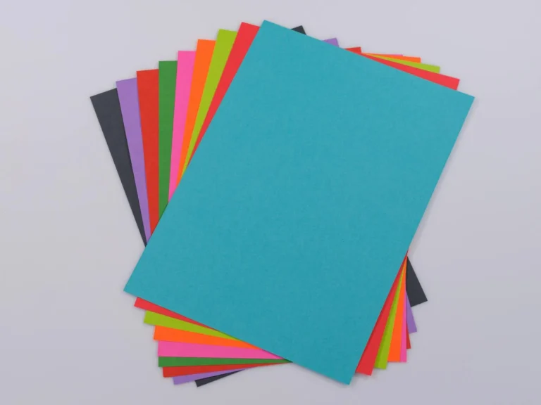
Punches are cheap and manual, one letter at a time. A die-cut machine like a Cricut or a manual Sizzix is the bigger investment but cuts whole words and any font you load. The detail worth knowing: cut letters from cardstock, not thin printer paper, because lightweight paper tears at the thin parts of a letter and lifts at the corners once it is glued. A slightly heavier weight is the difference between a crisp title and a fuzzy one.
Print your own titles: the cheapest custom route
This is the option people skip right past. You can design a title in any font you like, print it at home, and cut it out, which gives you total control for the price of paper and ink. It is also the cheapest way to get a look that no sticker pack carries, and the place where a free design tool pays off.
Lay the words out in Canva, pick a font that matches the mood of the spread, and print onto cardstock. Our roundup of the best Canva fonts is a good starting point, the cursive Canva fonts guide covers the script look that suits sentimental pages, and if Canva is new to you, adding fonts to Canva walks through the setup. Print, trim, glue, and you have a custom title no sticker pack could give you.
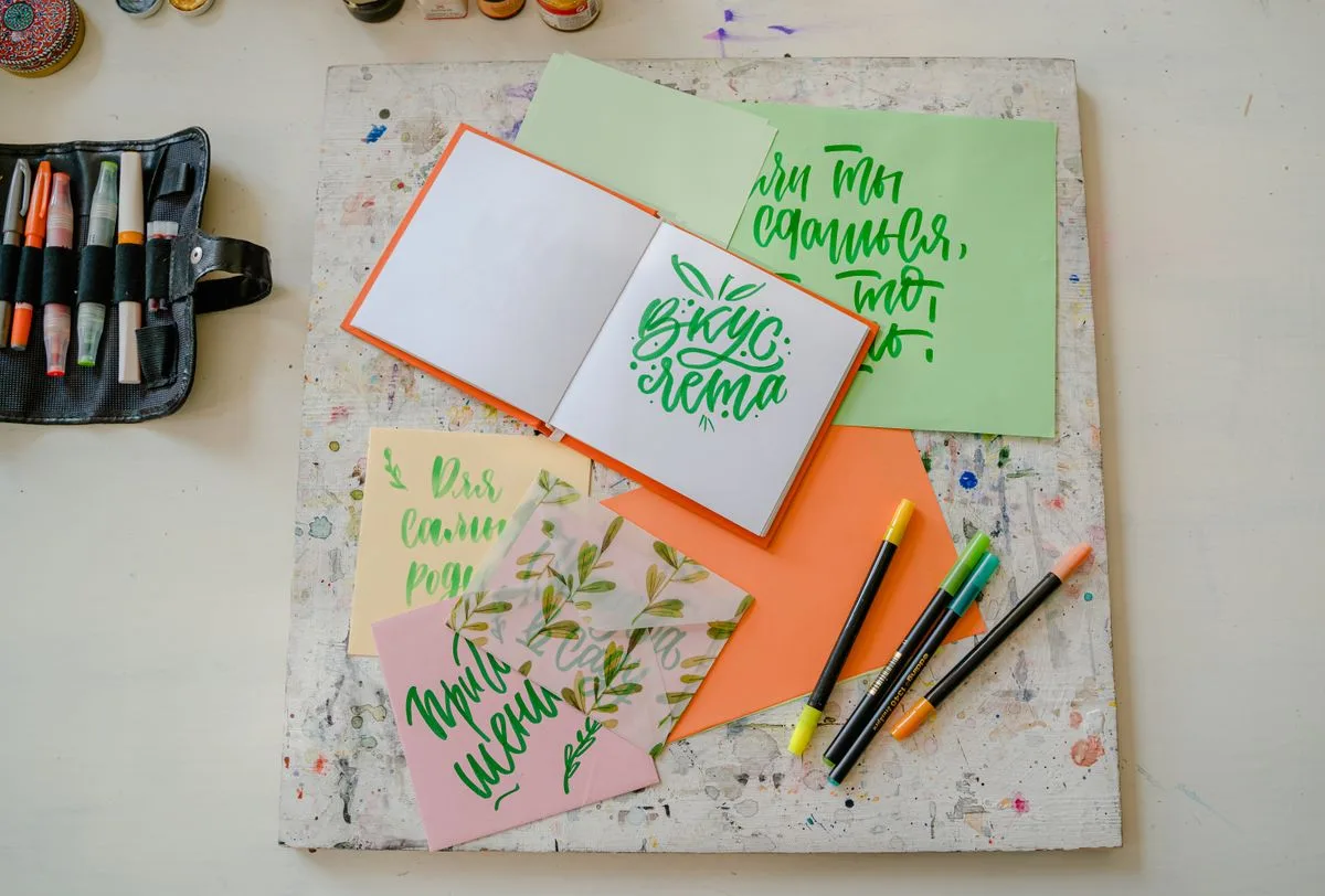
Hand-lettering: the one that needs practice
The last route is doing it by hand, the cheapest of all and the only one that gets better the more pages you make. Faux calligraphy, where you write in cursive and then thicken the downstrokes, is the most forgiving entry point and looks far more polished than plain marker.
If you go this way, give yourself a pencil baseline, write in pencil first, then trace in pen and erase. Practice the title on scrap before you commit it to the page. Hand-lettering rewards patience, and on a personal book the slight imperfection of your own writing is often the point.
Where the title actually goes
Whichever method you choose, the title still has to land somewhere on the page, and a strong one in the wrong spot throws the whole layout off. Where it sits is really a layout question, and our scrapbook page layout ideas cover how a title bridges the photos and the journaling without crowding either. For the front of the book, the title carries even more weight, and scrapbook cover ideas gets into making that one count.
That wobbly marker title was never a sign you lacked the skill. It was a sign you were using the one tool that needs it, when five others are sitting on the shelf waiting to do the job for you.
Frequently asked questions about scrapbook letters
What is the easiest way to add titles to a scrapbook?
Letter stickers are the easiest, since you peel and place them with no tools and the letters already match each other. Lay the whole word out dry before you commit, then place them one at a time working outward from the center so the spacing stays even. For a custom look with almost as little effort, titles printed from cardstock are the next step up.
How do I make scrapbook letters without buying stickers?
Design the title in a free tool like Canva, print it onto cardstock in a font you like, and cut it out. A letter punch or a die-cut machine will also cut letters from your own paper so they match the page. Stamps are another low-cost route, since one alphabet set letters pages for years.
What size should scrapbook titles be?
A title should be readable at a glance but not louder than the photos, usually around one to two inches tall on a 12×12 page. One short, strong word often works better than a full sentence. Scale it down on smaller albums so it stays in proportion with everything else.
Can I print my own letters for scrapbooking?
Yes, and it is one of the cheapest ways to get custom titles. Type the word in Canva or a word processor, choose a font that fits the mood, and print onto cardstock rather than thin paper so the cut letters hold their shape. Then trim and glue them like any other embellishment.
How do I keep scrapbook letters straight on the page?
Always work to a baseline, which can be a lightly penciled line you erase afterward or the edge of a ruler held in place. Lay the whole word out dry before committing, then place letters one at a time from the center outward. Cut and printed titles can be glued as a single strip, which keeps the spacing locked in.
Get free junk journal printables
New printables, page ideas, and paper craft tutorials, straight to your inbox.
Scrapbook ideas for your boyfriend that mean something without tipping into cheesy: what to put in it, themes, a ten-page starter order, and how to keep it him.
A doable month-by-month system for a first-year baby scrapbook: what to save, simple beginner layouts, keepsake pages, and the photo-safe basics that keep it from yellowing.
Scrapbook cover ideas that look intentional: the three-element anatomy, five cover styles, how to add a title without special tools, and protecting the front.
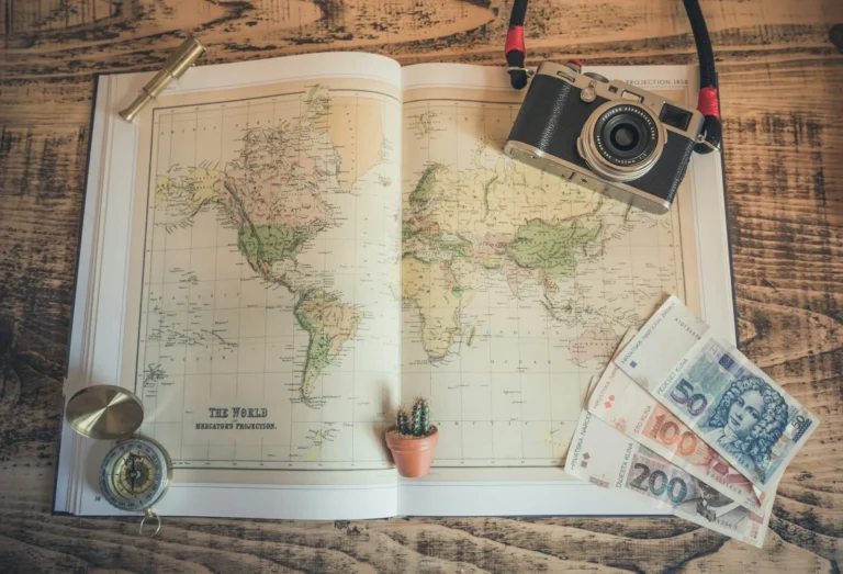
Turn the drawer of boarding passes and nine hundred phone photos into one travel scrapbook you’ll actually open: what to save, how to lay out spreads, and how to make it last.
Turn the drawer of birthday cards and a phone full of photos into a birthday scrapbook worth keeping: what to save, the milestone-or-yearly choice, and how to capture who they were at each age.
Manage Consent
To provide the best experiences, we use technologies like cookies to store and/or access device information. Consenting to these technologies will allow us to process data such as browsing behavior or unique IDs on this site. Not consenting or withdrawing consent, may adversely affect certain features and functions.
Functional
Always active
The technical storage or access is strictly necessary for the legitimate purpose of enabling the use of a specific service explicitly requested by the subscriber or user, or for the sole purpose of carrying out the transmission of a communication over an electronic communications network.
Preferences
The technical storage or access is necessary for the legitimate purpose of storing preferences that are not requested by the subscriber or user.
Statistics
The technical storage or access that is used exclusively for statistical purposes.The technical storage or access that is used exclusively for anonymous statistical purposes. Without a subpoena, voluntary compliance on the part of your Internet Service Provider, or additional records from a third party, information stored or retrieved for this purpose alone cannot usually be used to identify you.
Marketing
The technical storage or access is required to create user profiles to send advertising, or to track the user on a website or across several websites for similar marketing purposes.


")
")