You followed the steps. The photos are matted, the layout is balanced, there is room to breathe, and yet the page still looks a little homemade in the way you did not want. Three patterns are quietly arguing with each other, the colors are close but not quite friends, and a row of stickers landed wherever there was a gap. Nothing is technically wrong. The page just has no style holding it together.
Design is the layer on top of layout. Layout decides where things go, and we cover that in scrapbook page layout ideas. Design decides how it all looks once it is there, and it comes down to a few choices about color, pattern, and restraint that pros make without thinking. Learn those and the homemade-in-a-bad-way feeling goes away, regardless of what you are scrapbooking.
Nail those few choices and a page, even a whole book, starts to read as intentional.
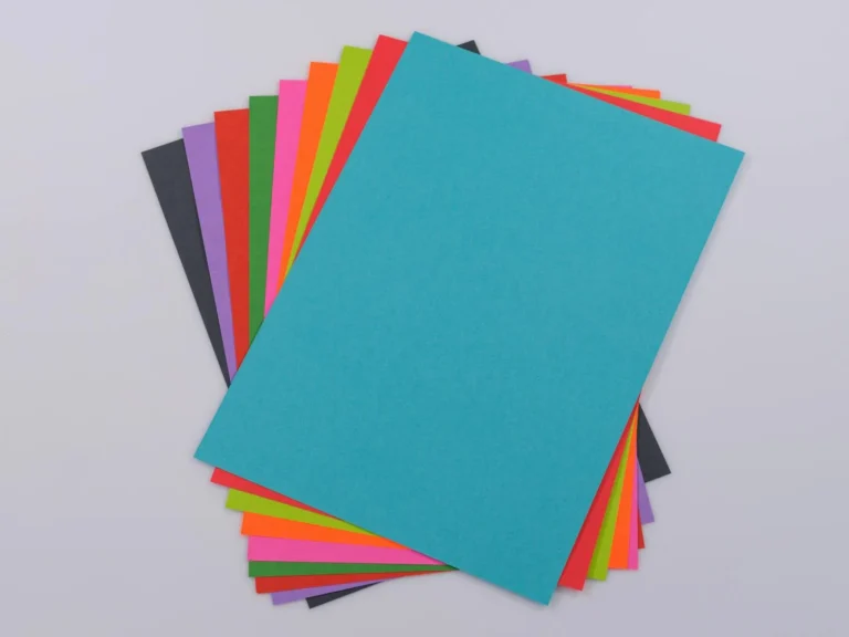
Per page, the simplest color trick is to borrow two or three shades from the photo, which we explain in the layout guide. Design thinking goes one level up: choose a palette for the whole book and let it repeat.
When the same three or four colors echo from spread to spread, the book reads as one book instead of a stack of unrelated pages. Pick a small set, say a soft neutral, one warm tone, and one accent, and lean on it throughout. Photos pull the eye, the repeating palette holds the room together, and the whole album suddenly looks like you planned it, because you did.
Mix patterns by scale, not by guessing
This is the one design skill that quietly fixes the most pages. When two patterns fight, it is almost always because they are the same size. The fix is to mix patterns by scale.
Use one large-scale print, one medium, and one small, and they stop competing and start supporting each other. A big floral as the background, a medium stripe for a mat, a tiny dot for a small accent. Keep them in the same palette so the colors agree while the sizes differ. Two large busy prints side by side will always clash, and two tiny ones read as mush, but a big, a medium, and a small almost always work. That single rule is worth more than any pack of coordinated paper.
Choose a style direction and commit to it
A page reads as designed when it clearly belongs to one look rather than borrowing a little from everything. You do not have to be precious about it, just pick a lane:
Clean and minimal. White space, one or two photos, a thin title, almost no embellishment. The photos do the work. Forgiving for beginners because there is less to get wrong.
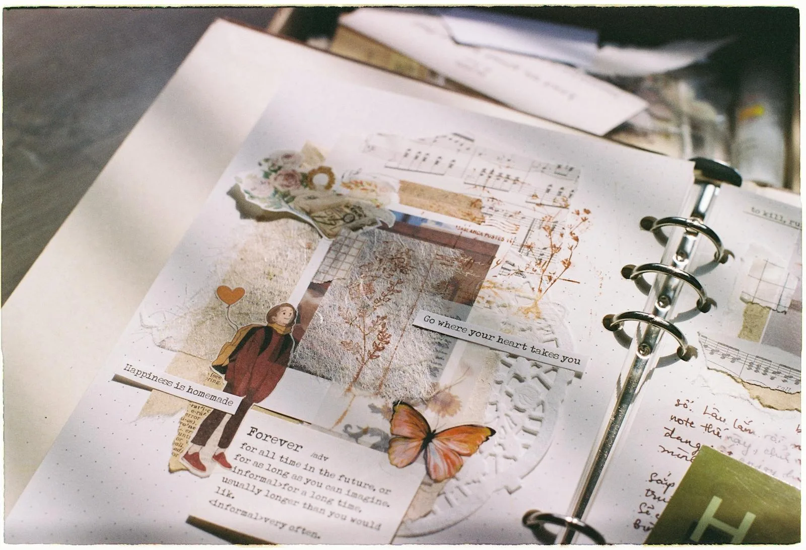
Vintage and layered. Muted colors, torn edges, old paper, a bit of lace or a ticket stub. This is the junk-journal-adjacent look, warm and a little imperfect on purpose.
Bright and playful. Saturated colors, bold patterns, chunky letters. Great for kids’ books, parties, and trips where the energy is the point.
Tonal and soft. A single color family in light shades, neutrals on neutrals. Quiet, modern, and very hard to make look cluttered.
Whichever you pick, let it guide the paper, the letters, and the extras, so they all speak the same language.
Let the photos lead and the extras follow
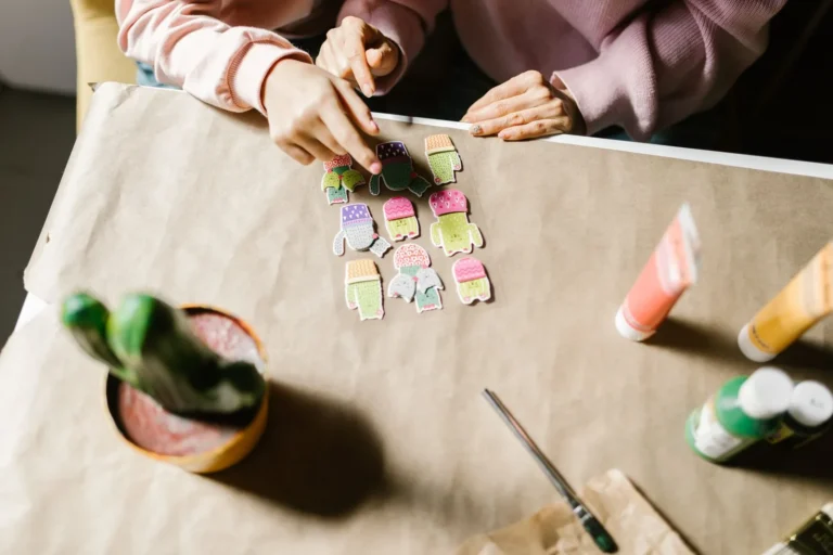
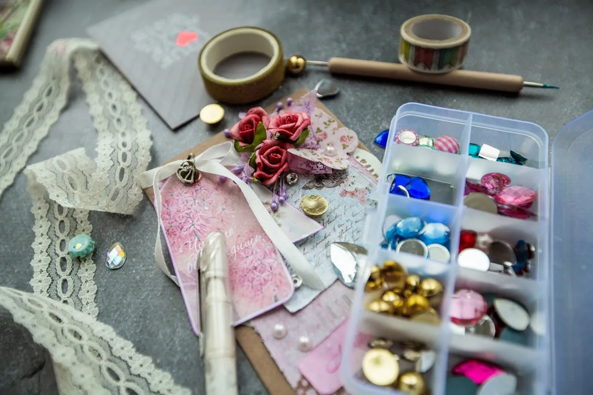
The most common design mistake is treating embellishments as the main event. Stickers, die cuts, washi, and trims are seasoning, not the meal. When they outnumber the photos, the page tips into busy.
A good test before you glue anything down: would the page still look finished with the embellishments removed? If yes, add a few back as accents. If no, the design is leaning on decoration to do a job the photos and layout should be doing. Restraint almost always reads as taste, and our picks for scrapbook stickers work best used as the occasional accent rather than wall-to-wall.
Use repetition to tie spreads together
Cohesion across a book comes from small things that recur. The same title font on every spread, a strip of the same patterned paper down each left edge, a matching color of mat throughout. We cover lettering options in scrapbook letters and titles, and picking one and reusing it is itself a design decision.
Repetition is why a stranger’s album can look professionally made even when each page is simple. Nothing on any single page is fancy. It is the echo from page to page that signals a designer was here. Choose two or three elements to repeat and let everything else vary.
Give the eye one place to land
Finally, every page that reads as designed has a hero, one thing the eye is meant to land on first. Style is how you crown it. A quieter, more muted surrounding makes a single saturated photo or a bold title carry the page, with nothing extra added.
The mistake is dialing everything up at once. When every color is loud and every pattern is busy, nothing leads and the page just feels noisy. Decide which element is the star, then tone the rest down a notch so the contrast does the work. How you actually size and mat that star is a layout call, covered in scrapbook page layout ideas; the design part is choosing what gets to be loud. Frame it with your patterned paper, and there is more to do with that stash in what to do with scrapbook paper.
Those three arguing patterns and not-quite-friendly colors were never a sign you lack an eye. They just needed editing. Pull them into one palette, vary their scale, and commit to a single look, and the patterns stop arguing while the colors finally agree. The page that read as homemade starts looking like you meant every bit of it.
Frequently asked questions about scrapbook design
How do I make a scrapbook page look professionally designed?
Two habits do most of the work: repeat one small color palette through the whole book, and mix patterns in different sizes so they support each other instead of competing. Let one photo lead each page and keep embellishments to a few accents. Pages look designed because of that page-to-page consistency, not because any single page is fancy.
How many patterns should I use on a scrapbook page?
Two or three is the sweet spot, and the trick is varying their scale: one large print, one medium, one small, all in the same colors. Two patterns of the same size will usually clash. If a page feels busy, remove one pattern before you add anything else.
What colors go well together in a scrapbook?
Settle on one small palette for the whole book and let it repeat: a neutral to ground things, one warmer tone, and a single accent. Borrowing those shades from your photos keeps them from clashing, and our layout guide covers choosing colors on a single page. Consistency across spreads is what makes an album feel intentional rather than random.
How do I make a busy page look intentional instead of messy?
Keep every pattern in the same color family, and vary their scale so a large print, a medium, and a small one support each other rather than compete. Treat stickers and trims as the occasional accent, not the main event. A busy page reads as designed when the colors agree and one element clearly leads.
What is the easiest scrapbook style for beginners?
A clean, minimal style is the most forgiving, since fewer elements means fewer things to get wrong. One or two photos, a simple title, plenty of white space, and a single accent will look polished with very little effort. You can always layer in more once you trust your eye.
Get free junk journal printables
New printables, page ideas, and paper craft tutorials, straight to your inbox.
A clear, no-experience-needed process for making your first scrapbook, from sorting photos and picking an album to building pages in short sessions and finishing the cover.
Six easy ways to add clean letters and titles to your scrapbook pages, from peel-and-stick alphabets to printing your own, so no title ever wobbles again.
Scrapbook ideas for your boyfriend that mean something without tipping into cheesy: what to put in it, themes, a ten-page starter order, and how to keep it him.
Turn the drawer of birthday cards and a phone full of photos into a birthday scrapbook worth keeping: what to save, the milestone-or-yearly choice, and how to capture who they were at each age.
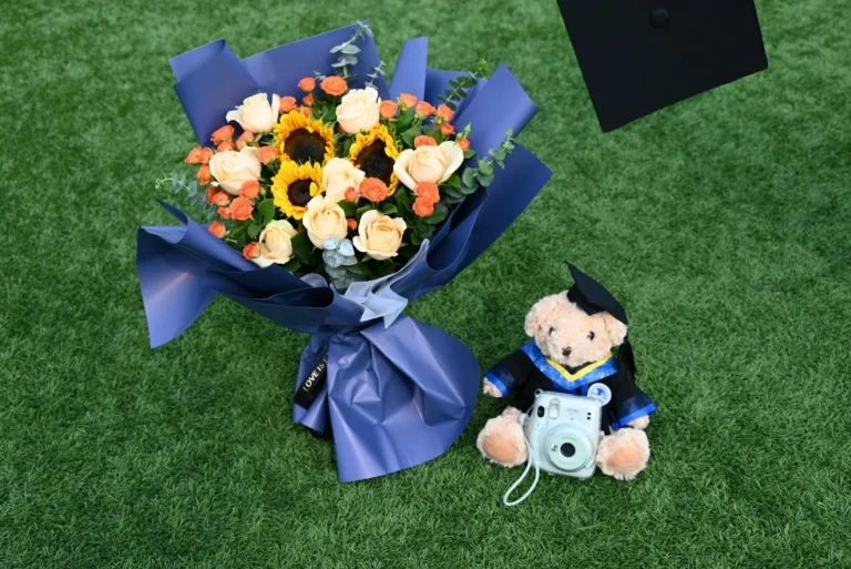
Turn the cap, the tassel, and four years of photos into a graduation scrapbook they’ll keep: what to save, how to gather it as a gift, and how to make it last.
Manage Consent
To provide the best experiences, we use technologies like cookies to store and/or access device information. Consenting to these technologies will allow us to process data such as browsing behavior or unique IDs on this site. Not consenting or withdrawing consent, may adversely affect certain features and functions.
Functional
Always active
The technical storage or access is strictly necessary for the legitimate purpose of enabling the use of a specific service explicitly requested by the subscriber or user, or for the sole purpose of carrying out the transmission of a communication over an electronic communications network.
Preferences
The technical storage or access is necessary for the legitimate purpose of storing preferences that are not requested by the subscriber or user.
Statistics
The technical storage or access that is used exclusively for statistical purposes.The technical storage or access that is used exclusively for anonymous statistical purposes. Without a subpoena, voluntary compliance on the part of your Internet Service Provider, or additional records from a third party, information stored or retrieved for this purpose alone cannot usually be used to identify you.
Marketing
The technical storage or access is required to create user profiles to send advertising, or to track the user on a website or across several websites for similar marketing purposes.


")