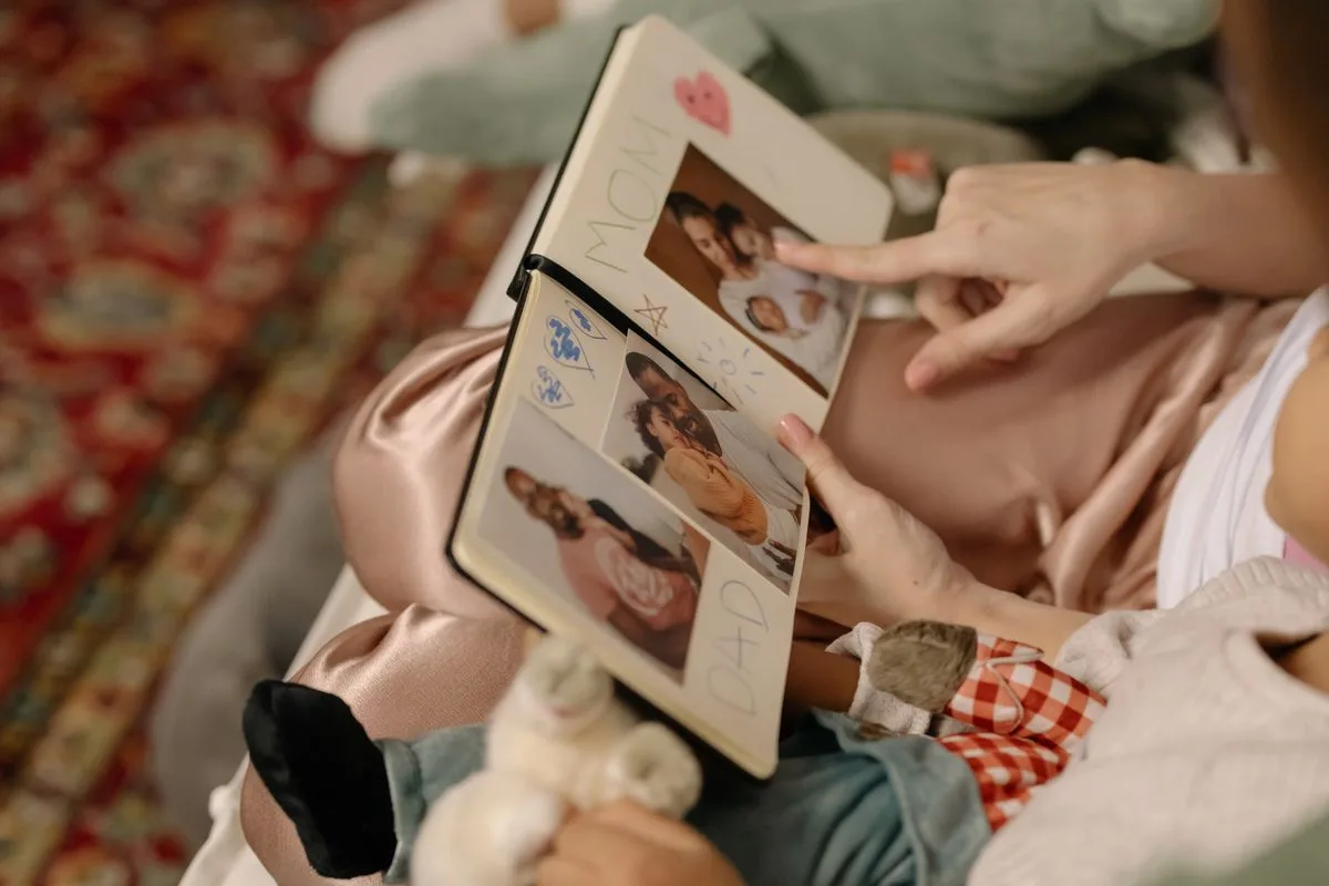
You finished the inside. Twelve good spreads, the photos matted, the story in order, and then you reach the front and stall out completely. The cover is blank, and a blank cover makes the whole thing look like a school binder instead of the keepsake you just spent a month on.
The cover is doing more work than any single page inside. It is the first impression, the thing people judge before they open a single spread, and the label that tells you which book this is when six of them are lined up on a shelf. Good news: a cover that looks intentional takes three elements, not thirty.
The anatomy of a strong cover comes first, then a handful of styles you can copy outright.
Strip away the decoration and a strong cover comes down to three jobs done well.
A clear title or label, so the book announces itself. A single focal element, usually one photo or one strong graphic, instead of a crowd of competing bits. And room to breathe, because a cover crammed edge to edge looks anxious while an uncluttered one looks designed. Get those three right and you can stop there. Everything else is flourish.
The photo cover
The easiest cover with the biggest payoff. One great photo, made large, with the title tucked into a corner or running along the bottom.
Pick the image that sums up the whole book, the face or the place the reader will recognize instantly. Some albums come with a window cut into the front so you slide a photo behind it, which looks polished with zero effort. If yours does not, mat the photo, gluing it onto a slightly larger rectangle of paper so it has a clean border instead of floating on the cover.
The typographic cover
Sometimes the title is the design. A big, confident title and nothing else on a clean background reads as modern and keeps the surprise of the photos for the inside.
This is where letters earn their keep. Hand lettering if you have the hand for it, otherwise a set of dimensional letter stickers does the work and looks deliberate, which our picks for scrapbook stickers cover in detail. Center it, give it space, maybe a small date underneath, and the restraint does the rest.
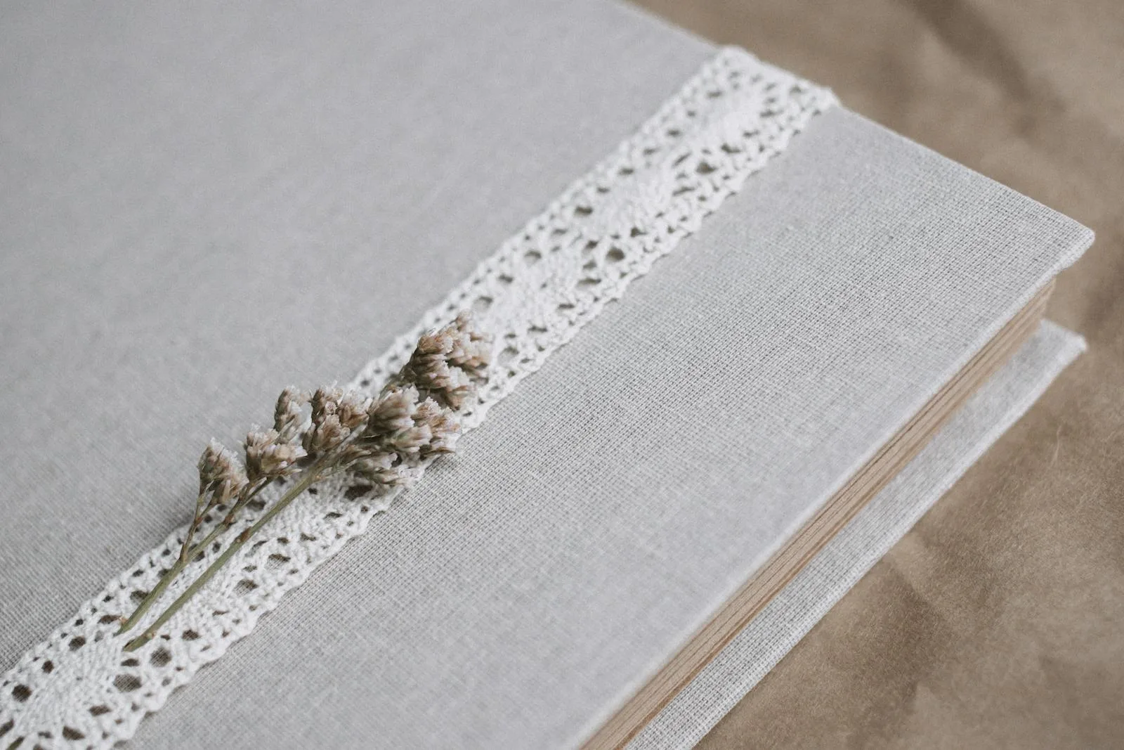
The fabric or cloth cover
For a gift or a heirloom book, fabric lifts it instantly. A linen, a scrap of a meaningful old shirt, a bit of lace over kraft. Wrap the chipboard cover, glue the edges to the inside, and add a paper or wooden label on top for the title.
Cloth covers feel expensive because they are tactile, and they hide a multitude of beginner sins underneath. They are the move when the book is meant to be handed to someone.
The kraft and vintage cover
If your scrapbook leans toward the layered, collected look, a kraft or vintage cover sets that tone from the front. Brown kraft card, an aged tag, a bit of book text or sheet music, a wax seal or a length of twine.
This is the cousin of a junk journal cover, and the same instincts apply: layer a few flat ephemera pieces, keep one area calm for the title, and let it look gathered rather than designed.
The themed cover
When the book has a clear subject, let the cover say so at a glance. A theme-matched front: a tiny map and a luggage tag for a travel book, a pressed flower for a garden one, a single baby photo and a soft palette for a first-year book like the one in our baby scrapbook ideas.
The trick is to nod at the theme with one or two objects, not to pile on every related sticker you own. One luggage tag says travel. Twelve says clutter.
Adding the title without a lettering setup
The title trips people up more than it should. Four reliable ways to get clean lettering:
Letter stickers, the fastest, with no skill required.
Printed and cut, set your title in a font you like, print it, trim it to a strip, and glue it down.
Die-cut letters, if you own or can borrow a machine.
A label or tag, hand-write the title on a separate card and mount it, so a shaky line does not live directly on the cover.
That last one is the safety net. Lettering on a removable tag means a wobble costs you a scrap of paper, not the whole front.
Make the front survive being a front
The cover gets handled more than any page inside, so it earns a little protection. If the book will be passed around, seal a paper title or photo: brush a thin, even coat of matte mod podge over it and let it dry, or press a self-adhesive matte laminate sheet across the top and smooth out the bubbles. On a gift book, use photo-safe, acid-free materials so the front does not yellow, the same basics in our guide to safe glues. For more on arranging what is inside once the front is done, the beginner’s guide to scrapbook ideas covers the rest.
Three quick mistakes to skip
Beyond crowding, which the three-element rule already handles, covers tend to fail in three specific ways.
The first is a cover that matches nothing. A soft baby album with a bold industrial front, or a travel book whose cover could belong to anything, leaves the reader guessing. The outside should whisper what the inside is about. The second is a title laid straight across a busy part of the photo, where neither the words nor the image can win. Move it to a calm corner or onto its own strip of paper so both get to breathe. The third is the quiet one: rushing the cover because you are tired of the project. After a month of careful spreads, people slap the front on in five minutes and wonder why it looks off. Give it the same half hour you gave any page inside.
None of these takes skill to avoid. They just take the patience to treat the front like it matters, because it is the part everyone sees first.
Just start the front page
The blank cover is only intimidating while it is blank. Pick one photo or one title, give it space, add a single object that hints at what is inside, and stop before you overthink it.
That binder-looking book on your table is three elements away from looking like the keepsake it already is on the inside.
Frequently asked questions about scrapbook covers
How do I decorate a scrapbook cover?
Build it from three things: a clear title, one focal photo or graphic, and plenty of empty space. Add a single object that hints at the theme, like a luggage tag or a pressed flower, and stop there. A clean, uncrowded cover almost always looks more intentional than a busy one.
What do I put on the front of a scrapbook?
Most covers work with a title plus one strong element, usually a photo that sums up the book or a bold typographic title on a clean background. A small date or name underneath helps it read as finished. Keep decoration minimal so the front does not fight with itself.
How do I make a title for my scrapbook cover?
The easiest options are dimensional letter stickers or a title set in a font, printed and cut into a strip. If you have a machine, die-cut letters work well. Hand-lettering on a separate tag is the safest route, since a shaky line costs you a scrap of paper instead of the whole cover.
What can I use for a scrapbook cover material?
A plain chipboard album cover takes paper, fabric, or kraft well. Wrap it in linen or a meaningful old fabric for a gift book, or layer kraft card and vintage ephemera for a collected look. Choose acid-free, photo-safe materials if the book holds real photos you want to last.
How do I protect a scrapbook cover from wear?
Seal a paper title or cover photo with a matte laminate sheet or a thin coat of mod podge, since the front gets handled the most. Use acid-free, photo-safe adhesive so it does not yellow over time. A little protection keeps the cover looking new long after the book is finished.
Get free junk journal printables
New printables, page ideas, and paper craft tutorials, straight to your inbox.
A beginner guide to scrapbook ideas: how to pick a finishable project, what supplies you actually need, layout and cover basics, and keeping it from feeling like homework.
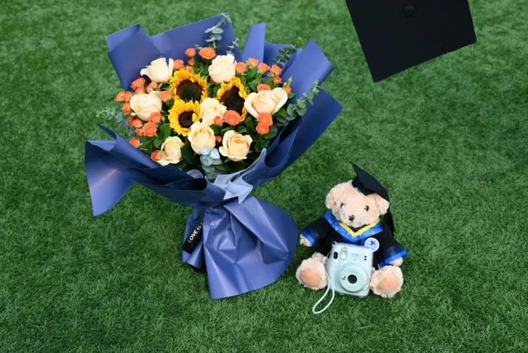
Turn the cap, the tassel, and four years of photos into a graduation scrapbook they’ll keep: what to save, how to gather it as a gift, and how to make it last.
Scrapbook ideas for your boyfriend that mean something without tipping into cheesy: what to put in it, themes, a ten-page starter order, and how to keep it him.
Turn the drawer of birthday cards and a phone full of photos into a birthday scrapbook worth keeping: what to save, the milestone-or-yearly choice, and how to capture who they were at each age.
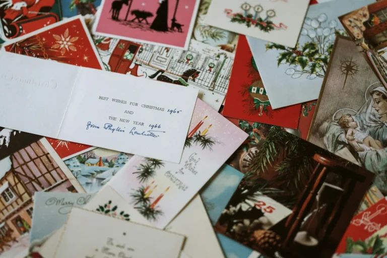
Turn every December pile of photos and cards into one Christmas scrapbook you add to each year: what to save, festive layouts, and color that skips the clearance-aisle look.
Manage Consent
To provide the best experiences, we use technologies like cookies to store and/or access device information. Consenting to these technologies will allow us to process data such as browsing behavior or unique IDs on this site. Not consenting or withdrawing consent, may adversely affect certain features and functions.
Functional
Always active
The technical storage or access is strictly necessary for the legitimate purpose of enabling the use of a specific service explicitly requested by the subscriber or user, or for the sole purpose of carrying out the transmission of a communication over an electronic communications network.
Preferences
The technical storage or access is necessary for the legitimate purpose of storing preferences that are not requested by the subscriber or user.
Statistics
The technical storage or access that is used exclusively for statistical purposes.The technical storage or access that is used exclusively for anonymous statistical purposes. Without a subpoena, voluntary compliance on the part of your Internet Service Provider, or additional records from a third party, information stored or retrieved for this purpose alone cannot usually be used to identify you.
Marketing
The technical storage or access is required to create user profiles to send advertising, or to track the user on a website or across several websites for similar marketing purposes.