This post contains affiliate links. We may earn a commission when you download a freebie or buy a subscription on Creative Fabrica, at no extra cost to you.
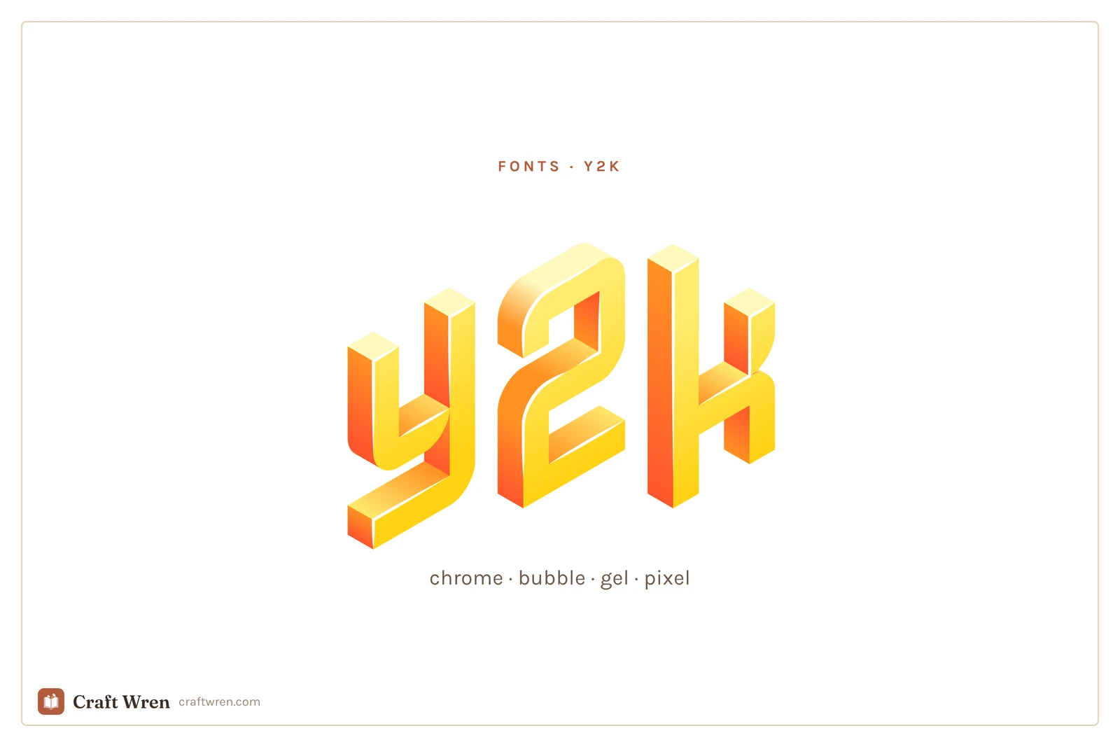
You are making something y2k. A birthday invite, a set of phone wallpapers, the cover art for a playlist that is all 2002. You can see it in your head: glossy, chrome, a little bratz-doll, a little Windows XP. Then you type the words in whatever font was already loaded and it comes out looking like a tax form. The vibe was in the lettering the whole time, and the lettering is the one thing you did not have.
Y2k is having a full revival, and the fonts are most of the work. Get the typeface right and a plain photo snaps straight back to 2003. Get it wrong and no amount of butterfly clips and lens flare will save it.
Y2k fonts are display typefaces that revive the late-90s and early-2000s look, including chrome and metallic, inflated bubble, gel and aqua, and blocky pixel styles. You use them big, for titles and single words, and keep the rest of the text plain.
The thing is, “y2k” is not one look. It is four or five, and they do not mix well. So pick the sub-style first.
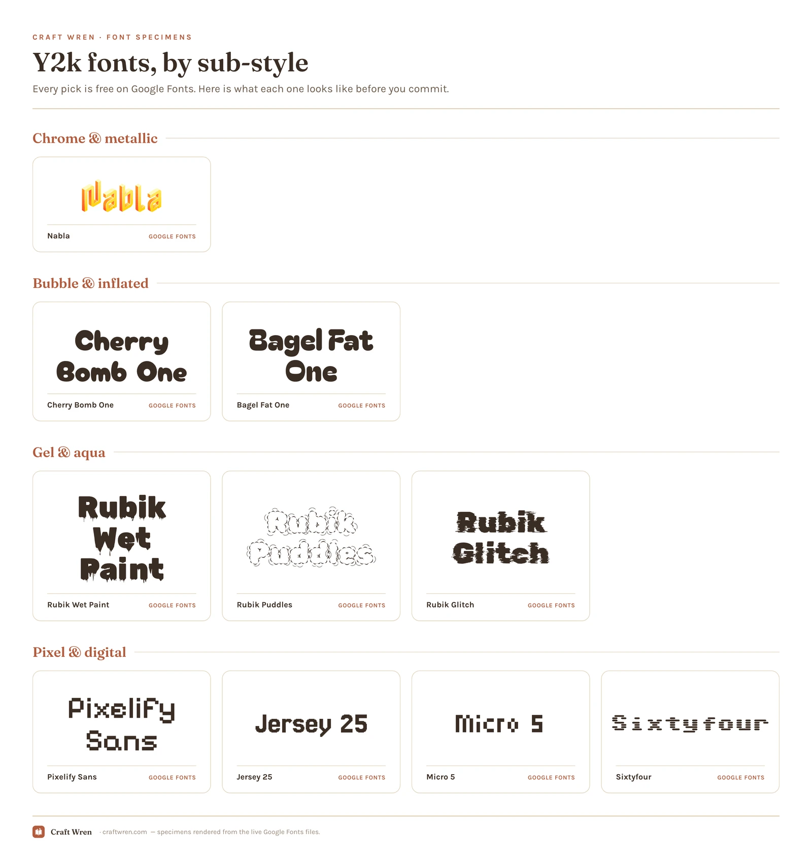
Smallest print size is measured from each font file: the letter height at which the thinnest part of the stroke drops to 0.25 mm, which is roughly where home printing starts dropping the line. Screens forgive more, vinyl forgives less. Nabla is a colour font, so a stroke measurement does not apply.
Font
Sub-style
What it gives you
Smallest print size
Nabla
Chrome
Colour font: chrome with no editing
—
Cherry Bomb One
Bubble
Inflated roundness that survives shrinking
1.7 mm
Bagel Fat One
Bubble
The same puffed look, a touch wider
2.1 mm
Rubik Wet Paint
Gel
Liquid, dripping gloss
12.0 mm
Rubik Puddles
Gel
Melting letters, titles only
20.0 mm
Rubik Glitch
Gel
The corrupted-screen variant
20.1 mm
Micro 5
Pixel
Tiny true-retro, straight off a 2002 Nokia
1.3 mm
Pixelify Sans
Pixel
Readable enough to carry a whole title
1.5 mm
Jersey 25
Pixel
Chunkier: arcade cabinet, not cellphone
1.6 mm
Sixtyfour
Pixel
Leans hardest into the boot-up screen look
3.5 mm
The chrome and metallic look
Liquid-silver letters with a hard highlight running across them, the kind that lived on every nu-metal album cover and energy-drink can. This is the loud one: shiny, slightly aggressive, unmistakably 2001.
True chrome is hard to fake, because the shine has to be baked into the letterforms. On Google Fonts, Nabla is the surprise pick: it is a built-in color font with a beveled, metallic 3D face, so it renders chrome straight out of the box with no editing. For the heavier liquid-metal styles, search “chrome” or “y2k” on dafont and Creative Fabrica, where the dedicated metallic display faces live. Use chrome on one word. Two chrome words start to look like a wrestling poster.
The bubble and inflated look
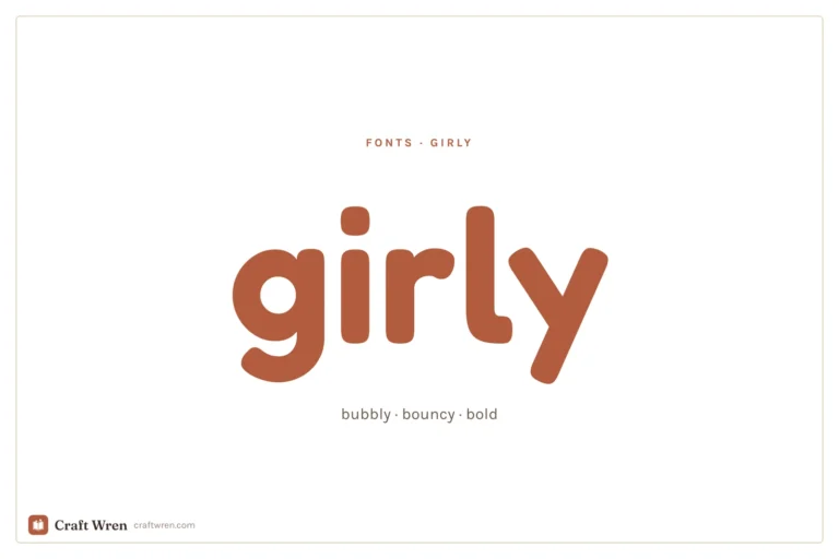
Fat, rounded, puffed up like the letters were filled with air. This is the friendliest y2k style, the one that shows up on early-2000s kids’ brands and bubblegum-pop covers. It pairs well with the girly aesthetic, so if your project leans more cute than edgy, start here.
Cherry Bomb One and Bagel Fat One, both on Google Fonts, give you that inflated roundness for free and read cleanly even at smaller sizes. They are the rare y2k fonts that survive being shrunk down to a sticker. For more in this lane, the girly fonts guide overlaps heavily.
The gel and aqua look
Think the original Mac OS X “Aqua” buttons: glassy, candy-colored, wet-looking letters that seem to have a droplet of water sitting on them. It is the dreamiest y2k style and the most dated in the best way.
Google’s experimental Rubik family covers this beautifully: Rubik Wet Paint and Rubik Puddles both have that liquid, dripping-gloss quality, and Rubik Glitch handles the corrupted-screen variant. All free, all installable in Canva and Docs. For a glossier candy gel, dafont’s aqua category is the deep well.
The pixel and digital look
Blocky, low-resolution letters built from visible squares, like text on a 2002 cellphone or an old computer boot screen. This is the techy end of y2k, less Bratz and more dial-up.
Google Fonts is generous here. Pixelify Sans is the readable one, clean enough to carry a longer title without dissolving into static. Jersey 25 runs chunkier, more arcade cabinet than cellphone. Micro 5 is the tiny true-retro option, the kind of type that looks trapped in a 2002 Nokia screen. Sixtyfour leans hardest into the old-computer boot-up look. None of them need a download in Canva.
Why these fonts read as y2k
None of this was an accident. The chrome came from designers getting their hands on early 3D software and rendering everything in liquid metal because they finally could. The bubble shapes rode the same millennium optimism that gave us inflatable chairs and gummy translucent gadgets. The pixel fonts were not nostalgic yet, they were just what low-resolution screens could display, from your first cellphone to the family desktop.
So when you reach for one now, you are borrowing a specific moment: the brief window where the future looked glossy and friendly instead of sleek and gray. That is why a single y2k word can date a whole design in the best possible way. The font does the time travel for you.
Where to download y2k fonts free
Three sources, in the order I would check them.
Google Fonts has the modern y2k revivals listed above, all free for personal and commercial use, no download needed inside Canva or Google Docs. Start here.
dafont is the archive for the genuine 2000s deep cuts, especially true chrome and gel. Read the license tag on each: a lot are “free for personal use” only, so you cannot put them on something you sell.
Creative Fabrica is where the polished, ready-to-use y2k sets live, like Y2K Nostalgia, Brick Bond, and Cookie Soda, and the free plan lets you download a batch on the free tier. Best if you want a matching chrome-plus-bubble pair instead of hunting two fonts separately.
One catch the moment you sell anything: a font marked free for personal use is off-limits on a product, even if you got it free. Google Fonts is cleared for commercial use across the board, so lean on it for Etsy work. Full licensing rundown is in our aesthetic fonts guide.
How to use a y2k font without it turning into a mess
The whole style runs loud, so restraint is the entire skill. One y2k font, used big, on the title or the single hero word. Everything else, the body copy, the date, the small print, stays in a clean modern sans like the ones already built into Canva.
For that plain partner, a geometric sans does the job: Inter, Work Sans, or plain Arial in a pinch. Match it to the title’s temperature.
Chrome title, cool gray body. Nothing warm sits well next to silver.
Bubble title, a rounded sans like Quicksand to keep the friendly note going.
Gel title, a white or pastel body, and let the title hold all the color.
Pixel title, a smooth modern sans for contrast. Never pixel on pixel.
The contrast is the point. A chrome title over plain gray text reads as intentional and a little ironic, which is exactly the y2k mood. Set the whole thing in chrome and you have built a screensaver nobody can actually read. Resist stacking two display fonts, no matter how much both of them scream early-2000s at you.
Get that one title right and the cover reads as 2002 the second someone glances at it, no butterfly clips required.
Frequently asked questions about y2k fonts
What font best captures the y2k aesthetic?
It depends which y2k you mean. For the classic chrome look, Nabla on Google Fonts renders metallic with no editing. For the cute bubble side, Cherry Bomb One; for the techy pixel side, Pixelify Sans. There is no single y2k font, which is why picking the sub-style first matters.
Do y2k fonts work for small text like stickers or captions?
Mostly no, with one exception. Chrome, gel, and pixel styles get muddy or unreadable the moment you shrink them, so keep those for titles. The inflated bubble fonts, Cherry Bomb One and Bagel Fat One, are the ones that still hold up small enough for a sticker or a caption.
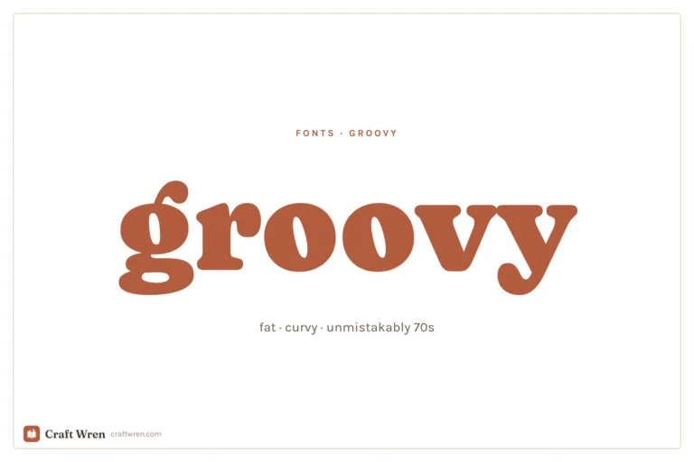
What is the difference between y2k and retro fonts?
Retro usually points to the 60s and 70s: warm, fat, groovy lettering. Y2k is specifically the late-90s and early-2000s look, which means chrome, gel, pixel, and inflated bubble styles. Same idea of borrowing from a decade, very different decade.
Can I use y2k fonts in Canva?
Yes. The Google Fonts listed here show up directly in Canva’s font menu with no download. One caveat: Nabla is a color font, and some editors render it flat instead of chrome, so glance at it before you commit. A chrome or gel font you downloaded from dafont can be uploaded to Canva on a Pro plan.
How do I make text look chrome or metallic?
The cleanest way is to start with a font that already has the chrome baked in, like Nabla, so the shine is part of the letterforms. Otherwise you are layering gradients and bevels by hand in an editor, which rarely looks as convincing as a purpose-built metallic typeface.
Get free junk journal printables
New printables, page ideas, and paper craft tutorials, straight to your inbox.
This post contains affiliate links. We may earn a commission when you download a freebie or buy a subscription on Creative Fabrica, at no extra cost to you. Picture the poster: a 70s-themed birthday, a disco playlist cover, a tote with one big word in mustard and brown. Fat bubbly letters, a little wonky, the…
This post contains affiliate links. We may earn a commission when you download a freebie or buy a subscription on Creative Fabrica, at no extra cost to you. It starts with your grandmother’s bread, the recipe you finally got right, and a card you want to look like it came out of a flour-dusted cookbook…
This post contains affiliate links. We may earn a commission when you download a freebie or buy a subscription on Creative Fabrica, at no extra cost to you. Three calm words, that is the whole print. “Let love grow,” maybe, for a bedroom wall, or the signage for a wedding buried in pampas grass and…
This post contains affiliate links. We may earn a commission when you download a freebie or buy a subscription on Creative Fabrica, at no extra cost to you. The screenshot has been in your camera roll for months. A name in a fine looping script, small, on the inside of the wrist, the kind of…
Manage Consent
To provide the best experiences, we use technologies like cookies to store and/or access device information. Consenting to these technologies will allow us to process data such as browsing behavior or unique IDs on this site. Not consenting or withdrawing consent, may adversely affect certain features and functions.
Functional
Always active
The technical storage or access is strictly necessary for the legitimate purpose of enabling the use of a specific service explicitly requested by the subscriber or user, or for the sole purpose of carrying out the transmission of a communication over an electronic communications network.
Preferences
The technical storage or access is necessary for the legitimate purpose of storing preferences that are not requested by the subscriber or user.
Statistics
The technical storage or access that is used exclusively for statistical purposes.The technical storage or access that is used exclusively for anonymous statistical purposes. Without a subpoena, voluntary compliance on the part of your Internet Service Provider, or additional records from a third party, information stored or retrieved for this purpose alone cannot usually be used to identify you.
Marketing
The technical storage or access is required to create user profiles to send advertising, or to track the user on a website or across several websites for similar marketing purposes.


")
")