Aesthetic Canva Fonts: Soft, Dreamy Picks for a Curated Look
You know the look. The soft, curated feeling of a good mood board, a quote graphic, a minimalist brand, that calm and slightly dreamy quality where everything seems intentional. A lot of people think it comes from the photos or the muted colors, and it does, partly. But the font is doing more of the work than you would guess. Set the same dreamy quote in a chunky default font and the whole spell breaks. The right typeface is most of what reads as aesthetic.
So this is the set of Canva fonts that bring that look: the airy minimal ones, the elegant vintage ones, the soft scripts. They are what designers reach for when a project needs to feel less like a flyer and more like a feeling. Nearly all of them are free.
The short version: Aesthetic Canva fonts share a soft, intentional quality: delicate serifs, airy spacing, and clean minimal shapes. For a minimal look, try Glacial Indifference or Josefin Sans. For elegant and vintage, Cormorant Garamond and Marcellus. For a soft handwritten touch, Sacramento or Parisienne. Add generous letter spacing to almost any of them and the aesthetic feeling deepens.
What makes a font look “aesthetic”
It helps to name what you are chasing, because “aesthetic” is a feeling more than a category. A few qualities show up in nearly every font that has it.
Delicacy runs through almost all of them: thin strokes, fine serifs, and light weights that read soft and refined where heavy bold fonts read loud. They tend to breathe, too, with airy letterforms and, often, generous space added between the letters. And they lean minimal and a little vintage, away from anything trendy or shouty. Put simply, aesthetic fonts whisper.
Knowing that turns the look into something you can build on purpose rather than stumble into. The lists below are sorted by the kind of aesthetic each font brings.
A quick honesty note: most of these are free, and the few that need Canva Pro show a crown in the menu. The aesthetic look is forgiving that way; almost any delicate font in the same style gives you the same feeling, so do not stress if one specific name is not there.
Minimal and airy aesthetic fonts
The clean, modern end of the aesthetic look: simple shapes, light weights, lots of room to breathe. Perfect for minimalist branding, quote graphics, and that quiet Pinterest feeling.
- Glacial Indifference. Probably the font you have seen on a hundred aesthetic graphics without knowing its name. A light, geometric sans with a calm, modern feel that looks expensive and effortless, especially in all caps with wide letter spacing. If you try one font from this post, make it this.
- Josefin Sans. A tall, elegant geometric sans with a vintage Art Deco hint. Refined and a little nostalgic, lovely for headers and logos that want to feel both modern and timeless.
- Quicksand. Soft, rounded, and gentle, with friendly circular letterforms. It reads calm and approachable, a good aesthetic pick when you want warmth rather than edge.
- Poppins. The lighter weights of Poppins are quietly aesthetic on their own: clean, round, and uncluttered, an easy neutral for the dreamier minimal look.
Elegant and vintage aesthetic fonts
The refined, editorial end: delicate serifs with a touch of old-world elegance. For luxury branding, magazine-style layouts, and anything that should feel quietly upscale.
- Cormorant Garamond. Thin, high-contrast, and beautiful, the aesthetic serif. Its fine strokes feel expensive and literary, ideal for large headlines and short elegant phrases.
- Marcellus. A graceful roman font with classical, almost carved letterforms. It reads timeless and refined, gorgeous in all caps for elegant titles and minimal logos.
- Playfair Display. The high-contrast fashion serif. Used at a large size for a single line, it brings instant editorial elegance to a quote or a cover.
- Cormorant. The wider cousin of Cormorant Garamond, with the same delicate, literary feel. A soft serif choice when you want refinement without weight.
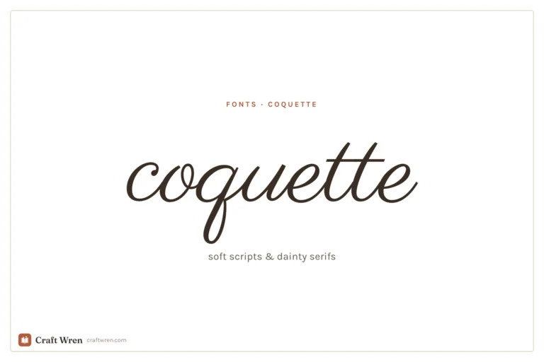
Soft script aesthetic fonts
For the dreamy, romantic touch: delicate handwriting and flowing calligraphy used sparingly, for a name or a single line.
- Sacramento. Light and casual, with just enough flow to feel personal without getting fussy. A soft accent script that suits the aesthetic look beautifully.
- Parisienne. Romantic and a little nostalgic, delicate enough to feel like a love letter. Lovely for a name, a monogram, or one soft phrase.
- Pinyon Script. Fine, formal calligraphy with elegant hairlines. Used large and brief, it brings a dreamy, vintage-stationery feel.
These overlap with the wider world of script fonts, so if you want the full range sorted by free and Pro, our guide to cursive and script fonts in Canva goes deeper.
Using aesthetic fonts (the one trick)
There is a single move that makes almost any font look more aesthetic, and it costs nothing: open up the letter spacing. In Canva, nudge the letter-spacing (tracking) slider up on a header, set it in all caps, and watch a plain sans like Glacial Indifference turn into something that looks like a curated brand. Wide, airy spacing is half the aesthetic look on its own.
The other half is restraint. Pair one aesthetic font with one quiet neutral, keep the palette muted, and leave plenty of empty space. Our guide to Canva font pairings has soft combinations to start from, and our best Canva fonts shortlist covers the calm body fonts to anchor them.
This is exactly the toolkit for a mood board, which is why these are the fonts we reach for when we put together a digital vision board: a delicate serif for the word of the year, an airy sans for the affirmations, lots of breathing room. The font is what turns a folder of pretty pictures into something that feels like yours.
Frequently asked questions about aesthetic Canva fonts
What are the most aesthetic fonts in Canva?
Glacial Indifference is the standout for a clean minimal look, Cormorant Garamond and Marcellus for elegant vintage, and Sacramento or Parisienne for a soft script touch. The common thread is delicacy: thin, airy, intentional letterforms rather than heavy bold ones.
How do I make my Canva text look aesthetic?
The fastest trick is to increase the letter spacing on a header and set it in all caps, which gives even a plain sans-serif that curated, breathy look. Pair it with one quiet font, a muted color palette, and lots of empty space, and the whole design reads aesthetic.
Are aesthetic Canva fonts free?
Most are. Glacial Indifference, Josefin Sans, Cormorant Garamond, and Sacramento are all typically free, with the odd elegant font behind Canva Pro, marked by a crown in the menu. If a specific name is missing, the closest delicate font in the same style will give the same feeling.
What font is best for a vision board in Canva?
A delicate serif like Cormorant Garamond or Marcellus for the big words, paired with an airy sans like Glacial Indifference for smaller text and affirmations. Keep the spacing wide and the palette soft. The goal is calm and intentional, so lean minimal rather than busy.
What makes a font look minimalist?
Clean, even letterforms, light to regular weights, and no decorative flourishes. Geometric sans-serifs like Glacial Indifference and Josefin Sans read minimalist because the shapes are simple and the spacing is open. Adding letter spacing and sticking to one or two fonts deepens the effect.
Let the type set the mood
The aesthetic look is mostly a quiet font given room to breathe. Pick a delicate serif or an airy sans from above, open up the spacing, pair it with one calm neutral, and the curated feeling arrives on its own. No filter required, just the right letters with enough space around them.
When you want to take it further, our font pairings guide has soft combinations, our cursive fonts roundup covers the dreamy scripts, and the same fonts carry straight over to a vision board when you are ready to build one.

")
")


")