The reason most vision board collages look like a scrapbook page made
under a deadline is that everyone arranges the cutouts in roughly the
order they cut them out, glues each one as they go, and ends up with a
board that has no center, no breath, and no path for the eye to land.
Composition is the part of the practice nobody teaches and the part that
turns a board you tolerate into a board you stop and look at.
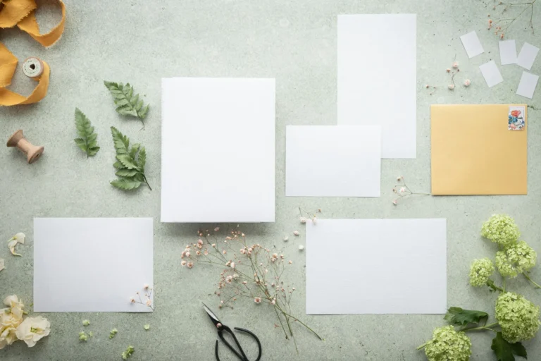
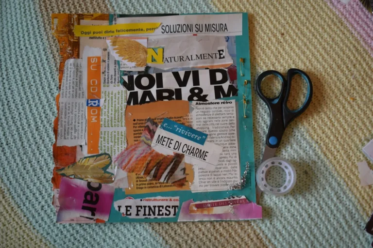
You laid out the magazine cutouts on the kitchen table. You shuffled
them into an arrangement that felt fine. You started gluing. Three
images in, you noticed the whole bottom-right corner is empty, the
centerpiece photo is competing with two big quote cards, and the colors
are pulling in five directions. The fix is not more cutouts. It is the
layout step you skipped.
Below is the composition framework: focal point, layering rules,
color palette, balance and white space, and the five collage styles that
actually work on a vision board. By the end of this post the board on
your wall stops looking like a printed PDF and starts looking like
something you made.
The short version: Pick one focal image before you
start gluing. Build out from it with three layers (background, mid,
foreground). Limit your color palette to two or three colors plus a
neutral. Leave breathing room around the focal image and at the edges of
the board. Use one of five collage styles (centered, grid, overlap,
scattered, framed). Glue last, not as you go.
What makes a good vision
board collage?
A good vision board collage has one focal image the eye lands on
first, a small color palette the rest of the cutouts support, layered
depth instead of flat single-image placement, and white space around the
edges so the board breathes. Most vision boards fail at one of these
four; a board that nails all four reads professional even from photos
taken on a phone.
The same composition habits work on a magazine collage glued to foam
board and on a Canva collage exported to a phone wallpaper. Materials
change the texture; they do not change the rules. For the materials
side, see our vision board materials
guide; this post is about what to do with them once they are in
front of you.
The four-part composition
check
Run this check on the layout before you put glue on
anything. Two minutes saves you a glued-down regret.
Focal image. Is there one cutout the eye lands on
first?
Color palette. Are the colors pulling toward two or
three dominant ones, or fighting in five directions?
Layering. Is anything overlapping, or are all
cutouts floating separately like islands?
Breathing room. Is there visible board around the
edges and around the focal image, or is the whole surface packed wall to
wall?
If any of the four fails, fix it before reaching for the glue stick.
A collage looks intentional when these calls were made on purpose;
without them, even a board full of beautiful cutouts reads as a
pile.
Pick a
focal image first (and protect the space around it)
A focal image is the single cutout that anchors the board. Every
other image on the board orbits around it. Without a focal image, the
eye does not know where to land, and the board reads as visual noise
even if every individual cutout is beautiful.
Three rules for the focal image:
Make it the biggest. Twice the size of the
next-largest cutout. Use a photo print at five-by-seven or a magazine
cutout you can scale up by trimming carefully.
Place it slightly off-center. Dead-center is the
most boring position on a vision board. Offset by a third (the classic
rule-of-thirds intersection) and the eye reads the board as composed,
not centered.
Protect the breathing room around it. A small halo
of empty board around the focal image (about an inch on each side) lets
it dominate. Crowd it and the whole hierarchy collapses.
The focal image is usually the most personal cutout on the board: a
photo of a place, a person, a destination, a goal moment captured. Not a
quote, not a logo, not a stock image. Quotes work as supporting cast;
they rarely carry a board as the focal piece.
Buy this, not that: If you are choosing between
buying one premium printed photo for the focal image or a bigger bundle
of generic stickers, get the photo. A single five-by-seven matte print
from a one-hour shop changes the whole board’s read. Stickers can
wait.
Layer in three
depths (background, mid, foreground)
A flat collage with every cutout glued straight to the board reads as
a brochure. A layered collage with depth reads as art. The difference is
three layers, applied in order.
Background. Solid-color paper, themed-paper
printables, or large magazine pieces (a full-page photo trimmed to
size). Goes on first, covers the foam board so no white shows through
behind the cutouts. Pack it most in the corners and around the edges;
leave the centerpiece zone for the layers above.
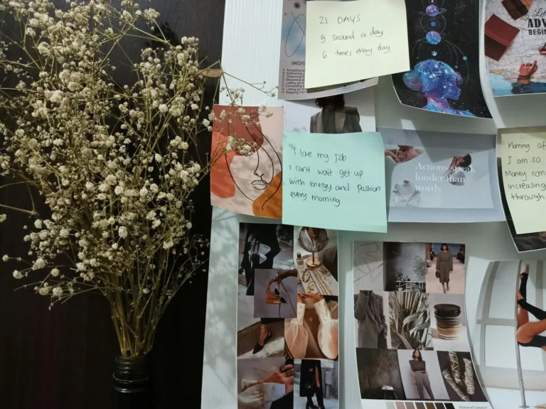
Mid-layer. Photo prints, larger cutouts, quote
cards. These sit on top of the background and form the main visual
content. Place them in clusters around the focal image, not evenly
spaced.
Foreground. Small cutouts, washi tape accents,
stickers, hand-lettered details, dimensional pieces (a real ticket stub,
a dried flower). These go on last and add the texture that separates a
layered board from a flat one.
Each layer should hide some of the layer below it. Cutouts that
overlap their neighbors by a quarter-inch read as a real collage.
Cutouts that float alone read as scrapbook stickers on a page. The
slight overlap is the whole trick.
A simple way to plan the layers: lay every cutout face-up on the
table in roughly the positions they will live on the board, then sort
them mentally into the three layers. Glue the background first, the
mid-layer second, the foreground third. Trying to do all three at once
turns into chaos halfway through.
Limit
the color palette (two or three colors plus a neutral)
The fastest way to make a vision board look unified is to limit the
color palette before you start cutting. Magazines have every color in
the world; if you cut whatever catches your eye, the board ends up
looking like a magazine rack instead of a composition.
Three palette frameworks that work for vision boards:
Two warm + neutral. Terracotta, mustard, cream. A
boho aesthetic, easy to source from home and travel magazines, forgiving
with mixed image sources.
Two cool + neutral. Sage, dusty blue, off-white. A
calming palette, reads as “intentional year” not “manic dream
board.”
Monochrome + accent. Black and white photos plus a
single accent color (red, gold, deep green). High-contrast, modern,
photographs well for sharing on Instagram.
The neutral does the breathing-room work. Without it, even a
beautiful palette feels claustrophobic on a single board. The neutral
can be white space (unfilled board), cream cardstock as backing, or
kraft paper as background layer.
Pre-select the palette before you start cutting from magazines. Walk
through the magazine pile with the palette in mind and skip anything
that does not fit. The pile of cutouts you end with is smaller and
infinitely more usable than a pile that includes every interesting image
on every page.
Balance the
board (without making it symmetrical)
A balanced board feels stable to the eye without mirroring itself.
Symmetry on a vision board reads rigid and a little dead. You want the
opposite: weight spread around the board so no single corner pulls the
eye, even though the cutouts are not the same on both sides.
Visual weight comes from size, from color, and from density. A small
cutout in a bright color pulls as much eye as a much larger cutout in a
muted one. A dense cluster of small cutouts in one corner can balance a
single large image in the opposite corner.
A few practical rules:
Distribute weight diagonally. Heavy cluster in
upper-left, balancing weight in lower-right (or vice versa). The eye
reads the diagonal as movement.
Mirror dense areas with rest. A packed corner needs
a quieter corner on the opposite side. Pack all four corners equally and
the board reads as visual noise.
Use the focal image to anchor balance. The focal
image is the heaviest point; everything else orbits to balance it.
Step back every few minutes. Stand five feet away
from the board (you will look at it from across a room more than from
arm’s length). Imbalance shows up at five feet that is invisible at
one.
A simple balance test: take a phone photo of the layout before gluing. Look at the photo. The board on your phone
screen is closer to what you will see from across the room than the
board in front of you. Adjust the layout based on the photo, not the
in-person view.
Leave breathing room
(most boards have none)
The most common composition mistake on a vision board is filling
every square inch. The board feels productive (look at all the goals)
but reads cluttered. Breathing room around cutouts and along the edges
of the board is what makes the composition read as deliberate.
Three places to leave space:
Around the focal image. About an inch of empty
board on each side. This lets the focal image read as the center of
attention.
Along the outer edges of the board. A half-inch to
an inch of empty board around the whole perimeter. Cutouts crammed to
the edge make the board feel like a flyer pinned to a corkboard at a
coffee shop. A clear border frames the composition.
Between cluster zones. If you have two or three
groups of related cutouts (a travel cluster, a home cluster, a career
cluster), leave visible empty board between them. The eye reads the gaps
as structure.
The cutouts you remove from the layout because there is not enough
room are usually the cutouts that were not serving the board anyway. The
five or six images you ended up holding back are exactly the ones to
start next year’s board with.
The five
collage styles that work on a vision board
Most strong vision board collages fit into one of five composition
styles. Picking the style upfront makes every later decision (focal
placement, layering depth, palette) faster.
1. Centered / focal style
One large focal image dead-center or just off-center, with smaller
cutouts orbiting around it in three to five clusters. The most common
style and the easiest to execute well. Good first-board style.
2. Grid / Bingo-card style
Cutouts arranged in a regular grid (3×3, 4×4, or 4×6), each in its
own zone with consistent gaps between. Reads as clean and goal-focused.
Best for goal-heavy boards (book titles, places to visit, skills to
learn). Pair with our bingo-style
printable templates for a head start.
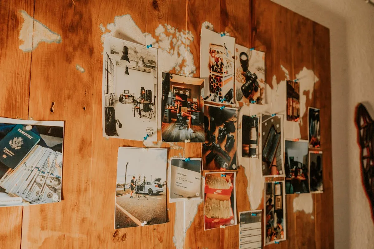
3. Overlap / layered style
Heavily layered, cutouts overlapping each other by half or more,
three to four layers deep. Reads as dense and rich. Best for boards with
a strong color palette and a single aesthetic source (all travel photos,
or all home interiors). Hardest to execute without it looking
chaotic.
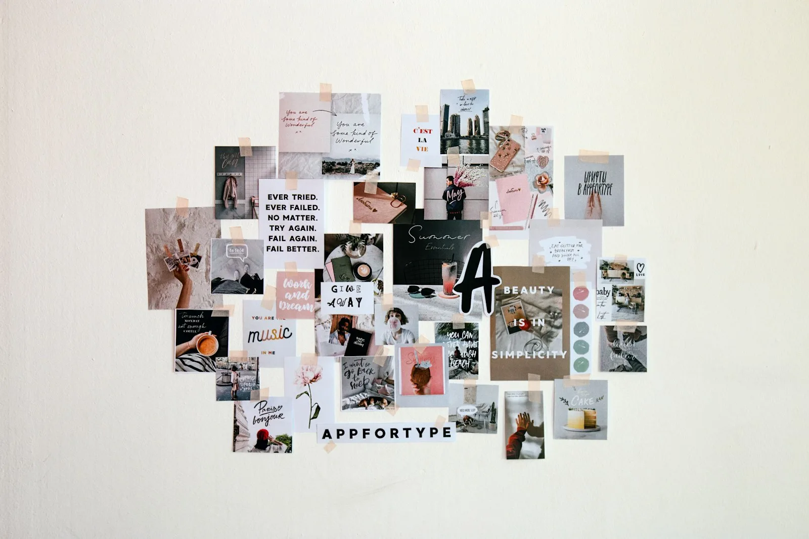
4. Scattered / organic style
No grid, no centerpiece, cutouts placed in loose clusters across the
board. Reads as casual and personal. Best for boards built from a mix of
personal photos and ephemera. Requires the most attention to balance
because there is no built-in structure.
5. Framed / bordered style
A clear border (washi tape, patterned paper, hand-drawn line) frames
the whole board, with cutouts placed inside the frame in any of the four
styles above. Adds a finished, art-piece quality. Great for a board you
want to hang as art, paired with a foam-board build.
How to fix a
collage that already looks off
Sometimes the board is already half-glued and feels wrong. Three
rescue moves before you start over.
Add a unifying border. Washi tape along the edges,
or a layer of patterned paper underneath everything visible. A border
ties scattered cutouts into a single composition.
Cover a clashing cutout with a strong overlay. A
quote card, a small photo, a strip of washi tape over the part that
feels off. Layering is the only available undo on a glued board.
Distress every edge. Run a distressing ink pad
along every visible cut edge. Five minutes of ink turns a board that
looked too “printer fresh” into one that looks intentional and
vintage-flavored.
A board that started rough usually finishes well after one of these
moves. The cutouts are not wrong; the composition is. Layering rescues
most composition problems.
Frequently
asked questions about vision board collages
How do you make a vision
board collage?
You make a vision board collage by picking a focal image, planning a
layout with cutouts arranged on the table before any glue, layering in
three depths (background, mid, foreground), limiting the color palette
to two or three colors plus a neutral, and gluing only after the
composition is checked. The actual building part takes one to three
hours; the planning step is what separates a good board from a flat
one.
What makes a good
vision board collage?
A good vision board collage has one clear focal image, a limited
color palette, three layers of depth, balanced visual weight without
strict symmetry, and visible breathing room around the focal image and
along the board’s edges. The cutouts themselves matter less than the
composition rules applied to them. A board built from dollar-store
magazines with strong composition reads better than a curated kit thrown
together randomly.
How do you arrange a vision
board?
You arrange a vision board by picking a focal image first, building
out from it with clusters of related cutouts, and leaving deliberate
empty space around the edges and around the focal piece. The two most
useful rules are diagonal balance (heavy cluster in one corner,
balancing weight in the opposite corner) and asymmetry (offset the focal
image from dead-center). Glue only after the layout is finalized.
What size should a
vision board collage be?
Twenty by thirty inches is the sweet spot for a wall vision board
collage, large enough to hold a year of imagery without looking sparse,
small enough to hang in a rental bedroom or office. Eleven by fourteen
is fine for a desk board or a board you photograph for a phone
wallpaper. Anything bigger than 28 by 40 overwhelms most apartment
walls.
How many
images should be on a vision board collage?
A vision board collage usually has 15 to 30 images for a 20 by 30
inch board. Fewer than 10 reads as sparse and underplanned; more than 40
reads as cluttered and loses the focal point. The sweet spot is enough
images to fill the major composition zones with deliberate breathing
room around the focal image and at the edges.
Build the layout
before you reach for the glue
The two-minute layout check before gluing (focal image, palette,
layering, breathing room) is the single biggest upgrade to any vision
board you will ever make. Skip it and the board glues down in the order
you cut, which is the order with the least intention behind it. Do it
and the same cutouts become a composition.
For the supply side of the build, our vision board supplies starter list
has the four-item starter. For the deeper material breakdown, the vision board materials guide covers
which board, glue, and magazines actually work. And when you have built
the collage and want a year-long check-in practice for the board, the vision boards for manifesting
post covers the practice side.
Want a layout template printable to plan your collage before
you cut? Grab our Craft Wren free pack: a four-zone layout
template, twelve quote cards, and a one-page goals worksheet. Print at
home, plan the layout, glue with confidence. Sign up below and we will
send it over.
Get free junk journal printables
New printables, page ideas, and paper craft tutorials, straight to your inbox.
A vision board kit is worth buying if it solves the blank page problem for you, and is a waste of money if you would have collected most of the same stuff on your own at the dollar store. The price has very little to do with the result; what a $30 kit actually buys…
A teen vision board works best when it is built around two or three real, near-term goals (one semester, one summer, one season of a sport) instead of a full life plan. The high school version of “the rest of your life” changes about four times before graduation, and a board that tries to picture…
A 2026 vision board works best when it covers four to six categories of your actual life (career, money, health, travel, relationships, creativity, home, self), with one specific outcome per category rather than a general mood. Pinterest is full of beautiful but useless boards that picture sixteen versions of “abundance.” The boards that actually move…
Cork beats poster board for any vision board you keep more than a season. The four kinds of cork, how to mount on a rental wall, what you really need, and the maintenance habit nobody mentions.
The vision board materials that actually matter and the ones to skip. Black foam board over poster, tape runner over glue stick, magazines, and the three quiet upgrades nobody puts in a kit.
How to write goals that work on a vision board: the four kinds every working board needs, the number-and-date trick, placement rules, and the review cadence that keeps the board alive.
Manage Consent
To provide the best experiences, we use technologies like cookies to store and/or access device information. Consenting to these technologies will allow us to process data such as browsing behavior or unique IDs on this site. Not consenting or withdrawing consent, may adversely affect certain features and functions.
Functional
Always active
The technical storage or access is strictly necessary for the legitimate purpose of enabling the use of a specific service explicitly requested by the subscriber or user, or for the sole purpose of carrying out the transmission of a communication over an electronic communications network.
Preferences
The technical storage or access is necessary for the legitimate purpose of storing preferences that are not requested by the subscriber or user.
Statistics
The technical storage or access that is used exclusively for statistical purposes.The technical storage or access that is used exclusively for anonymous statistical purposes. Without a subpoena, voluntary compliance on the part of your Internet Service Provider, or additional records from a third party, information stored or retrieved for this purpose alone cannot usually be used to identify you.
Marketing
The technical storage or access is required to create user profiles to send advertising, or to track the user on a website or across several websites for similar marketing purposes.


")
")

")