This post contains affiliate links. We may earn a commission when you download a freebie or buy a subscription on Creative Fabrica, at no extra cost to you.
Three calm words, that is the whole print. “Let love grow,” maybe, for a bedroom wall, or the signage for a wedding buried in pampas grass and terracotta. Warm, airy, a little hand-touched, the kind of thing that looks good next to a trailing pothos. Then you set it in a clean, minimal font and the whole thing turns into the logo for a tech startup that sells oat milk, all neutral palette and not a scrap of warmth.
Boho type is sneaky that way. The aesthetic looks effortless, so people assume any plain, minimal font will do, and plain-minimal is exactly the thing that tips it into corporate. The earthy, lived-in feeling does not come from one magic font. It comes from three small qualities, and once you can name them you can coax almost any font toward boho or rescue one that went sterile.
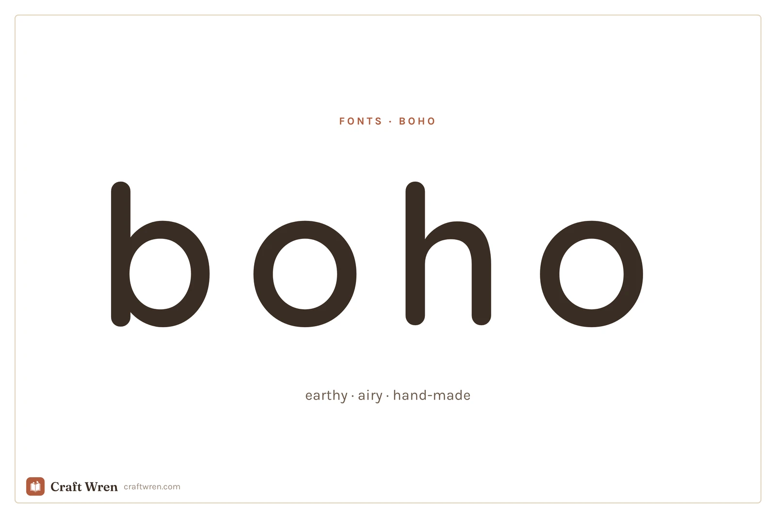
Boho fonts are earthy, organic typefaces with an airy, hand-made feel, used for bohemian-style prints, wedding signage, and neutral decor. The look depends as much on wide spacing and a hand-drawn touch as it does on the font itself.
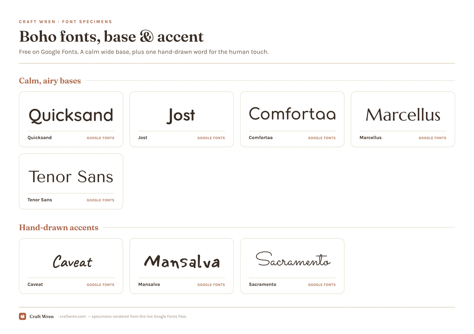
Smallest print size is measured from each font file: the letter height at which the thinnest part of the stroke drops to 0.25 mm, which is roughly where home printing starts losing the line. Screens forgive more, vinyl forgives less.
Font
Sub-style
What it gives you
Smallest print size
Quicksand
Airy
Geometric rounded with excellent tracking
2.1 mm
Jost
Airy
Crisp geometric, Futura-style wide spacing
2.3 mm
Comfortaa
Warm
Rounded soft corners, geometric warmth
2.5 mm
Mansalva
Handmade
More character and wobble, accent word
2.6 mm
Caveat
Handmade
Friendly all-rounder, casual and slanted
3.3 mm
Tenor Sans
Warm
Old-world sans, the smaller-safe of the pair
4.3 mm
Marcellus
Warm
The same Scandi calm, cut as a serif
5.0 mm
Sacramento
Handmade
Thin looping script, romantic feel
5.4 mm
Quality one: airy spacing
The fastest way to make a font read boho is not to change the font at all. It is to give the letters room to breathe. Boho lettering sits wide and open, with generous space between each letter, the typographic version of an uncluttered room with a lot of natural light. Cramped, tight spacing reads as busy and modern; loose spacing reads as calm and bohemian.
This is the cheapest move you have, and it works on fonts you already own. In Canva, set your word, then drag the letter spacing slider up until the word stretches out and relaxes. A perfectly ordinary sans serif, spaced wide and set in lowercase, suddenly looks like it belongs on a linen banner. Quicksand and Jost are great starting points because they are clean and geometric to begin with, and they take wide tracking beautifully without falling apart. The one catch is that this wants short text: three or four words look intentional, while a whole sentence stretched that wide just looks like the spacebar got stuck.
Quality two: an organic, hand-made edge
Pure geometry is what turns boho into corporate, so the second quality is a touch of the human hand somewhere in the design. Something that looks drawn rather than printed. You rarely need the whole thing handwritten, just one element that carries the imperfection.
The easy way is to pair a clean base with one loose, handwritten word. Caveat is the friendly all-rounder, casual and a little slanted without being hard to read. Mansalva has more character and wobble, good for a single accent word. Sacramento is a thin, looping signature script for when you want the hand-made bit to feel romantic rather than casual. All three are free on Google Fonts. Use one of them for the word that matters, “gather,” “stay wild,” the couple’s names, and keep the rest calm and clean.
Quality three: warm restraint, not stark
Boho is earthy and quiet, not high-contrast or loud, so the third quality is a kind of softness in the letters themselves. A font with gently humanist edges reads warmer than a hard, mechanical one. Comfortaa brings rounded, soft corners to the geometric look. Marcellus and Tenor Sans are the elegant, slightly old-world faces that lean into the modern, Scandi-adjacent side of boho without ever feeling cold.
This is also where the most common boho mistake hides. Reach for a font that is too tidy, too perfectly geometric, too evenly weighted, and the design stops reading as boho and starts reading as a yoga-studio logo. A little softness, a little warmth, one element slightly off-grid: that is the difference between earthy and clinical.
Putting the three together
Almost every boho design you have admired is really two fonts working together: a calm, wide-spaced base doing the heavy lifting, plus one hand-drawn word as the accent. The base brings the airy restraint, the script brings the human touch, and between them you land all three qualities at once.
A reliable recipe: set most of the words in Quicksand or Jost, spaced wide and in lowercase, then drop the one word that matters into Caveat or Sacramento. Keep the colors warm and few, sand, clay, sage, cream. That is a finished boho print, built entirely from free fonts.
Where to find boho fonts free
The good news with boho is that you rarely have to go anywhere. The whole toolkit above, Quicksand, Jost, Comfortaa, Marcellus, Tenor Sans, Caveat, Mansalva, and Sacramento, lives on Google Fonts, all cleared for commercial work and waiting in Canva’s font list with nothing to install. A complete boho design, base plus accent, can come entirely from there.
If you want the more decorative bohemian display faces, the hand-lettered ones or the bundles that ship with matching leaves and arches, Creative Fabrica is the place, and its free plan lets you try a few before subscribing. dafont’s brush-and-handwritten shelf is another organic well worth a browse. With both, glance at the license first: free to download and free to sell with are two separate permissions, and a personal-use font cannot go on a product you charge for. Everything from Google Fonts is fine to sell, so a print shop or a full wedding suite stays on safe ground. The aesthetic fonts hub lays out the licensing in detail.
The hardest part of boho is not choosing the fonts, it is stopping. Set your base, space it out, add the single handwritten word, then leave the rest of the page mostly empty. The look lives in the breathing room as much as in the letters, so a print that is two-thirds open space will almost always beat one that fills every corner. If your project leans softer and more storybook than earthy, the cottagecore fonts guide covers that gentle, old-book neighbor, and the aesthetic fonts hub ties the whole family together.
Give a calm font some air, hand-letter the one word that counts, and stop while it still feels uncluttered. Those three calm words you wanted on the wall will finally read warm and lived-in, instead of like they are trying to sell you a subscription.
Frequently asked questions about boho fonts
What font is the boho font?
There is no single one. The boho look comes from combining a calm, wide-spaced base font with one hand-drawn accent. On Google Fonts, Quicksand or Jost make a great airy base, and Caveat or Sacramento give you the handwritten touch. The earthy feeling depends as much on the spacing and pairing as on the font itself.
Are boho fonts free?
Most of the toolkit is. Quicksand, Jost, Comfortaa, Marcellus, Tenor Sans, Caveat, Mansalva, and Sacramento all come from Google Fonts with commercial rights included and nothing to pay. The fancier hand-lettered display faces usually sit on Creative Fabrica or dafont, where a fair number are personal-use only, so confirm the terms before putting one on something you sell.
Why does my boho font look corporate instead of earthy?
Almost always because it is too tidy. A perfectly geometric, evenly spaced, hard-edged font reads as a clean logo, not as bohemian. Add wide letter spacing, bring in one softer or hand-drawn element, and keep the colors warm and few. A little imperfection is what separates earthy from clinical.
How do I get the wide boho spacing in Canva?
Set your text, then use the letter spacing slider to push the letters apart until the word looks open and relaxed. Wide tracking is the single cheapest way to make an ordinary font read boho. Keep it to a few short words, though, since a long sentence stretched that wide becomes hard to read.
What fonts pair well for a boho wedding?
A wide-spaced clean base like Jost or Quicksand for the details, paired with a looping script like Sacramento or a casual hand like Caveat for the names. Set everything in warm, earthy colors and leave plenty of empty space. That combination gives you legible information and a hand-made feeling at the same time.
Get free junk journal printables
New printables, page ideas, and paper craft tutorials, straight to your inbox.
This post contains affiliate links. We may earn a commission when you download a freebie or buy a subscription on Creative Fabrica, at no extra cost to you. It starts with your grandmother’s bread, the recipe you finally got right, and a card you want to look like it came out of a flour-dusted cookbook…
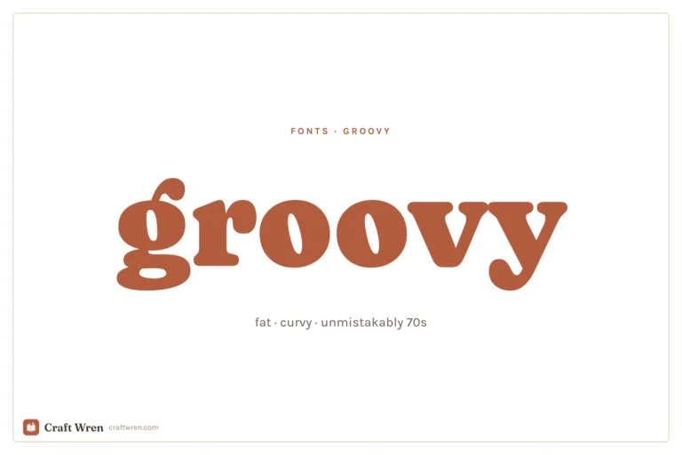
This post contains affiliate links. We may earn a commission when you download a freebie or buy a subscription on Creative Fabrica, at no extra cost to you. Picture the poster: a 70s-themed birthday, a disco playlist cover, a tote with one big word in mustard and brown. Fat bubbly letters, a little wonky, the…
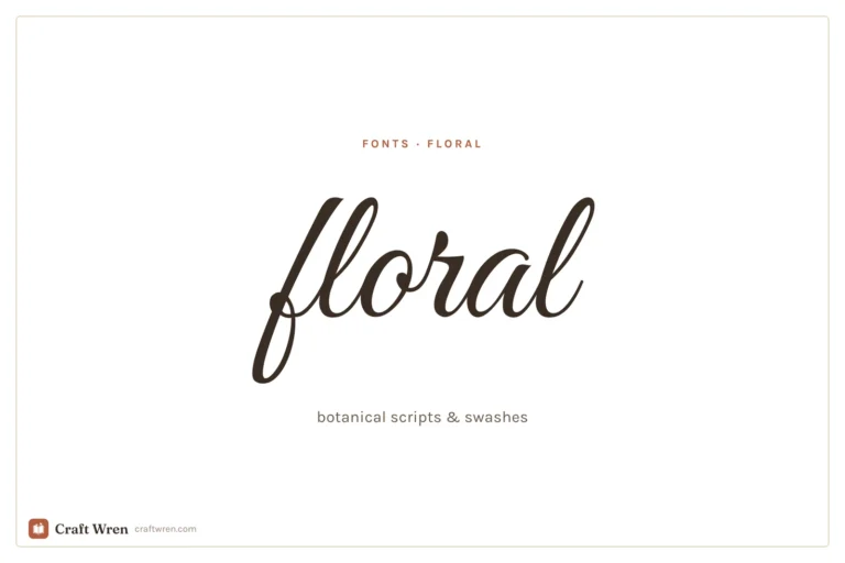
Floral fonts for invitations, journaling, and monograms: botanical scripts and swashes, the best free picks, and how to keep them legible in print.
Manage Consent
To provide the best experiences, we use technologies like cookies to store and/or access device information. Consenting to these technologies will allow us to process data such as browsing behavior or unique IDs on this site. Not consenting or withdrawing consent, may adversely affect certain features and functions.
Functional
Always active
The technical storage or access is strictly necessary for the legitimate purpose of enabling the use of a specific service explicitly requested by the subscriber or user, or for the sole purpose of carrying out the transmission of a communication over an electronic communications network.
Preferences
The technical storage or access is necessary for the legitimate purpose of storing preferences that are not requested by the subscriber or user.
Statistics
The technical storage or access that is used exclusively for statistical purposes.The technical storage or access that is used exclusively for anonymous statistical purposes. Without a subpoena, voluntary compliance on the part of your Internet Service Provider, or additional records from a third party, information stored or retrieved for this purpose alone cannot usually be used to identify you.
Marketing
The technical storage or access is required to create user profiles to send advertising, or to track the user on a website or across several websites for similar marketing purposes.


")

")