This post contains affiliate links. We may earn a commission when you download a freebie or buy a subscription on Creative Fabrica, at no extra cost to you.
You are going for soft. A little bow in the corner, the pink that reads expensive instead of plastic, the whole quiet-luxury-but-make-it-girlish thing. Then you type the words and they come out blocky and confident, and your delicate little thing suddenly looks like a flyer for a gym. The bow cannot save it. The font is the bow.
Coquette lives almost entirely in the lettering. The aesthetic is about restraint, fine lines, and a kind of practiced prettiness, and a heavy font breaks all three at once. So the right typeface is doing more work here than in any other aesthetic.
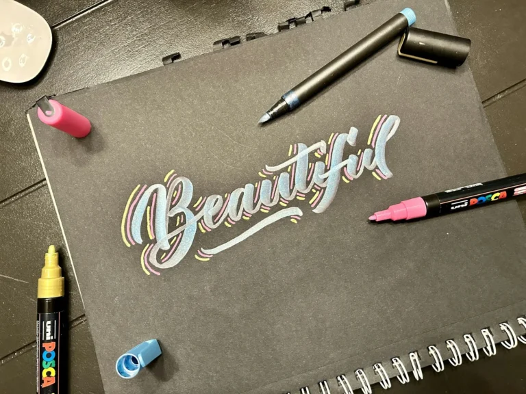
Coquette fonts are delicate, romantic typefaces, mostly fine-lined scripts and dainty serifs, that read soft and feminine. They suit affirmations, wedding details, and anything that wants to feel tender rather than loud.
There are really two families that pull it off, plus one mistake that ruins both.
Smallest print size is measured from each font file: the letter height at which the thinnest part of the stroke drops to 0.25 mm, which is roughly where home printing starts losing the line. Screens forgive more, vinyl forgives less.
Font
Sub-style
What it gives you
Smallest print size
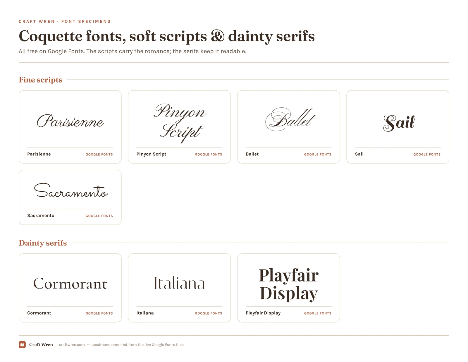
Sacramento
Fine scripts
Simplest monoline, stays readable
5.4 mm
Parisienne
Fine scripts
Fine-lined and flowing, the easier of the two
8.5 mm
Playfair Display
Dainty serifs
Refined serif, dramatic heading
8.5 mm
Cormorant
Dainty serifs
High-contrast serif, fashion magazine feel
10.0 mm
Sail
Fine scripts
Decorative, old-fashioned, dramatic
12.0 mm
Pinyon Script
Fine scripts
Same flow, needs nearly twice the height
14.9 mm
Ballet
Fine scripts
Featherweight script, almost whispers
20.0 mm
Italiana
Dainty serifs
Refined serif with structure
20.0 mm
The fine scripts
This is the heart of coquette: thin, loopy, handwritten letters that look like they were dashed off with a very expensive pen. They carry the romance, and they are the first thing the eye reads as “soft.”
Parisienne and Pinyon Script, free on Google Fonts, are the easiest place to start, both fine-lined and flowing without being illegible. Ballet is the daintiest of the bunch, a featherweight connecting script that almost whispers. Sail leans more decorative and old-fashioned if you want a little drama, and Sacramento is the simplest of the set, a single-weight monoline that stays readable when the loopier ones get fussy. All install straight into Canva, no download.
The dainty serifs
When you need the words to actually be readable, a delicate serif does coquette without the squint. These are the fonts for the longer line, the journaling, the part a script would turn into a pretty blur.
Cormorant is the standout, a high-contrast serif with thin, elegant strokes that feels like a fashion magazine. Italiana gives you a similar refined look with a little more structure, and Playfair Display brings more drama to a heading without losing the refinement. Set your title in a script and your body in one of these, and the page reads soft and legible at the same time.
What coquette fonts are best for
Coquette is a specific mood, so it shines on some projects and quietly fails at others. The fine scripts are made for the things that should feel like a love letter: a name on a wedding place card, a two-word affirmation, the cover of a keepsake journal. The dainty serifs carry the calmer, longer pieces, a soft-girl planner, a quote you actually want to read, a recipe card that should feel like it came from a Paris kitchen.
Where coquette struggles is anything that needs to shout. A sale banner, a bold logo, a sign read across a room, all of these want a weight the aesthetic refuses to give. If your project needs to grab attention rather than reward a closer look, a bolder display font will serve you better. Coquette is built for the lean-in, not the glance.
The legibility trap
Coquette fonts have one real flaw: the prettier the script, the harder it is to read, and it is easy to fall for a font you cannot actually use.
A few rules keep you out of trouble. Use the fine scripts only on short phrases, a name, a date, a two-word affirmation, never a paragraph. Size them up generously, because thin strokes vanish when small. And if a word has to be read at a glance, like the time on an invitation, put it in the serif, not the script. A gorgeous font that leaves your guest squinting at the start time has failed at the one job an invitation has.
Where to download coquette fonts free
Start at the top of this list and work down:
Google Fonts has the scripts and serifs above, free for both personal and commercial use, no download needed in Canva or Docs. Start here for almost everything.
Creative Fabrica is where the softer, more decorative coquette styles live, the ones with little hearts and swashes built in. American Coquette is a free one to start with, and the ribbon-soft Preppy Coquette and its decorative version lean fully into the look. The free plan lets you try a few before subscribing.
dafont has a deep romance-and-script category, just check the license line, since many are personal-use only.
Selling your work? The personal-use label is the thing to watch, because it bars a font from anything you charge money for, free download or not. The scripts and serifs here are all clear to sell with, so a paid wedding suite is safe ground. Our aesthetic fonts guide goes deeper on licensing.
How to pair a coquette font
One delicate accent, one quiet workhorse. Set the name or the phrase in a fine script, set everything you need to read in a soft serif or a plain sans, and let the white space do the rest. Coquette loves room to breathe, so crowding the page is its own kind of mistake.
The look is closely related to the girly fonts world, but a step quieter: where girly is bubbly and fun, coquette is hushed and a little precious. If your project wants more bounce than whisper, that guide is the better starting point.
Keep it to two fonts. A coquette layout with three competing scripts stops looking expensive and starts looking like it tried too hard. Effortless is the whole brand, and three scripts is visible effort.
Frequently asked questions about coquette fonts
What font is the coquette aesthetic?
There is no single one, but the coquette look lives in fine-lined scripts and delicate serifs. Parisienne and Ballet cover the soft, loopy script side, and Cormorant covers the readable serif side. The common thread is thin strokes and a quiet, romantic feel rather than anything bold.
Are coquette fonts free?
Yes, the core ones are. Google Fonts has Parisienne, Pinyon Script, Ballet, Sail, and Cormorant free for personal and commercial use. The more decorative coquette styles with built-in bows or hearts tend to live on Creative Fabrica and dafont, where some are free for personal use only.
What is the prettiest coquette font for a wedding?
For the names and the romantic flourishes, a fine script like Parisienne or Ballet. For the details people actually have to read, the date, the time, the address, switch to Cormorant so nobody is decoding a swirl. That script-plus-serif pairing is the standard for a reason.
How is coquette different from cottagecore?
Coquette is urban and polished, all ribbons, ballet, and soft-girl restraint, so it leans on fine scripts. Cottagecore is rural and storybook, gentle and a little hand-drawn, so it leans on soft serifs and casual hand-lettering. They overlap in softness but pull from different fonts.
Can I read a coquette font at small sizes?
The serifs, yes. The scripts, often not. Thin script strokes disappear when you shrink them, so keep scripts large and reserved for short phrases. Anything that needs to be legible small, like fine print on a printable, belongs in a dainty serif instead.
Get free junk journal printables
New printables, page ideas, and paper craft tutorials, straight to your inbox.
This post contains affiliate links. We may earn a commission when you download a freebie or buy a subscription on Creative Fabrica, at no extra cost to you. Picture the poster: a 70s-themed birthday, a disco playlist cover, a tote with one big word in mustard and brown. Fat bubbly letters, a little wonky, the…
30 free Procreate fonts you can install today, grouped by style, plus the exact steps to add fonts to Procreate on iPad.
Manage Consent
To provide the best experiences, we use technologies like cookies to store and/or access device information. Consenting to these technologies will allow us to process data such as browsing behavior or unique IDs on this site. Not consenting or withdrawing consent, may adversely affect certain features and functions.
Functional
Always active
The technical storage or access is strictly necessary for the legitimate purpose of enabling the use of a specific service explicitly requested by the subscriber or user, or for the sole purpose of carrying out the transmission of a communication over an electronic communications network.
Preferences
The technical storage or access is necessary for the legitimate purpose of storing preferences that are not requested by the subscriber or user.
Statistics
The technical storage or access that is used exclusively for statistical purposes.The technical storage or access that is used exclusively for anonymous statistical purposes. Without a subpoena, voluntary compliance on the part of your Internet Service Provider, or additional records from a third party, information stored or retrieved for this purpose alone cannot usually be used to identify you.
Marketing
The technical storage or access is required to create user profiles to send advertising, or to track the user on a website or across several websites for similar marketing purposes.


")

")
")